
Times Roman vs. Times New Roman | CreativePro Network
Times Roman vs. Times New Roman
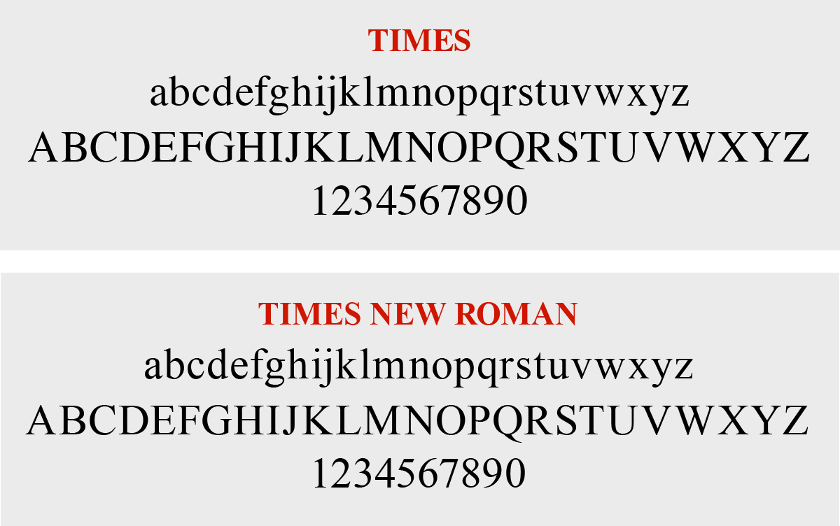
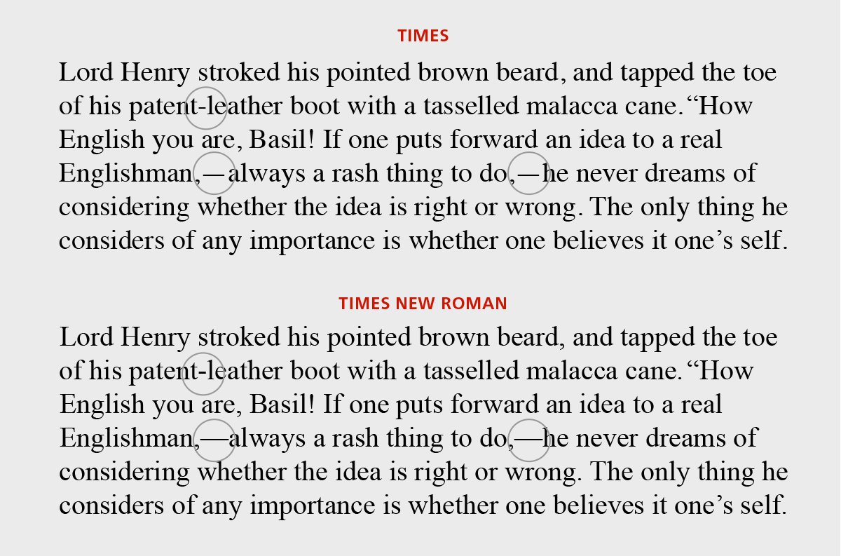
Times Roman and Times New Roman typefaces, while similar in name and appearance, are not exactly the same. These two (both of which are found in most font menus) are variations on a theme, so to speak. They do have subtle differences in design and spacing, so they’re not exactly interchangeable.
The Origins of the Times Font
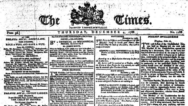
The original typeface used by the British newspaper The Times (founded in 1785) wasn’t officially named ‘Times.’ It was referred to as ‘the Times font’ or the typeface used by The Times. In 1931, The Times of London commissioned a new text type design from Stanley Morison and the Monotype Corporation, after Morison had written an article criticizing The Times for being badly printed and typographically behind the times. The new design was supervised by Morison, a typographic consultant to The Times (and to Monotype), and drawn by Victor Lardent, an artist from the advertising department of the newspaper.
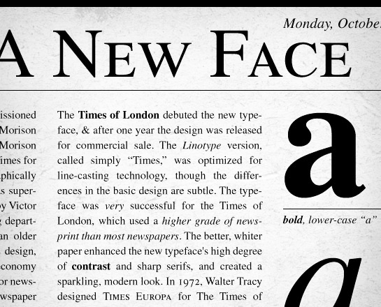
Morison used an older typeface, Plantin, as the basis for his design, but made revisions for legibility and economy of space (always important concerns for newspapers). As the old type used by the newspaper had informally been referred to as ‘Times Old Roman,’ Morison’s revision became ‘Times New Roman.’ The Times of London debuted the new typeface in October 1932, and after one year they released the design for commercial sale.
Times New Roman was originally developed by Monotype for use on their own typesetting equipment, which produced type in individual characters. However, newspapers of the day (including The Times) also used Linotype equipment, so Linotype developed a version of Times New Roman for their typesetters, which became known as ‘Times Roman.’ The Linotype version, often simply called ‘Times,’ was optimized for line-casting technology, though the differences in the basic design are subtle. The typeface was very successful for The Times of London, which used a higher grade of newsprint than most newspapers. The better, whiter paper enhanced the new typeface’s high degree of contrast and sharp serifs and created a sparkling, modern look.
Differences Between Times Roman and Times New Roman
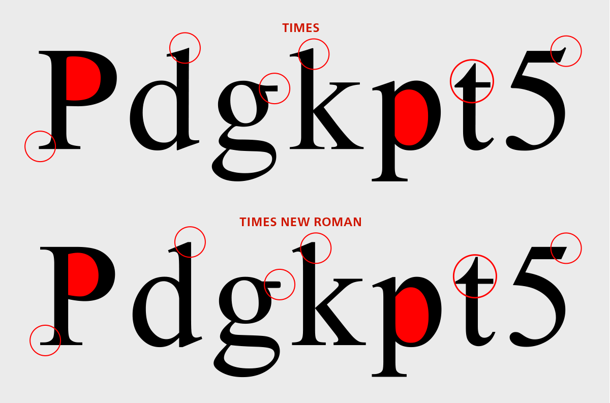
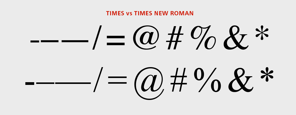
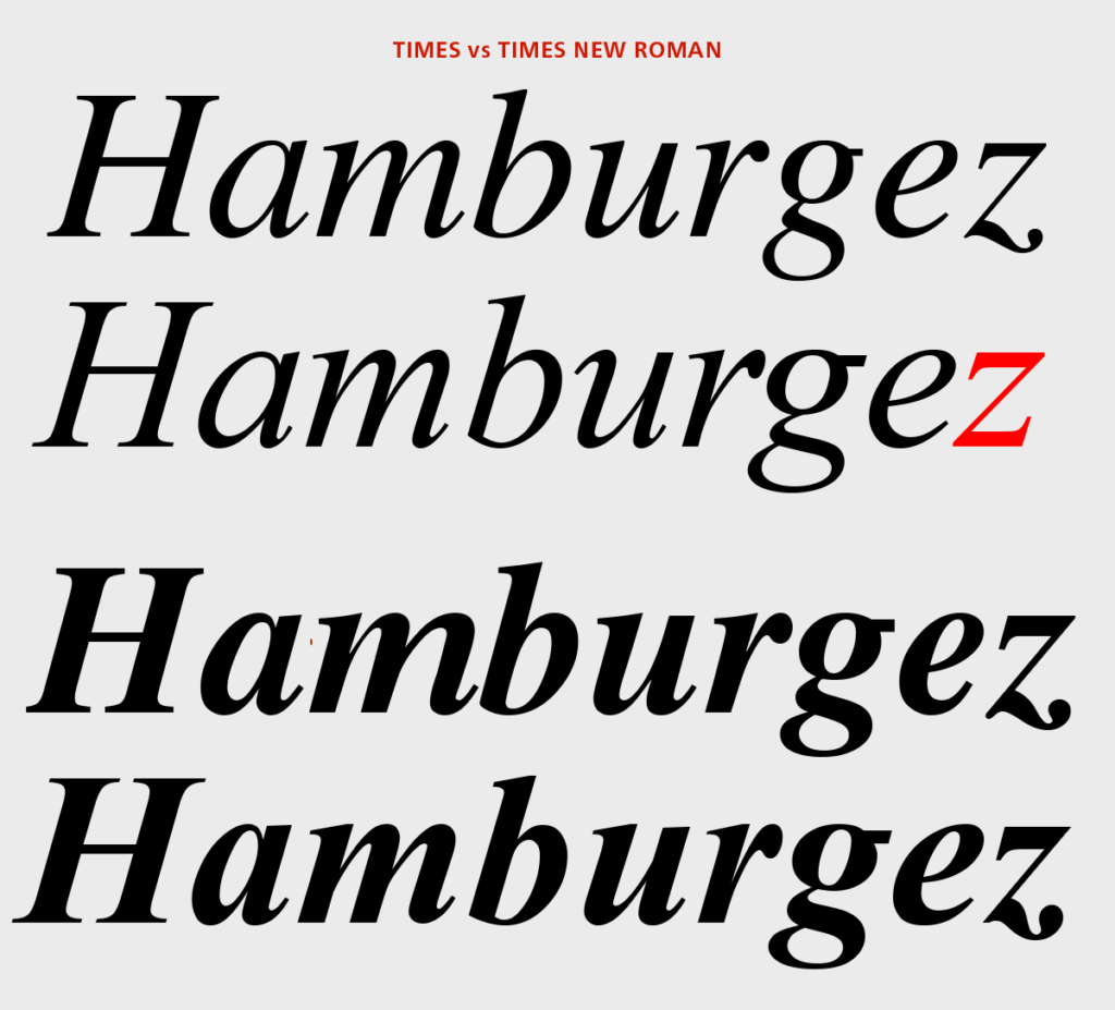
These distinctions remain today—including the fact that Times New Roman is still owned by the typeface company Monotype, while Times is owned by its rival, Linotype. While these two fonts look very similar and almost identical at small sizes, you can see the differences at larger sizes. Times New Roman has thinner serifs, blunted terminals, and a rounded ear on the ‘g’, as well as other more subtle refinements. In addition, the swash has been removed from the lowercase italic roman ‘z’. Upon close inspection of the signs and symbols, you notice the thinner, longer dashes, both with tighter spacing (not an improvement, IMHO!) In addition, it has thinner linear symbols (except for the hyphen, which has been made heavier), redesigned @ and % symbols, and a heavier asterisk.
Once made commercially available, Times continued to be very popular around the world because of its versatility and readability and because it went on to become a standard font on most computers and digital printers. While many people still use either version of Times in spite of the thousands of—dare I say—better alternatives, it should be confined to print, as it is definitely not the best choice for the web, especially for lower resolution devices. In these cases and when one wants to stick to system web fonts, Georgia is the better choice. It is cleaner and more legible, as it was designed specifically for digital usage.


![Toni Kroos là ai? [ sự thật về tiểu sử đầy đủ Toni Kroos ]](https://evbn.org/wp-content/uploads/New-Project-6635-1671934592.jpg)