Starfleet insignia
(covers information from several alternate timelines
Multiple realities
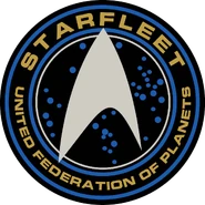
The Starfleet insignia was an asymmetrical, arrowhead-shaped pennant adopted by Starfleet as its identifying emblem. This delta is used on every Starfleet badge and is displayed on starship hulls, installations, uniforms, and equipment used by Starfleet personnel.
History
This article or section is incomplete
This page is marked as lacking essential detail, and needs attention. Information regarding expansion requirements may be found on the article’s talk page. Feel free to edit this page to assist with this expansion.
The United Earth Starfleet of the 22nd century used a simple forward-facing “pointer” shaped pennant, with a round backdrop, that was reminiscent of symbols used by NASA in the 20th and 21st centuries. The original design for the Starfleet uniform of that era did not include this symbol, unless it was a crewperson assigned to Starfleet Command, who wore the insignia as their assignment patch on the left shoulder. In a later uniform revision of the 2160s, personnel wore the Starfleet patch on their right shoulder as well as the left shoulder assignment patch. (ENT: “First Flight”, “These Are the Voyages…”; TNG: “The Royale”)
Shortly after the founding of the United Federation of Planets in 2161, a solid silver delta was worn on the left breast of the uniform, with individual assignment patches worn on both shoulders. (Star Trek Beyond) This simple delta design would see a resurgence in the early 2380s. (LD: “Second Contact”; PRO: “Lost and Found”)
After the 2160s, Starfleet slightly changed up it’s insignias. The forward facing “pointer” shaped pennant remained the main logo for all of Starfleet. however Starfleet adopted different insignias for a different part of the fleet such as Starships and installations. For Starships. a new arrowhead delta design was adopted. This new arrowhead was the iconic Starfleet delta and was used only used on Starships. This design was used continuously until at least 2255 or 56 when the right side of the delta was changed to be outlined and slightly separated from the rest of the arrowhead. (DIS: The Vulcan Hello). (DIS: seasons 1 and 2; SNW: season 1; TOS and TAS; TMP)
The main logo of Starfleet was modified by 2256, with the left side of the insignia shortened. This simplified pennant was still used to display on Federation starships, and some installations, though it was not used on uniforms. (TOS: “Court Martial”; ENT: “In a Mirror, Darkly”, “In a Mirror, Darkly, Part II”)
The arrowhead delta insignia of Starships remained on the uniforms of officers and enlisted who served on starships. It came into usage for much of Starfleet’s exploration division in the early to mid 23rd century. (TOS: Court Martial)
A starburst insignia was used by flag officers and administrative support staff of fleet headquarters and starbases. The regular Starfleet arrowhead insignia remained the standard identification for Starfleet from the late 2250’s to at least 2265. (TOS: “The Cage”, “Court Martial”, “The Doomsday Machine”, “The Omega Glory”; ENT: “In a Mirror, Darkly, Part II”; Star Trek; DIS: “The Vulcan Hello”)
By the mid-2270s, while most installations such as Epsilon IX station, maintained their individual assignment patches, Starfleet Command began adopting the arrowhead design for all of Starfleet. (Star Trek: The Motion Picture; Star Trek; Star Trek Beyond) Specifically, the command division insignia, with the MACO five-pointed star contained in the arrowhead, was most often used, although a version omitting the internal star gained prominence as well. This arrowhead shape, with similar asymmetry as the previous incarnation, had roots in history as being used in a basic form on the United States military space command ratings badge and unit insignia, and on UESPA exploration vessels, such as the Friendship 1, in the 21st century. This symbol was now pointed up when worn on the chest or shoulder of uniforms, as well as displayed in signage. The arrowhead was faced forward when used as hull decoration. This symbol eventually phased out all assignment patches by the late 2270s, and remained in use for some Starfleet divisions well into the 24th century. The metal badge version of this symbol became Starfleet’s first combadge as well. (Star Trek II: The Wrath of Khan; TNG: “Yesterday’s Enterprise”; VOY: “Friendship One”)
In the 2340s, a more stylized version of the symbol, the familiar arrowhead without any internal symbology within the shape, and mounted on an oval field, was incorporated into uniforms. A metal badge of this emblem, again serving as a combadge, was worn on the uniform chest. This symbol also became common in starship hull pennants. (TNG: “Encounter at Farpoint”, “Family”)
By the 2370s, a newer version was created for use as a combadge, with a stylized trapezoidal background. Starship hull pennants of this era began using a simplified version of the arrowhead alone, without a background. (Star Trek Generations; DS9: “The Search, Part I”; VOY: “Caretaker”; Star Trek: Insurrection) Starfleet adopted the simplified silver version as part of the uniform used in the early 2380s alongside continued use of the version used in the 2370s. (LD: “Second Contact”; PIC: “Nepenthe”)
By 2399, a hollow, outlined version of the arrowhead in silver with two dark, irregular stylized vertical trapezoids descending from behind was the Starfleet insignia. (PIC: “Maps and Legends”) This is similar to a version of the insignia used in several alternate timelines around 2390 onward, which used vertical gold bars as the backing. (TNG: “All Good Things…”; DS9: “The Visitor”; VOY: “Timeless”, “Endgame”) In 2378, one of these “alternate future” combadges was brought into the prime timeline by a future version of Kathryn Janeway, where it remained alongside other anachronistic advanced technology used to bring the USS Voyager home early. (VOY: “Endgame”)
By 3190, a solid chrome background with 2 golden triangular shapes (one bigger than the other), making up the arrowhead, placed on top with a silver, curved, bottom. It also had markings on the right-hand side to show the wear’s rank, following the same pattern as the pips on the collar (number and colour). it was also the wear’s Tricom badge. This insignia was also used on robotic droids such as Darts used on USS Discovery. (DIS: “Scavengers”) An insignia, similar to that used in the 24th Century, was used on EV suits.
Alternate reality
In the alternate reality created by Nero’s incursion, Starfleet had done away with the assignment patches by the 2250s. Instead, the fleet was united behind a gold arrowhead, slightly modified from the assignment patch of the USS Kelvin, with a shallow arrowhead indentation on the inside (as seen on dress uniforms). The insignia used on starships was a silver arrowhead with a hollow division symbol inside the arrowhead, similar to the assignment patches used aboard the prime timeline’s USS Enterprise. (Star Trek)

Dress uniform insignia

Fleet version
(Command division)

Uniform patch
Mirror universe
In the mirror universe, a dagger impaling the Earth was the symbol of the Terran Empire, and, as such, was used as the insignia of the Imperial Starfleet. (ENT: “In a Mirror, Darkly”, “In a Mirror, Darkly, Part II”; DIS: “Despite Yourself”; TOS: “Mirror, Mirror”)

(2150s)
Imperial insignia

Imperial insignia
(2250s)

(2260s)
Imperial insignia
Parallel and future versions
In the Barash-created false-future illusion experienced by William T. Riker in 2367, the symbol used in the Starfleet combadge consisted of the arrowhead, either silver or gold, with four horizontal bars behind indicating the rank of the individual by the number of bars that were gold or silver. (TNG: “Future Imperfect”) This version was also in use in an alternate quantum reality visited by Worf in 2370. (TNG: “Parallels”)
In several alternate timelines observed by Starfleet personnel, new variations of this symbol existed. In the 2390s and 25th century, Starfleet personnel were known to wear a hollow, outlined version of the arrowhead with two irregular stylized vertical trapezoids behind it as their badge. (TNG: “All Good Things…”; DS9: “The Visitor”; VOY: “Timeless”, “Endgame”) One of these combadges was brought back in time to 2378 in the prime universe by a future version of Kathryn Janeway, where it was left behind alongside other anachronistic technology. (VOY: “Endgame”) This design was in use aboard the USS Dauntless in 2384 of the prime timeline. (PRO: “A Moral Star, Part 2”)
Further in the future, 29th century Starfleet had a rotated version of the arrowhead shape, with the bottom half filled in with a mirror of the top point of the shape. In 29th century timeship hull decorations, the arrowhead was shown pointing backwards from the direction of motion for the first time, possibly because of the vessels’ capability for time travel. (VOY: “Future’s End”, “Future’s End, Part II”, “Relativity”)
This insignia, somewhat modified, was also used as the logo for the Chronowerx Industries company of the late 20th century. Its founder, Henry Starling, stole a 29th century vessel and used the insignia aboard as his company logo, as most of his products were invented using scavenged parts of the ship.
Appendix
Background information
From the Star Trek Encyclopedia (4th ed., vol. 1, p. 365), “The distinctive arrowhead symbol used on Starfleet uniforms was first created by Star Trek: The Original Series costume designer William Ware Theiss for the “The Cage” in 1964. Three versions of the original symbol were created, used for command personnel, science specialists, and engineering staff. (A fourth version, featuring a red cross, was occasionally worn by Christine Chapel.) During the original Star Trek series, it was generally assumed that the arrowhead symbol was unique to Enterprise, and that other starships had different insignia for their uniforms.”
Another version, which appeared only in “The Cage”, had a unique symbol of a box, open on the wearer’s left, with a “C” shape inside. Only two crewmembers were seen wearing this unique insignia; both were on the bridge with one standing like a guard at the turbolift doors, and the other standing at times next to Captain Pike’s chair. This unique insignia’s department/division was never mentioned on screen; it was dropped in the second pilot, “Where No Man Has Gone Before”, and never appeared again.
A memo from Bob Justman dated 18 December 1967 discusses the Starfleet arrowhead emblem and individual crew patches. It states “all Starship personnel wear the Starship emblem that we have established for our Enterprise Crew Members to wear,” meaning that the arrowhead was always meant to be the emblem for all of Starfleet. Further, the crew of the Antares was the “equivalent of the Merchant Marines or freighter personnel” and other emblems should be counted as production mistakes. [1]
Reference works, such as the Star Trek: The Next Generation Technical Manual (p. 3), suggest that the Starfleet-wide adoption of the Enterprise emblem was probably to honor the ship and her crew for their successful and historic five-year mission. Considering that one of Star Trek‘s long-held influences is the Age of Sail, it may be a reference to the British Royal Navy’s adoption of Nelson Chequer – the particular coloration of the ships of Admiral Horatio Nelson – on all of its ships after the Battle of Trafalgar. In a form of fact emulating fiction (and vice-versa), the US Air Force Space Command badges have a delta arrowhead very similar to the 1960s-designed Enterprise insignia, while the United Earth Starfleet insignia seems to be a deliberate synthesis between the TOS era pennant and the NASA logo. Several other space agencies (Roscosmos, JAXA, CNSA, ISRO) use a variation of the ‘vector’ shape in their logos as well.
The Star Trek Encyclopedia further notes: “This changed in Star Trek: The Motion Picture, when a modified emblem, designed by Robert Fletcher, was used not only on Enterprise crew members, but on all Starfleet personnel. We therefore assume that at some point after the original Star Trek series, the Enterprise emblem was adopted for the entire Starfleet. The feature film insignia (in a couple of variations) was used for the movies set in the Kirk era, as well for Star Trek: The Next Generation flashback sequences involving Picard’s cadet days. Yet another variation was created for Star Trek: The Next Generation‘s first season by Theiss, in conjunction with Rick Sternbach and Mike Okuda. This version was also used on Star Trek: Deep Space Nine. Most recently. Starfleet officers wear a version designed by John Eaves and Bob Blackman, first seen in Star Trek Generations. Additionally, two hypothetical future versions have been seen. One, designed by Okuda, was seen in “Future Imperfect” and “Parallels”, while another, designed by Eaves, was used in “All Good Things…” and “The Visitor”. Still more variants were added for the Kelvin timeline for Star Trek and Star Trek Into Darkness.”
The 29th century insignia is referred to as the “far future Starfleet” symbol in the Star Trek Sticker Book, and was designed by Richard James and Rick Sternbach. (p. 14)
Several patches were sold off on the It’s A Wrap! sale and auction on eBay. [2]
Following the announcement of the logo of the United States Space Force, a division of the Department of the Air Force, a number of sources noted its similarity to the Starfleet insignia, though others pointed out that the design appeared to based on the logo of the Air Force Space Command, which was phased out in place of the new Space Force. [3]


![Toni Kroos là ai? [ sự thật về tiểu sử đầy đủ Toni Kroos ]](https://evbn.org/wp-content/uploads/New-Project-6635-1671934592.jpg)


