Logo Analysis: The New Xiaomi Logo (formerly Mi) for $300,000? – Logo Design & Brand Identity for Businesses | Instant Logo
If you’re a massive tech fan, you’re probably familiar with Xiaomi, a Chinese electronics company. The now fourth-largest smartphone maker in the world revamped the Xiaomi logo from square and a circle to squircle.
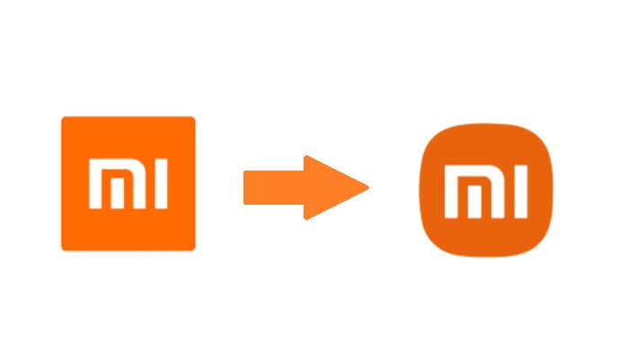
But what’s even more surprising is its hefty price tag of $300,000! Some say that the design is too simple, while others believe it is exquisite and perfectly balanced.
But what are the reason why Xiaomi decided to make this change? And what are the most significant differences from its previous design to the latest one? Let’s look at the new Xiaomi logo and what it represents.
Mục Lục
What is Xiaomi?
Mi or Xiaomi is a Chinese electronics business recognized for its sleek aesthetics, innovative features, and reasonable prices.
The brand was founded in 2010 by Lei Jun. The company has managed to maintain a cult-like following thanks to a focus on innovative design and delivering quality products at affordable prices.
Lei Jun explains why Xiaomi while performing like a high-range smartphone, is more affordable than its contemporaries, “Other phone makers sell exorbitantly expensive handsets, but expensive phones aren’t necessarily the best.”
Xiaomi is known for its amazing flagship, Xiaomi Mi 11, which has new camera modes, screen, and rear camera designs. Other brand phones come with various features such as dual cameras, fingerprint scanners, and fast charging.
The Old Xiaomi Logo
When Xiaomi initially unveiled its new logo, there was a lot of speculation about its meaning.
Some speculated that the square and circle represented masculine and female energies. In contrast, others assumed that it was a homage to the company’s Chinese roots.
Although there was no issue with the old logo, Xiaomi decided to make a change in order to appeal to a global audience and change the overall energy and spirit of the brand.
The $300,000 Worth of Xiaomi Logo
When Xiaomi first announced its new logo, there was a lot of speculation about what it could mean. Some people believed that the square and circle represented male and female energy, while others thought it might be a nod to the company’s Chinese roots.
However, Xiaomi explained that the logo is all about perfect balance. It took them three years to thoroughly discuss the final and new Xiaomi brand design.
Meanwhile, the designer Kenya Hara, the Art Director of MUJI known for his minimalist and perfect balance designs, was tapped to create Xiaomi’s new logo.
In a 5-minute interview, Lei and Hara explained the real meaning behind Xiaomi’s new logo design.
“The new logo is not a simple redesign of the shape but an encapsulation of Xiaomi’s inner spirit,” said Hara during the Mega Launch event.
Hara and the rest of the team extensively study the circle and square and the middle ground between the two shapes by applying mathematical equations, a common element in arts and design.
“The design is essentially a reflection of the concept ‘Alive,’” he added.
The final look shows the combination of circle and square shape with slightly adjusted or rounded corners, dubbed as “squircle,” while the colors orange and white remain. Meanwhile, the letter M of “Mi” has also been slightly changed to fit the frame.
Lei Jun doesn’t deny that the new logo was pretty similar to the old one when he said: “Are you disappointed at this logo, that we just made our original logo rounder?“
But he later went on to add that the new Xiaomi logo and identity strikes a perfect balance between the shapes and the upgrade to the brand’s inner spirit and qualities.
What Are Your Thoughts?
The truth is, most people went on to mock the new Xiaomi logo calling Lei and Hara different names. Some believe that the design is very elegant and perfectly balanced, while others feel that it doesn’t represent Xiaomi well or is too similar to the old logo.
As a brand that offers logo design services, we knew there was something more behind redesigning or rebranding logo design. Although the meaning it expresses displays a deep understanding of design and art, the modification Xiaomi has made may be too subtle for some people to appreciate.
And what about the $300,000 cost? We’re not in the position to name a price, but it can be a part of the marketing strategy of revamping a logo design similar to the old one with a price that many people think is too much.
But do you think it’s worth it? Probably, since you’re already reading articles about them! wink
Regardless of people’s reaction, the only real winner here is Hara and the brand Xiaomi. Every part of the team was satisfied with the work, and many people became aware and curious about the brand.
What about you? Do you like Xiaomi’s new logo? Do you think it represents the brand well? Let us know in the comments below.
I don’t have that enough money, but I would love a logo!
Not every business has that kind of money allocated to their brand’s logo design. Our Instant Logo Design team offers impressive and affordable logo design, aimed especially at startups and small businesses.
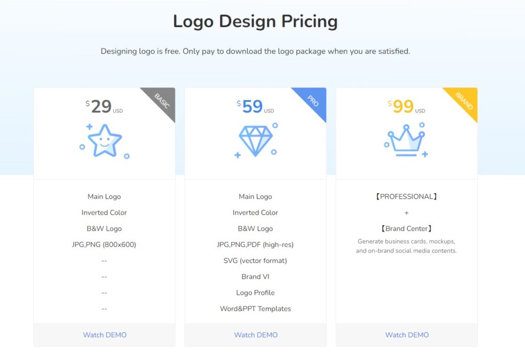
For as low as $29, you can have a completely custom logo design that will help represent your business in the best light possible. And we’re constantly updating our font library, shapes, and colors so you can always find the perfect logo for your company.
Why not give us a try today? We promise you won’t be disappointed!





![Toni Kroos là ai? [ sự thật về tiểu sử đầy đủ Toni Kroos ]](https://evbn.org/wp-content/uploads/New-Project-6635-1671934592.jpg)


