How to Use the Psychology of Color in Business | VistaPrint US
Estimated reading time: 4 minutes
We chatted with Dr. Sally Augustin, Ph.D, an environmental and design psychologist, to learn more about the psychology of color. Read on for Dr. Augustin’s expert tips on choosing the right colors for your small business.
Color says a lot about your business – so when you’re designing your logo and brand identity, make sure you’re sending the right message and setting the right tone. Environmental psychologists have been thinking about these sorts of associations for a long time. They’ve conducted rigorous scientific research into how seeing certain colors influences the way we think and behave. Here, we’re ranking colors from most to least popular based on Vista customer orders. You’ll also discover scientific data relating to many different colors and how to apply color psychology to your small business branding – along with plenty of insights from Dr. Sally Augustin.
Mục Lục
Blue
According to Vista’s data, blue is the most popular color selected by their customers for marketing materials. “At a global level, if you ask people what their favorite color is, they’re more likely to tell you it’s blue than any other color,” Dr. Augustin says. “Researchers aren’t sure why blue is so popular, but we think its status may have something to do with the fact that during our early years as a species, the things that we valued were blue—for example, skies during good weather and water holes seen from a distance are both blue.”
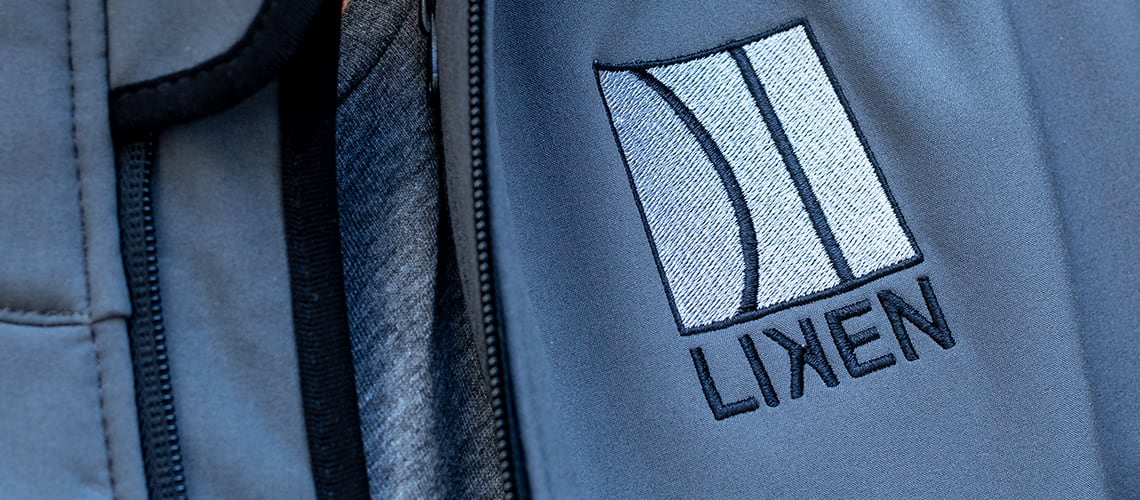
Blue is generally associated with competence and trustworthiness. Those associations make blue color schemes good options for businesses in the finance sector, as well as for businesses that require customers to place a lot of trust in them – maybe a veterinary office or a medical practice.
VistaPrint Tip
Blue probably isn’t the best choice if you’re in the food service industry – it supposedly suppresses appetite! But if you really want to use it in your restaurant branding, choose a lighter shade or a blue-green hue.
Black
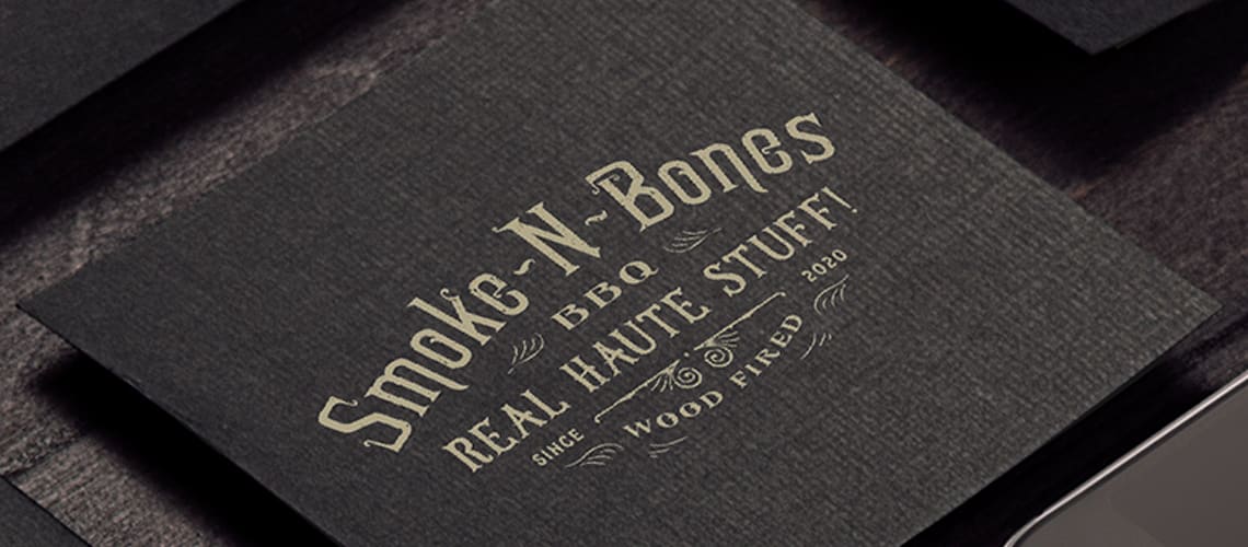
“Black is a widely used and preferred shade,” Dr. Augustin explains. “Since many associate black with strength, sophistication, tradition and formality, its popularity isn’t surprising.” Black can be a great choice for your retail or fashion business if you want to convey sleekness, sophistication and luxury.
White
White is one of the most versatile colors out there – it can work for almost any industry since it’s so neutral. On its own, white represents modernity, simplicity and cleanliness. It’s a great brand color choice for small businesses in the technology and health industries, as well as for upscale retail companies. White also makes a great accent color if your primary brand color is especially vibrant.
Green
“Seeing green, even briefly, has been tied to enhanced creative thinking, so using it in marketing materials may be a good idea if people need to do a little creative thinking to understand your appeal,” Dr. Augustin says.
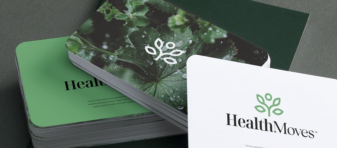
Green is associated with nature and environmental responsibility, which can make greens good for businesses that prioritize leaving a green footprint. Green is also linked to spring and rebirth, making it a good option for small businesses that help people start new lives – maybe you’re a dietitian or a tutor. “Marketing health or education products may also benefit from blue’s association with competence and trustworthiness,” Dr. Augustin adds.
VistaPrint Tip
Wondering how to choose the right shade of green? Saturated, softer greens, like sage, are better for spas or lower-key businesses. On the other hand, brighter versions, like kelly green, can inspire action right away.
Red
Red is linked to love, danger and excitement. “Research has shown that looking at red can degrade our analytical reasoning, but seeing red on a wall or similar surface does give us a burst of strength,” Dr. Augustin explains. “It’s the perfect color to look at as you lift weights.” Science also says that red stimulates appetites – so it can be a great fit for eateries of all kinds.

Pink
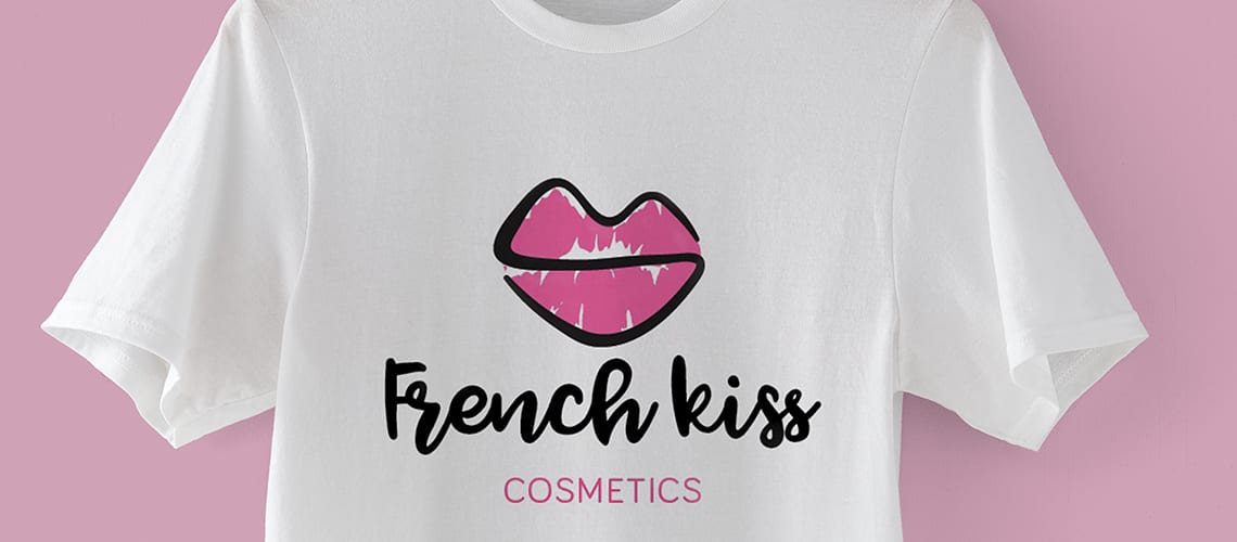
Pink represents romance and femininity, so it’s ideal for small businesses that target women as their primary customer base. And since there are so many shades of pink, it’s super versatile – it has a youthful energy that works well in many technology and fast-food brands.
Purple
Purple blends the excitement of red with the calmness of blue, which can help your brand appear luxurious, innovative or feminine. Purple isn’t as widely used as pink in brands geared towards women, but it’s definitely a feminine color and can be great for your small business if you specialize in beauty, skincare or luxury retail.
Orange
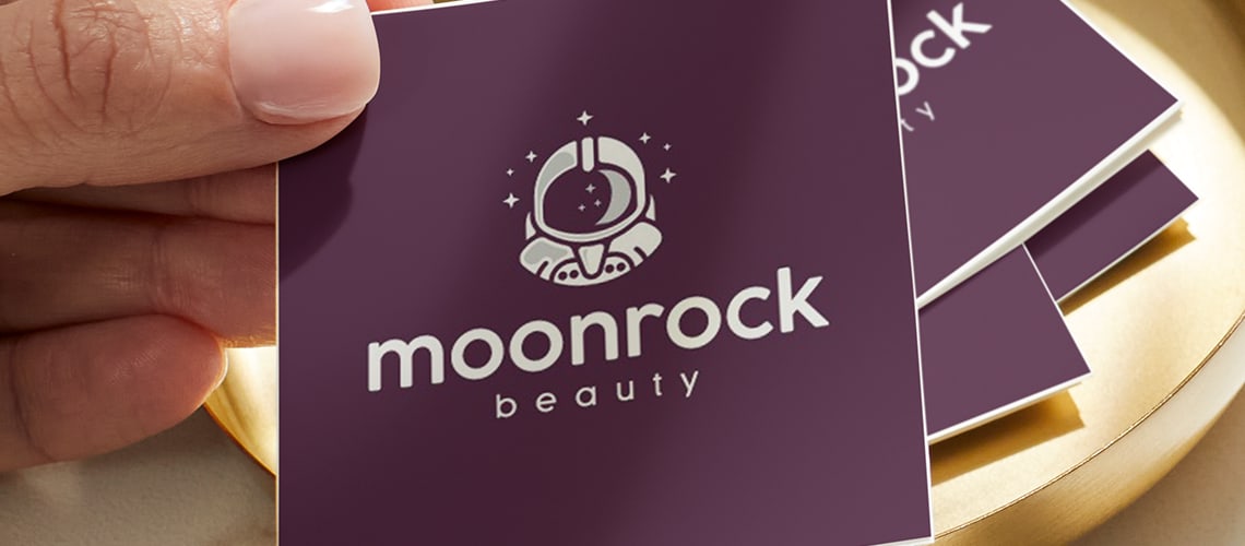
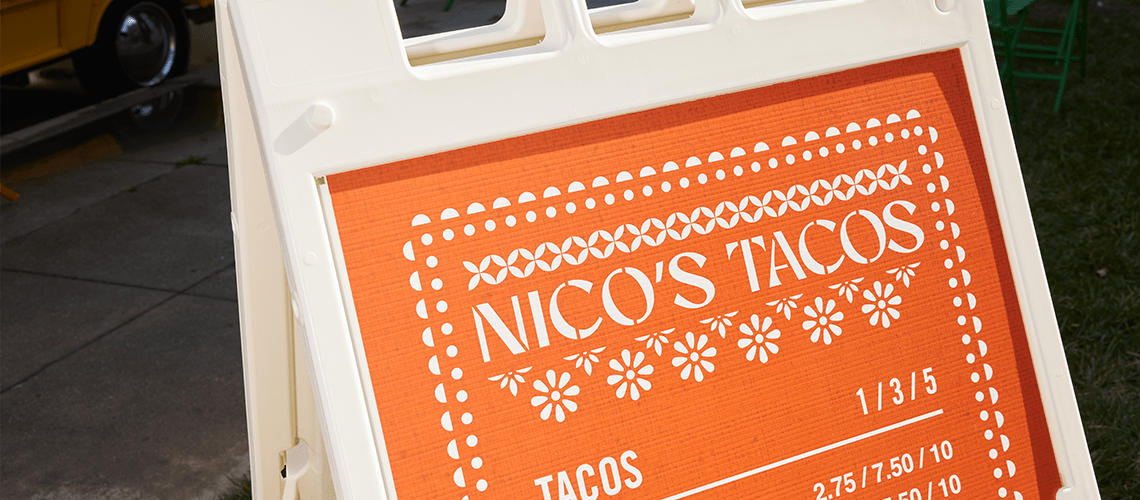
Orange is an energetic color, blending the excitement of red with the friendliness of yellow. Consider using orange in your branding if you want to communicate energy and boldness – maybe you’re a gym, travel company or even a toy store. Similarly to yellow, orange is perceived as a ‘cheap’ color – so if you’re trying to communicate that you’re a high-end brand, consider using a different hue.
Gray
In between black and white, gray represents balance and neutrality. Gray is a great color choice for professionals, like lawyers, financial planners and accountants, since it’s serious and has a corporate feel.

Yellow
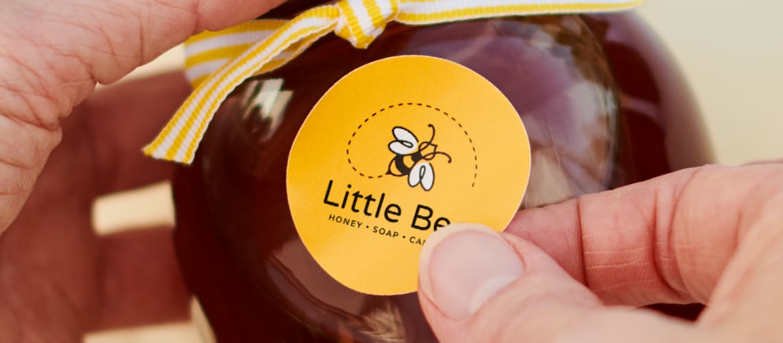
What color are people least likely to select as their favorite? Yellow. It’s generally pretty unpopular and is one of the colors least likely to be selected for marketing materials by Vista customers worldwide. “Despite being less favorable, there are always exceptions where yellow can be used as an accent color to help stand out,” Dr. Augustin says.
If you use yellow as your primary logo color, you’re communicating cheerfulness, accessibility, energy and friendliness. And unlike the luxuriousness of black, yellow is associated with affordability. So, yellow can be a great fit if you’re opening a fitness studio or casual restaurant, or want to convey that your offerings are budget-friendly.
Brown
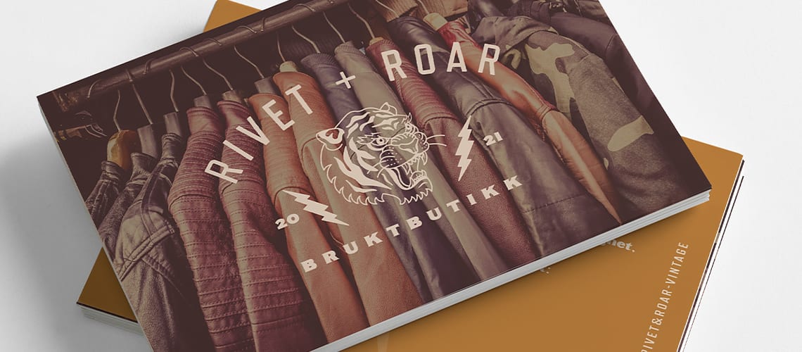
“Brown is linked in our minds to ruggedness,” Dr. Augustin says. We see a lot of utility businesses use brown, like construction companies or package delivery services, as well as more “earthy” brands. This color can make your branding appear more masculine, too, so it’s a good option if you’re targeting a male audience – maybe with a men’s clothing line or custom woodworking business.
What this means for your business
“The meanings we attach to colors are affected by the specific experiences we have with them, so select accordingly,” Dr. Augustin advises. “For example, if a popular new cartoon character is yellow, expect a few more positive responses to yellow than usual.” She recommends reviewing the brand colors you’re considering with your friends, family and prospective customers before you make a final decision.
“Remember, the colors you select send important messages. Choose wisely and apply what environmental psychologists have learned about the science of seeing colors.”












![Toni Kroos là ai? [ sự thật về tiểu sử đầy đủ Toni Kroos ]](https://evbn.org/wp-content/uploads/New-Project-6635-1671934592.jpg)


