How to Create a Dashboard in Excel in 3 Easy Steps
What is an Excel Dashboard?
A dashboard is a compact visual representation of data. Dashboards are designed to be eye-catching, easy to understand, and concise so that users can quickly extract insights.
Dashboards can contain raw numbers, tables, and charts. However, dashboards become powerful tools when they incorporate visual elements to enrich the information they convey, such as through colors, charts, and conditional formatting.
Why are Excel Dashboards Useful?
Dashboards can be used in nearly every industry and business use case. They are a tool for improving the business’s decision-making process and can perform complex data analyses. You can learn more about how to do data analysis in Excel or, more generally, in spreadsheets with one of our courses.
Here are a few reasons why dashboards are so useful in organizations. They allow you to:
- Track KPIs.
- Perform complex calculations and analyses.
- Promote data-driven decision-making.
- Diagnose, investigate, and solve business problems.
- Explore scenarios for business forecasting and planning.
Before Creating an Excel Dashboard
To build high-value dashboards that people in your organization actually use, first start with a strategy. You need to know beforehand why you’re building this dashboard, who you’re building it for, how it will be built and how you will distribute it to your users.
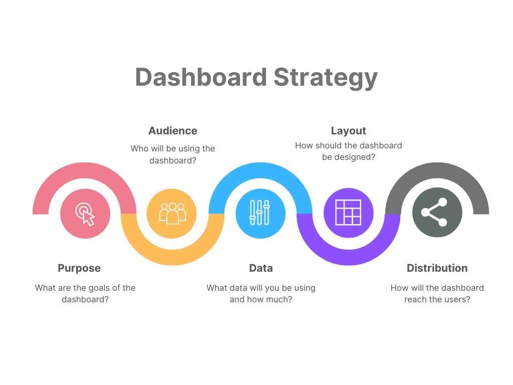
The dashboard strategy process can be summarized into these five main components:
- Purpose
- Audience
- Data
- Layout
- Distribution

Image by the author
Knowing all of this before you start building your dashboard will save you more time and headaches later on because you will build what is actually needed and you can avoid entering revision hell or getting negative feedback because you built something that the business didn’t actually need.
Clarity is your best friend when building dashboards. Let’s review how you can gain clarity with these dashboard strategy components.
Purpose
Be clear on why you need this dashboard – what are the goals? Is this dashboard answering a specific business question or solving a particular problem?
Sometimes, the departments in an organization may already have one or more goals in mind for the dashboard. They may have a task to complete and know that a dashboard would help them do their job better.
However, other times business users don’t know that a data-driven approach is even possible or useful to them. In these cases, you or your manager may need to look out for possible areas where a dashboard can add value to the business and propose it as a solution. Here it is even more important to clearly define the purpose and goals of the dashboard before you start building it.
Audience
In this step, you identify who this dashboard is intended for. Find out who your targeted audience is and what their goals are when they look at the dashboard. Is it for detail-oriented finance managers who want to see a lot of detail or for C-level executives who just want a high-level overview of the business KPIs?
Knowing your audience is an important prerequisite for answering the questions in the next few sections of your dashboard strategy.
Data
What data will you be using? Is the data already available in a database or a flat file that you can simply import into Excel for your dashboard? Or do you need first to extract and prepare the data?
Also, understand how much data is needed. Do you need large amounts of historical data, or are you dealing with more recent events?
Does the data need to be cleaned and transformed before you can build the dashboard? Do you need to check for errors or remove duplicates? This is usually the case for newly extracted data, and data obtained from a database would typically already be transformed and ready to use.
How often do the data and the dashboard need to be updated? Flat files tend to lead to static dashboards, whereas database connections using ODBC can be updated when needed and lead to dynamic dashboards.
Layout
You can identify the best layout for your dashboard at this stage. The previous stages of the dashboard strategy will inform this step. You already know why you’re creating the dashboard, who it’s for, and the details about the data that will be used.
- Purpose – based on the goals you identified in this step, you know what you should focus on as you design the dashboard – these are the metrics, KPIs, and core pieces of information that should be shown on the dashboard.
- Audience – since you know who the dashboard is for, you know the best layout for them. For example, you can incorporate a lot of tables and extra sheets for the detail-oriented folks or quick, eye-catching visuals for the C-level executives.
- Data – since you know more about the data needed for the dashboard, you can determine the best method for importing the data and whether you need to make special considerations for displaying large volumes of data on the dashboard.
Also, determine if the dashboard needs interactive elements so users can explore the data and diagnose and investigate possible business problems themselves. Or, if the dashboard will be used to create PowerPoint presentations, it can be more static.
Distribution
How will you be sharing the Excel dashboard with your intended audience? There are a few options for sharing Excel files, such as attaching it to an email, saving it to a shared OneDrive folder, or exporting it to a PDF.
Keep in mind that these methods (except the export to PDF) give users the ability to edit the dashboard and the data. If you don’t want anyone to be able to make changes, you can protect the workbook and lock the cells using a password. Or, you force the workbook to open in read-only mode.
Excel Dashboard Design Best Practices
Follow these simple best practices as you design and create your dashboard:
- Keep it simple – choose simple charts and simple design elements for your dashboard. This will help to maintain focus on what is important.
- Don’t overcrowd the dashboard – don’t try to fill up every available space with visuals, data, or color. The more overcrowded the dashboard becomes, the less information it conveys because it becomes a confusing mess. Give each element on your dashboard room to breathe.
- The five-second rule – this is a general design rule. In the context of Excel dashboards, you should be able to convey the most high-value, high-impact information within five seconds. This requires regular communication with business users to determine what types of information are most relevant and important to them and to ensure it aligns with the purpose described above.
- Use colors wisely – colors should be used sparingly and should also ideally convey some meaning.
- For example, using a specific set of colors to denote different categories across all visuals in the dashboard
- Or, ‘robot’ colors can be used to denote good and bad values.
- Always use colorblind-friendly color palettes – red and green are the two most problematic colors, especially when used together
- Use freeze panes for large tables to enhance readability
- Stay consistent (colors, layout, formatting, etc.) – if you use a particular color in one dashboard to denote a ‘good’ value then make sure you use this color for the same purpose in other dashboards. Doing so will make future dashboards more intuitive and easier to understand.
A Step-by-Step Guide to Creating an Excel Dashboard
This step-by-step guide takes you through the process of how to create an Excel dashboard from scratch. If you’d like to follow along with this tutorial, you can find the dataset on DataCamp Workspaces.
If you’re already quite comfortable with Excel, check out this intermediate spreadsheets course on DataCamp. Then come back here to see if you can build an even more powerful dashboard with this data.
In this fictional scenario, imagine you work for a financial services firm. Your task is to help the marketing department better understand how their campaigns are performing, particularly their most recent campaign. They have sent you the data in a CSV file and have asked you to prepare a dashboard for them.
Specifically, they would like to answer these questions with this dashboard:
- How well did the campaign perform overall? In other words, how many people signed up for the product?
- What is the demographic profile of the people that were contacted during the campaign? Does the profile differ for those who successfully signed up for the product versus those who did not?
- Does the number of contacts impact the likelihood that a person will sign up for the product?
Go ahead and open a blank Excel workbook and start by creating two sheets named ‘Data’ and ‘Dashboard’.
1. Import
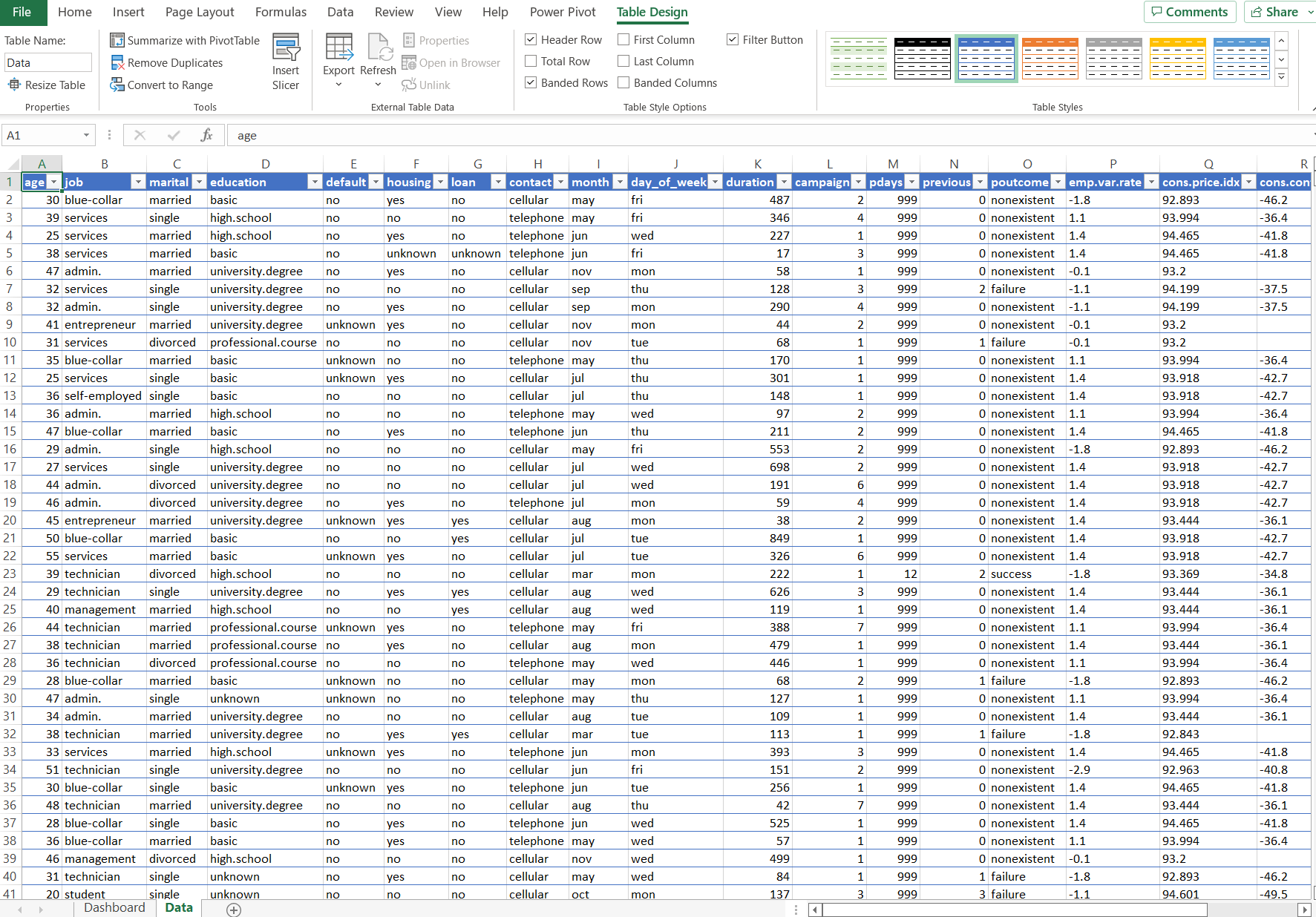
Since the marketing team sent us a static CSV file, we will import it into our Excel workbook by copying and pasting it into the ‘Data’ sheet.
I have also selected “Format as Table” so that Excel regards this data set as a table. Other than making the data look nice, it adds some functionality, too, such as referencing column headers by name in formulas (instead of referencing the column letter).

Image by the author – screenshot from Microsoft Excel
Note that you can find all other controls involved in importing data on the ‘Data’ tab of the ribbon.
2. Transform & Calculate
During this step, you will transform, prepare, and clean your data, so it’s ready to use in the dashboard. You should also spend some time on the calculations you will need for your dashboards. Excel has hundreds of functions and formulas that you can use to build the calculations you need.
These formulas are powerful and flexible but can be very overwhelming when you’re just starting. Check out our tutorial on the basic Excel formulas for everyone.
3. Build
We have finally reached the dashboard-building stage. You need to choose which visual elements you will use in your dashboard to achieve the goals you set out at the start. We have a course on how to create engaging data visualizations in spreadsheets which is a great place to start learning.
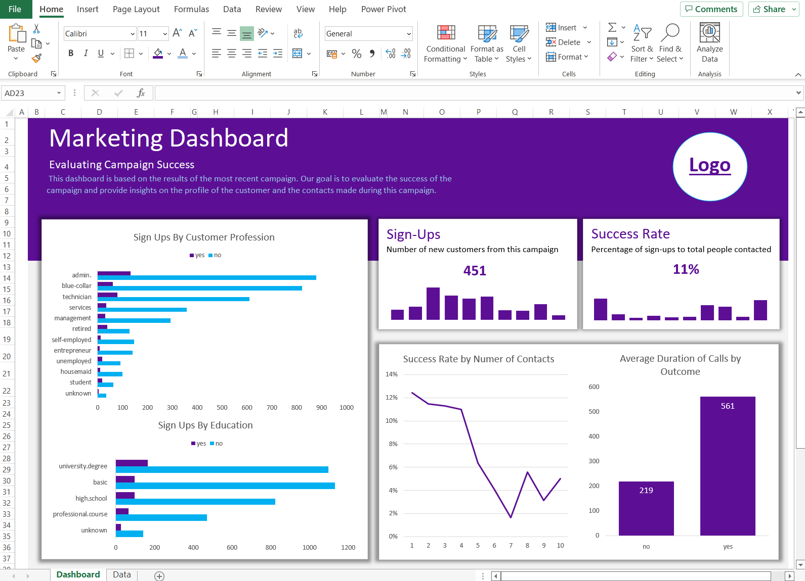
This dashboard has three major elements based on the goals that the marketing department set out for us. These are:
- Give a quick snapshot of the campaign’s overall performance – here, we will display these metrics as numbers so users can see them quickly.
- Create charts that display the customer profile of those who signed up versus those who didn’t – for this, we can use a horizontal bar chart since we will be showing the categories of some demographic features in our data.
- Create charts that show how contacts affect the success rate – for this, we can use a mixture of a line chart and a vertical bar chart.
We won’t go over how to create every chart in Excel as it is quite repetitive. However, this is the process you would usually follow:
- Create a new sheet for the chart you want
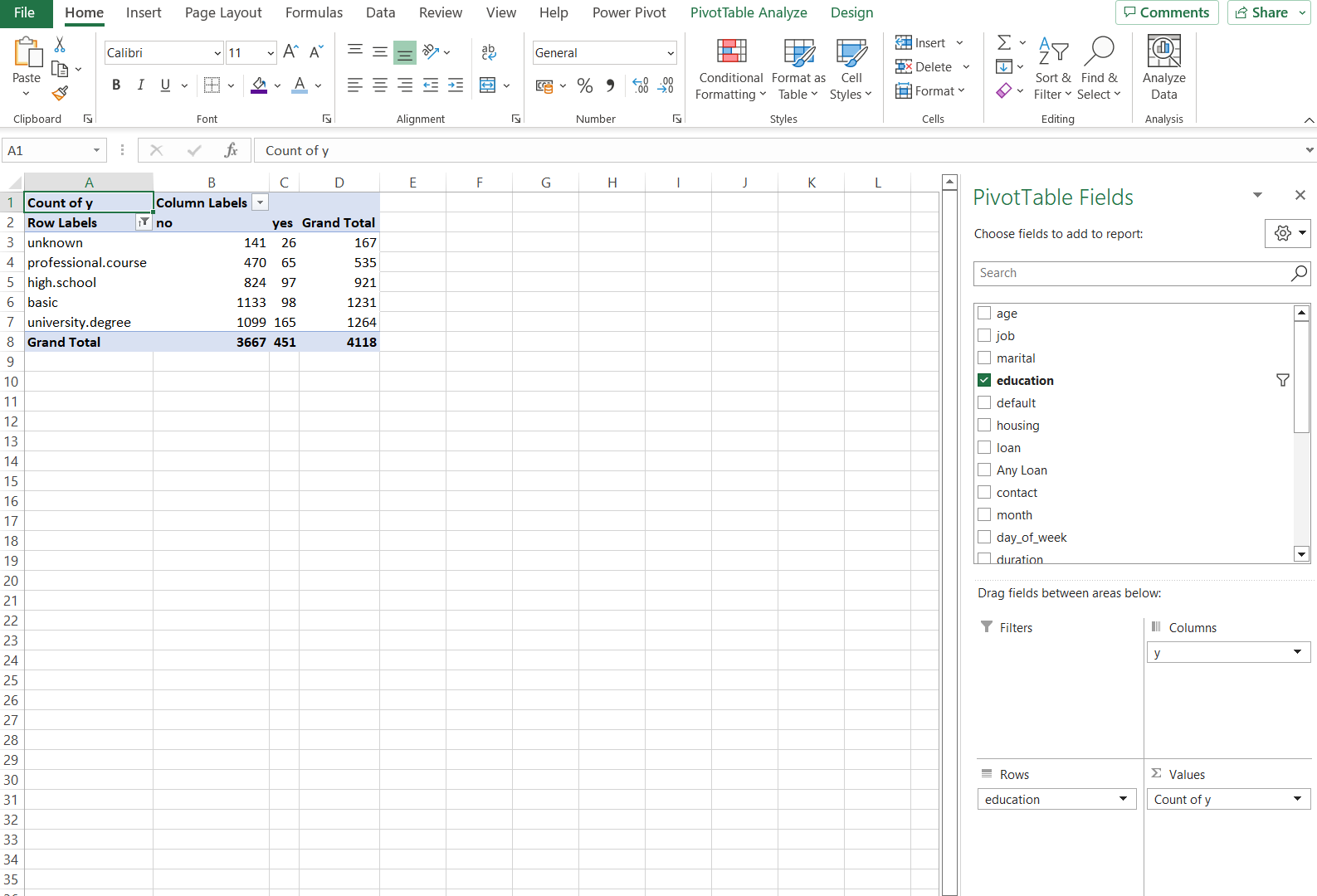
- Insert a Pivot Table from the ‘Insert’ tab of the Ribbon. Enter the name of the table or the range where the data is located, and a panel will pop up on the right-hand side where you can add columns, rows, values, and filters to your Pivot Table. We have a course on Pivot Tables you can take if you want to learn how to master them for your dashboards.

Image by the author – screenshot from Microsoft Excel
- Then you can insert a chart based on the Pivot Table. Right-click the chart you added and select ‘Format Chart Area’ to adjust the formatting options.
- Once you’re happy with how your chart looks, right-click it and select ‘Cut.’ Then paste it onto your dashboard. From now on, the information in the Pivot Table powers the chart, so take care if you need to make any changes to the Pivot Table or the data. You can hide the sheets that the Pivot Tables are on to keep the Excel Workbook neat.
Here is the final result of the example Excel dashboard we created. You can use this as inspiration as you create your own dashboards.

Image by the author – screenshot from Microsoft Excel
Get Started Building Excel Dashboards Today
Now that you know how to create a dashboard in Excel, you should have the confidence to present your data with impact. Whether you’re starting out with a simple excel table or data source, you can use the skills learned here to turn raw data into something meaningful.
Learn more about Data Analysis in Excel with our course, or explore topics as diverse as financial modeling and marketing analytics using spreadsheets.


![Toni Kroos là ai? [ sự thật về tiểu sử đầy đủ Toni Kroos ]](https://evbn.org/wp-content/uploads/New-Project-6635-1671934592.jpg)


