How to Choose a Content Layout for Your WordPress Blog
When creating a blog, much of your focus will (rightfully) be on the content itself. However, how you’re presenting your content to the world matters, too. And we’re not just talking about the appearance or design here. The actual layout of how your content is presented can be instrumental in how site visitors interact with your message. This can spell the difference between a visitor signing up for your email newsletter or bouncing.
Today, we’ll be focusing our attention on content layout and how you can best choose the right one for your blog. First, let’s explore the different types of blog layouts available. Then we’ll discuss a few options for each category.
Mục Lục
Types of Blog Layouts
Here’s a brief rundown of the types of content layouts you can expect to find when searching for blog themes.
Single-Column or Full-Page

Single column, full page or full width blog layouts take up, you guessed it, the entire page of a website. The content of a blog post encompasses the full width of the browser and will often include a large featured image, larger text, and sometimes text features you’d find in magazines like drop caps or fancy quotes. Literary journals, personal blogs, and travel blogs often find this type of layout useful.
Two-Column (Usually With a Sidebar)

The two-column layout is often considered the traditional or standard layout we’ve become accustomed to. It features a primary column that contains the blog content and a secondary column or sidebar that features auxiliary content like links to related blog posts, a search bar, an “about me” blurb, navigation, and so forth.
Three-Column

The three-column layout is often used for magazines and blogs that feature a lot of content. The middle column contains the blog post content and the two sidebars can feature a wider array of secondary information.
Grid/Gallery Layouts
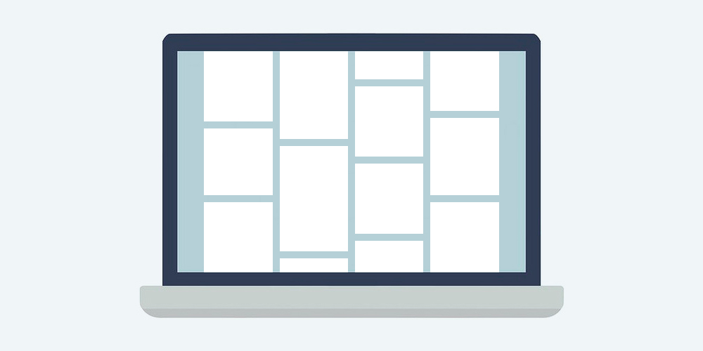
Sometimes referred to as masonry layouts, this type of blog layout is used on image-heavy blogs. It’s also sometimes used for personal blogs. It basically features each link to a post displayed in card style laid out in a grid that visitors can scroll through.
Galleries can be identical to the grid layout style but photography blogs and other image-oriented bloggers may find a full gallery layout to be more appropriate. The featured image of each post is rendered in a higher resolution. Visitors can click each image to view a full post about it or to view additional images.
Traditional Business
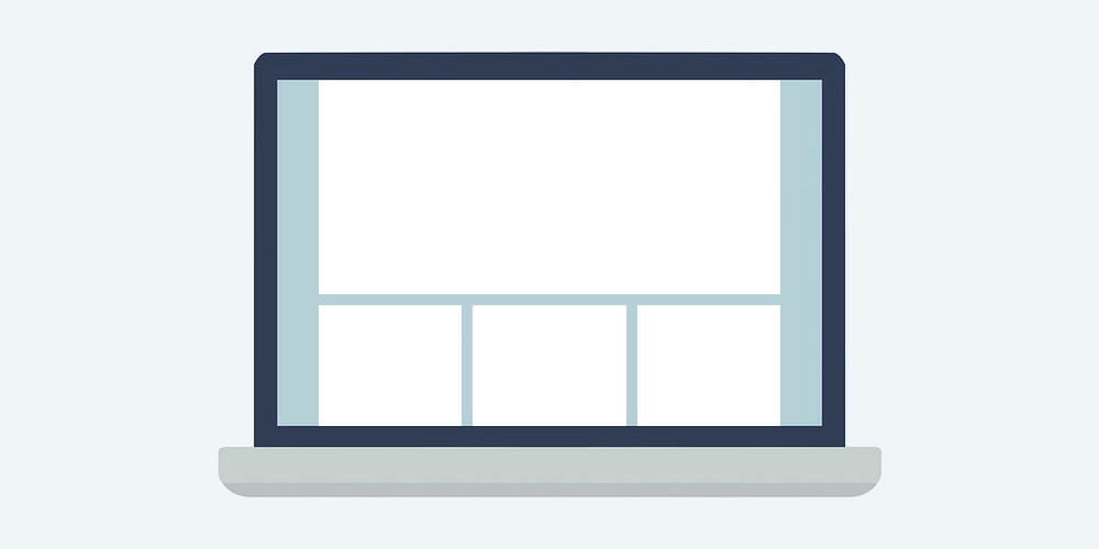
Most business websites have blogs on them nowadays. But we’d be remiss if we didn’t include that as an option here. Company websites will often have a static homepage with a blog included as a secondary link. Within that, the content layout could adhere to any of the above options described.
Which Would Work Best For You?
Deciding on the best content layout for your blog is going to be a pretty personal decision. It will largely depend on the type of blog you run, what sorts of content you’ll publish, and what overall look you want to convey. Here’s few things to keep in mind:
- Is your blog image heavy?
- Do you create long-form, in-depth posts?
- Will you be publishing frequently like for an online newspaper or magazine?
- Will you be selling products on your website, either digital or physical?
Answering these questions will help you to better categorize the type of blog you plan on creating and will then give you some ideas about the type of layout that would best suit your content.
WordPress Themes with Full-Page Blog Layouts
It’s important to note that just about any theme can be configured to display blog posts as full-width. However, we’ve collected a few that are considered to be fullscreen themes for those looking for a truly immersive content experience.
Fullpane
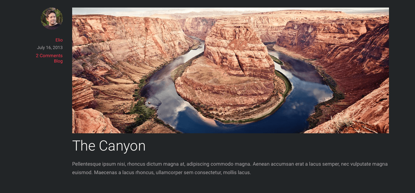
This WordPress theme offers a fullscreen experience throughout your site, not just on the blog, and relies on parallax effects. Expect full-width images, fullscreen backgrounds, and no sidebar in sight on the blog page itself.
Pineapple (Free Theme)
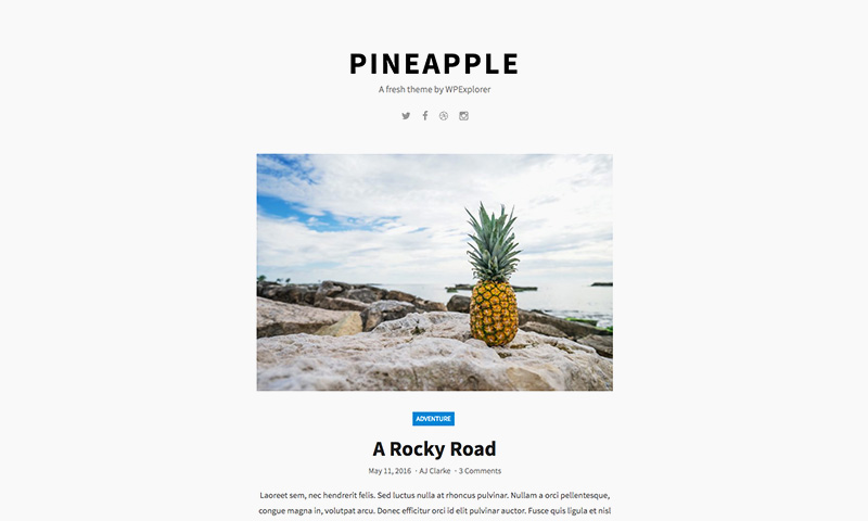
The classic single column layout of the free Pineapple WordPress theme offers up a large featured image, a post snippet, and a “continue reading” button that allows visitors to click through and read your content. On each blog post, you’ll find related posts and social links – offering a clean and simple layout that adds some definition to your content.
Traditional Blog with a Sidebar WordPress Themes
This is a category of blog content layout that you have options aplenty. Really, you could search for “WordPress themes” and anything you stumble upon would qualify. there are tons of blog WordPress themes, but below are a couple nice-looking choices to give you an idea.
Beautiful
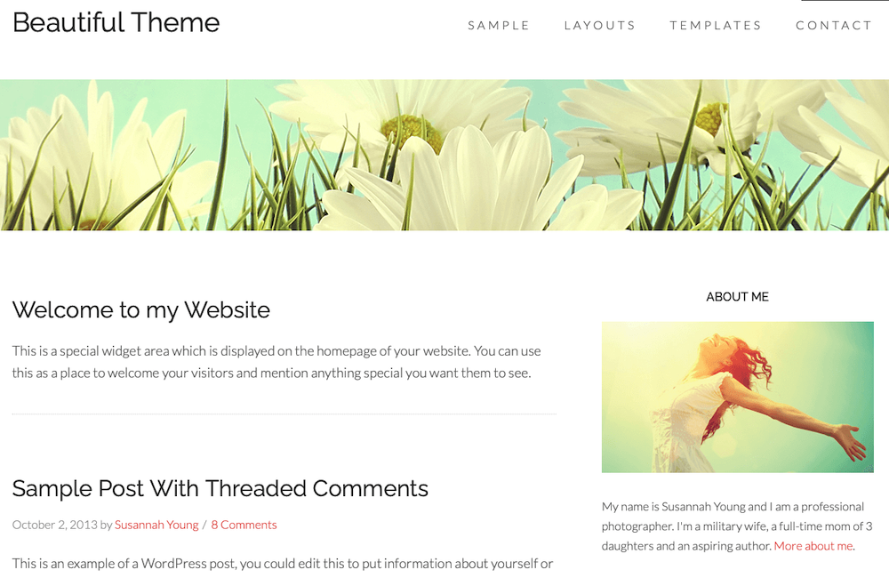
The aptly named Beautiful WordPress theme is super simple but definitely gets the job done. It provides a standard blog layout with the sort of sidebar we’ve all come to expect. But the overall look is gorgeously minimalist.
Corner
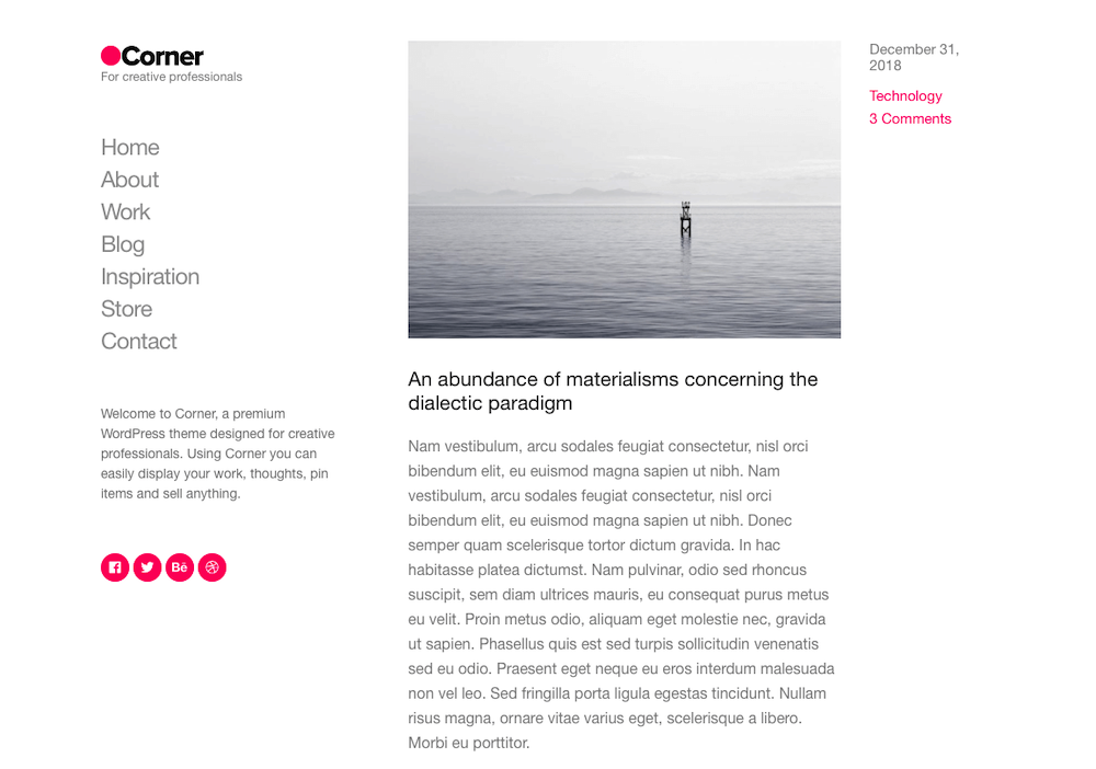
This theme allows you to display your blog content in a traditional way as well. However, it does offer up a bit of variation by including all navigation in the top left hand corner of the page. It’s visually-oriented but could be used for just about any purpose from professional to personal.
Blog Themes with a Masonry or Grid Layout
For blogs and portfolios a grid is a great layout option. If you’re looking for masonry grid WordPress themes there are a number of options, but here are a few of the best (in our opinion).
Total
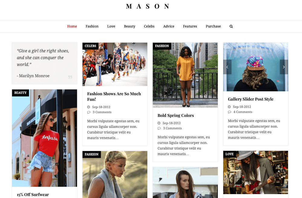
You get access to a lot of demos with this theme, one of which is Mason, a masonry grid layout for blogs. Each post is presented as its own card-like image. Once clicked, you’re taken to the full post where large images prevail.
ART.
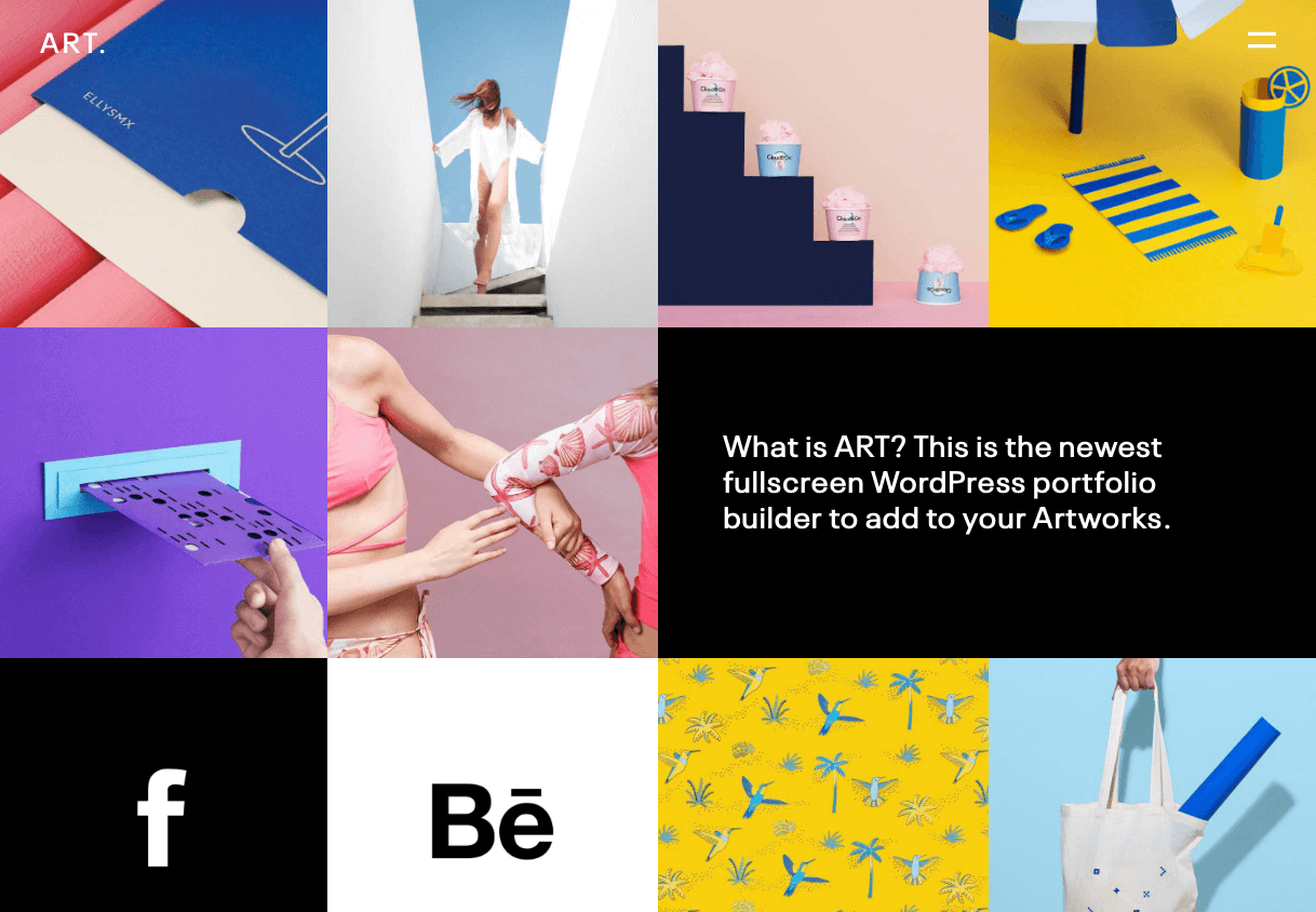
The ART. WordPress theme is a multipurpose portfolio but it has some great blog-specific options worth mentioning. For instance, the grid layout creates a wall of pictures with no space between them. Each serves as a link to an individual blog post and could work well for any media-heavy site.
Gallery-Style WordPress Themes
And here’s a sampling of gallery-style WordPress themes that prioritize images and other media.
Soho
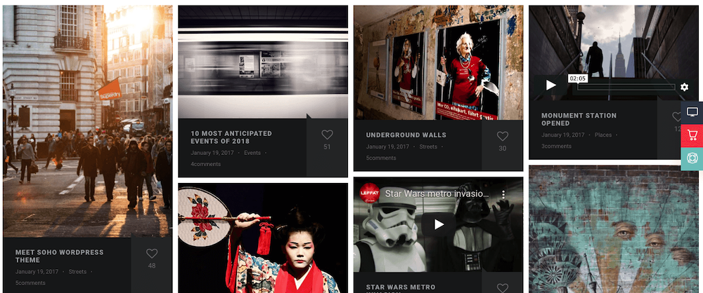
This photo and video WordPress theme features a variety of layout options. However, it’s fullscreen layout offers a grid-style gallery that includes social media-esque interaction on the blog homepage. Clicking through reveals a traditional blog with sidebar, however it’s still image heavy and gives photographers and visual artists plenty of room to play.
Stockholm
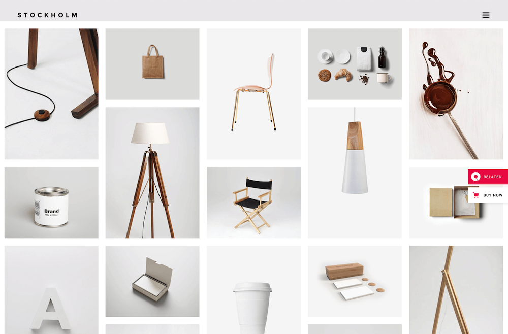
Here’s another multipurpose theme that prioritizes the gallery style layout for its blog template. This theme could have fit within the masonry or grid layout section as well, but its design reads “art gallery” and could easily be used as such for a photographer’s portfolio, an online store, or a content curator.
Business Themes with Blogs
This is a super general category, but it’s still important to note some more traditional business website themes often include blog templates, too. Here’s a quick sampling:
Elegant (Free Theme)
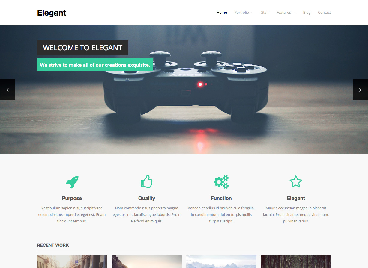
Elegant is a free theme created here are WPExplorer that includes all the features you’ve come to expect from a business theme like dedicated sections for your team and porfolio, but it also has a great blog template that’s clean and to the point.
Karma
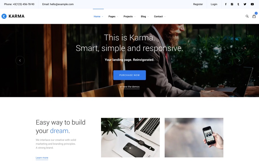
The standard Karma theme was designed for businesses, but has a blog and professional features as well that caught my eye. It’s obviously professional but maintains all the elements from modern and minimal blog designs like plenty of whitespace, large featured images, and clean navigation.
Choosing the Right Content Layout for Your Blog Matters
Though it might seem a bit arbitrary, deciding on the right content layout for your blog really does matter. Whether it’s for personal use or to accompany your business website, the content layout dictates how visitors will interact with your content and help shape everything from their first impressions to whether or not they’ll convert.
If anything, considering your blog’s layout should go to show that absolutely every aspect of your site is important and each detail can bear weight in terms of how your content and overall brand is received. And hopefully this little guide will help you get one step closer toward making a decision about what will work best for you.








![Toni Kroos là ai? [ sự thật về tiểu sử đầy đủ Toni Kroos ]](https://evbn.org/wp-content/uploads/New-Project-6635-1671934592.jpg)


