Guide to IELTS Academic Task 1 with Samples and Tips
This guide provides a summary of all the different IELTS writing task 1 questions you could encounter in the Academic IELTS exam including Bar Charts, Line Graphs, Tables, Pie Charts, Process Diagrams/ Flow Charts, and Maps.
Useful IELTS guide covering overview, examples, tips and strategies on IELTS Academic writing task 1 questions you could encounter in the Academic IELTS exam including Bar Charts, Line Graphs, Tables, Pie Charts, Process Diagrams/ Flow Charts, and Maps. Gain insight into the IELTS writing assessment criteria that you need to meet to achieve a high writing band score.
Note that this guide is for Academic IELTS candidates. Visit this link for GT Writing Task 1
Mục Lục
1. Bar Charts
1.1 Advice for Bar Charts
Summary
A bar chart, also called a bar graph, is a very common type of Academic IELTS question. You may be presented with a horizontal or vertical chart. You may even be given two bar charts, or you could get a combination task like a.
Task approach:
- Analyse the question: Identify the key words in the description and read the instructions carefully
- Decide if your chart is comparative or describes a trend
- Write a 1-2 sentence introduction that paraphrases the given statement using your own words (use synonyms/parallel expressions/change the word order/change the word class)
- Write a clear overview that summarises the main features of the bar chart
- Write two main body paragraphs that goes into more detail about the bar chart
- You must write at least 150 words
- Your report should be written in a formal tone
What to include/avoid:
- Use vocabulary for accuracy (e.g. nearly; just over; around)
- Use linking devices (e.g., whereas; while; compared to; as opposed to)
- Use comparative and superlative forms (e.g more popular than; the most expensive)
- Use referring expressions (e.g. respectively; in turn)
- Do not give your opinion
- Do not use informal language (e.g. slang or contractions)
- Do not use the first person (e.g. I think)
Here is an in-depth IELTS Bar Chart Guide
1.2 Bar Chart Sample Question and Answer
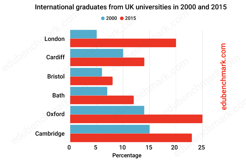
The graph below shows the number of international graduates from UK universities in 2000 and 2015.
Summarise the information by selecting and reporting the main features and make comparisons where relevant.
Write at least 150 words.
Sample
The bar chart compares the amount of graduates from UK universities that were international graduates in 2000 and 2015. The chart shows six UK universities, including London, Cardiff, Oxford and Cambridge, and the units are displayed in %.
Overall, it can be seen that the most international graduates came from Oxford and Cambridge in 2000 with Bristol and Bath being the lowest. Likewise, Bristol and Bath also had the fewest international graduates in 2015 and Cambridge and Oxford held the title for the most.
Regarding international graduates in 2000, Cambridge and Oxford had the highest number at 15% and 14% respectively. None of the other universities had more than a tenth of their graduates come from overseas, with Bristol and Bath coming in at the lowest at about 6% and 7% in turn. Cardiff had twice as many international graduates, at 5% and 10% .
In terms of international graduates in 2015, Oxford came top of the list with a quarter of its graduates being classed as international. Similarly, Cambridge had the second highest number of international graduates at roughly 23%. As seen in 2000, Bristol and Bath again had the fewest international graduates with about 6% from Bristol and 12% from Bath.
2. Line Graphs for IELTS
2.1 Advice for IELTS Line Graphs
Summary
A line graph is another common type of IELTS Writing question in Academic Task 1. You will see a series of lines that represent a change over time. You could be presented with one or two line graphs, or even a line graph and a table in the same question.
Task approach:
- Analyse the question: Identify the key words in the description and read the instructions carefully
- Identify the main trends in the graph(s)
- Write a 1-2 sentence introduction that paraphrases the given statement using your own words (use synonyms/parallel expressions/change the word order/change the word class)
- Write a clear overview that summarises the main features of the line graph (the biggest/smallest/most interesting features)
- Write two main body paragraphs that goes into more detail about the features of the line graph(s)
- Pay close attention to the time period of the data; is it in the past, present or future? You need to use the corresponding tense
- You must write at least 150 words
- Your report should be written in a formal tone
What to include/avoid
- Use verbs and adverbs to describe change (e.g. decline considerably; fell drastically)
- Use verbs to describe a big change if required (e.g., plummet; rocket; soar)
- Use linking words to structure your report (e.g To begin with; To start with; And then,…)
- Use a range of sentence stems to introduce multiple features in one sentence (e.g. After falling considerably; Having fallen considerably )
- Join sentences together using phrases such as ‘after which’/ ‘at which point’
- Do not just describe each feature, make sure to compare and contrast the data
- Do not give your opinion
- Do not use informal language (e.g. slang or contractions)
- Do not use language for a map or process
- Do not use the first person (e.g. I think)
Here are in-depth Line Graph IELTS Tips
2.2 Line Graph Sample Question and Answer
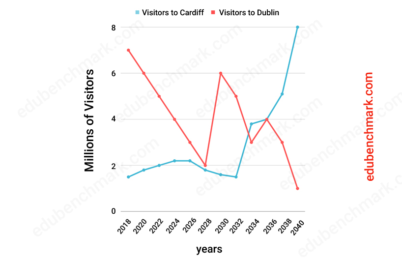
The graph gives information about the actual and predicted number of visitors to Cardiff and Dublin from 2018 to 2040.
Summarise the information by selecting and reporting the main features and make comparisons where relevant
Write at least 150 words.
Sample
The line graph shows information about how many people visited and are predicted to visit Cardiff and Dublin between 2018 and 2040.
Overall, what stands out from the line chart is that there is a huge fluctuation in the number of predicted visitors to Dublin, whereas the number of visitors to Cardiff shows more of an upward trend. A further additional point is that Dublin had far more visitors in 2018, but in 2040, it is predicted that Cardiff will be far more popular than Dublin.
In detail, the number of visitors to Cardiff started at around 1.8 million (m) in 2018 and then the figure is predicted to rise steadily to about 2.1m in 2026. After this, the figure will level off and stay at 2.3m until 2026. After falling slightly to about 1.7m in 2032, the number of visitors will soar, rising sharply to just under 4m in 2034. Lastly, there will be a huge increase in visitors from 2036 to 2040, with the final figure finishing at 8m in 2040.
However, if we look at the number of visitors to Dublin, the trend is very different. The number of visitors started at around 7 m in 2018, after which there will be a considerable fall to 2m in 2028. After rocketing to 6m in 2030, the number of visitors will fall drastically to 3m in 2034. there will be a sharp increase to 4m in 2036 before plummeting to below the starting figure for Cardiff in 2018 at 1m.
3. Tables
3.1 Advice for Tables in IELTS
Summary
In IELTS, a table is exactly what you would expect, you will be given a table showing a range of data in columns and rows. A table often accompanies combination questions such as a . Your approach to this task will be similar to how you would approach a bar chart or line graph.
Task approach
- Analyse the writing topic: Identify the main words in the description and read the instructions thoroughly
- Identify if your table shows data from one year, or from a range of years (past, present, future)
- Write a 1-2 sentences in your introduction by paraphrasing the given statement (use synonyms/parallel expressions/change the word order/change the word class)
- Write a concise overview summarising the main features of the IELTS table
- Give two main body paragraphs by including more details about the data given in the table
What to include/avoid:
- Use a range of comparative language (e.g. …far more popular than…; …twice as many women as men…)
- Use linking devices throughout your report (e.g. in summary; overall; furthermore; finally)
- Use a range of comparative structures (e.g. X is as _____ as Y; X is not as _____ as Y)
- Always refer to the figures in your main body paragraph and avoid being vague
- Avoid repetition by using a range of other comparative language (e.g. X is 50% the price of Y; X is double the price of Y; X is the same price as Y
Here is an in-depth IELTS Table Writing Guide
3.2 Table Sample Question and Answer for IELTS
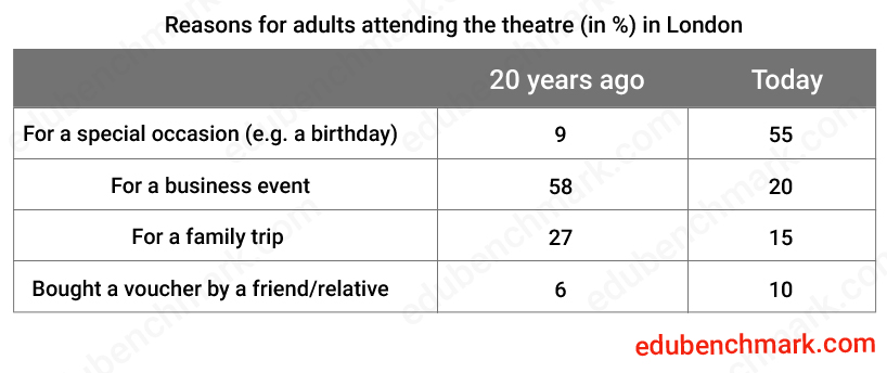
The table below shows the reasons that surveyed adults attended the theatre 20 years ago and today.
Summarise the information by selecting and reporting the main features and make comparisons where relevant
Write at least 150 words
Sample
The table highlights information about the factors that caused adults in London to choose to attend the theatre, ranging from special occasions, business, family and vouchers, over a 20 year period.
Overall, what stands out from the table is that a business event was the most common reason for attending the theatre both 20 years ago, as opposed to today where a special occasion is the most popular cause. Furthermore, a voucher was the least common cause for visiting the theatre 20 years ago.
In detail, if we look at the data from two decades ago, a business trip was given as the most common reason to visit the theatre at 58%. The second most popular reason to visit was due to a family trip, with just over a quarter of surveyed people claiming as such. Nearly as many people claimed that they went to the theatre due to a special occasion as those who were bought a voucher, at 6% and 9% respectively.
Conversely, a special occasion is the most popular reason for visiting the theatre today at 55%. Unlike 20 years ago, only 20% of people today report going to the theatre due to business. Finally, a family trip and being bought a voucher are the least common factors causing a trip to the theatre today, at 15% and 10% in turn .
4. Pie Charts for IELTS
4.1 Advice for Pie Charts
Summary
A pie chart is another visual representation of data represented with a circle(s) split into sections. The data is usually given in percentages. You may be given one or two pie charts or given a combination, for example, a question with a .
Task approach
- Make sure to understand the question carefully and underline the key words
- Identify if the data shows information from the past, present or future
- Paraphrase the given IELTS statement in your introduction by using a combination of synonyms, parallel expressions, changing the sentence structure and changing the word class of suitable words (do not try and change every word)
- Produce a clear overview that summarises the key features of the pie chart
- Write two main body paragraphs that goes into more detail about the pie chart
- If you are given more than one pie chart, make sure to carry out the task approach for both
What to include/avoid:
- Use vocabulary to rank the data (e.g. the least popular; second place; equally; bottom)
- Use a range of phrases to describe percentages (Football was 55%…; Football made up 55%…;Football accounted for 55%..)
- Avoid repetition by expressing percentages with similar phrases (e.g. 10%- one tenth)
- Use the correct tense: does the pie chart show information from the past, present, future, or a combination?
Here is an in-depth IELTS Academic Pie Chart Guide
4.2 IELTS Pie Chart Sample Question and Answer
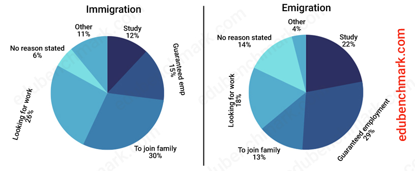
The pie charts show the main reasons for migration to and from the USA in 2018.
Summarise the information by selecting and reporting the main features and make comparisons where relevant
Write at least 150 words
Sample
The pie charts show information about the percentage of people that migrated to and from the USA in 2018.
Overall, what stands out from the pie charts is that most people chose to move to the USA to join their family, whereas the majority of people decided to emigrate from the USA for guaranteed work. Another interesting point is that the biggest difference in immigration and emigration was choosing to study.
If we look at immigration, deciding to travel to join family members was the most common reason for migration. Similarly, looking for work was also a common reason, coming in at 26%. Nearly as many people immigrating did so due to education as employment, with 12% and 15% respectively. The lowest percentage of people immigrating was either for another reason (11%) or no reason (6%).
Regarding emigration, nearly a third of people decided to emigrate for guaranteed employment, with study being the next most common factor with just under a quarter. Exactly twice as many people chose to study as those who immigrated to the USA, at 12% and 22% in turn.Unlike immigration, fewer people choosing to leave the USA did so to join family members at only 13%. However, similarly to immigration, the fewest given reasons to emigrate were due to other reasons (4%) or not stated (14%).
5. Process Diagrams/Flow Charts for IELTS
5.1 Advice for IELTS Diagrams/Flow Charts
Summary
This uncommon IELTS writing task requires a slightly different approach than summarising the features of a graph or chart. You will be given a series of diagrams or boxes that represent a natural or man-made process. The passive voice is very useful here
Task approach
- Analyse the question: Identify the key words in the description and read the instructions carefully
- In this type of question , you do not have to separate your introduction and overview, you can write them as one paragraph
- Write two main body paragraphs that goes into more detail about the process diagram or flow chart (make sure to organise them in some way e.g. the first and last stages of the process)
What to include/avoid:
- Use linking phrases to create order in your report for the start, next stage and end (e.g. In the first stage; After that; finally)
- Use a range of passive and active voice, with a focus on the passive (e.g. the present simple passive and the present perfect passive)
- Mention all stages of the process, but give more attention to some than other for the sake of time
- Be accurate when referring to each stage of the process
- Avoid repetition
- Use a range of simple and complex sentences
- You will not be able to paraphrase everything, you will have to use some of the same words from the process diagram/flow chart
- Make sure to use the correct tense
Here is an in-depth IELTS Process Diagram Guide also called IELTS Flow Chart
5.2 IELTS Flow Chart Sample Question and Answer
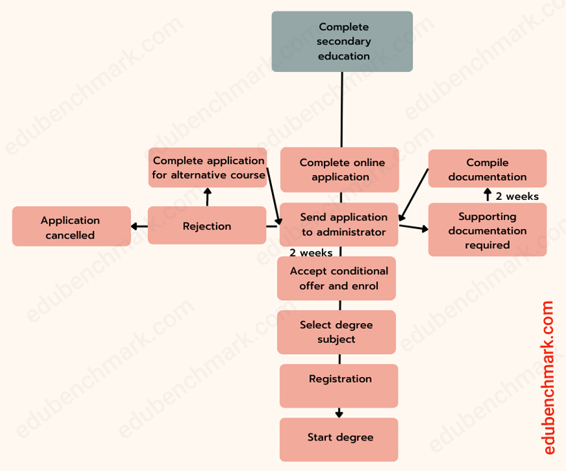
The diagram shows the procedure for successful high school graduates to enrol at university.
Summarise the information by reporting and selecting the main features making comparisons where relevant.
Sample
The flowchart illustrates the procedure for students who have graduated from high school should follow when applying to enter higher education. Overall, the process requires graduates to follow several steps, commencing with the completion of an online application form and ending with the rejection and subsequent cancellation of their application or the need to apply for an alternative course.
In the first stage, a student must send a completed application to the university administrator where there are three possible outcomes: the application is accepted, supporting documents are required to be sent, or the application is rejected. Where supporting documentation is needed, it takes 2 weeks to collect the documents and send them back to the administrator for approval.
If the application is accepted, then a conditional offer is issued after a 2-week consideration period. The applicant is then able to select a subject degree and register for their chosen degree before finally joining the university.
6. IELTS Maps
6.1 Advice for IELTS Maps
Summary
If you receive this type of question, you will always get more than one map so that you can compare the features from the same or different time periods (past, present, future). The map will be a diagram of a simplified town, city or place.
Task approach
- Read the question carefully and identify what the map or maps are showing
- Decide which tense/tenses will be appropriate
- Paraphrase the given IELTS statement within one or two sentences
- Write a clear overview that summarises the main features of the map(s)
- Detail the main changes mentioned in your overview when writing your two main body paragraphs (make sure to choose a logical structure to organise your ideas)
What to include/avoid:
- Use verbs to describe changes in maps (e.g. extend; remove; demolish)
- Use noun phrases to describe change (e.g. remove; pedestrianise)
- Use language to describe where each feature is on the map (e.g. in the North; in the far-left corner; to the west)
- Use linking phrases for change (e.g. One significant change is…; another change has been…)
- Use linking phrases to refer to areas (e.g. regarding; as regards)
- Use the present perfect passive to describe changes in the past and present
- Use the present simple passive and past perfect passive for maps that both occur in the past
- Use relative clauses to form complex sentences that describe the map (e.g. the building that was located…)
Here is an in-depth IELTS Map Writing Guide
6.2 IELTS Map Sample Question and Answer
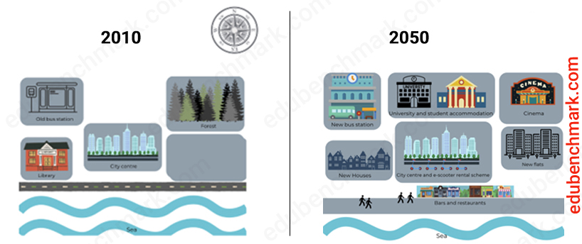
The maps below describe the main changes that are predicted to happen in the city of Oakville between 2010 and 2050.
Summarise the information by selecting and reporting the main features and make comparisons where relevant.
Sample
The two maps highlight the main developments that are predicted to take place in the coastal city of Oakville, over the period between 2010 and 2050.
Overall, what stands out from both maps is that Oakville will become far more developed and modern, with more accommodation, amenities and entertainment facilities, and fewer trees and green spaces.
In detail, if we look at the north of the city, one major change will be that the forest in the north-east will be cut down and a cinema is to be constructed in its place. In 2010, there was no university and student accommodation, whereas in 2050 there are plans for these buildings to be erected in the north of the city. Regarding the city centre, the forty-year period will see the introduction of an e-scooter rental scheme, making it easier for people to travel around the city centre without producing emissions.
As regards the south of the city, a significant change will be the conversion of the library in the south-west into new houses. Moreover, new flats will be built in the south-east of the city which could have become a green space in this period. A further future development is the pedestrianisation of the road near the sea. Bars and restaurants will also be opened along the coast, meaning that this area will be a nicer place to visit for residents and tourists.
7. IELTS Writing Task 1 Band Descriptors Explained
7.1 Task Achievement (25%)
To achieve a high band score in task achievement, you must:
- Produce a factual report (use a formal register; do not give your opinion; avoid the first person ‘I’)
- Write at least 150 words (you need to be able to sufficiently develop your ideas)
- Report and compare the key features of the graph/chart/diagram (do not try to describe every detail of the chart)
- Provide an overview that clearly highlights the key features (this is essential to scoring above a band score 5 in task achievement)
- Accurately describe the data
7.2 Coherence and Cohesion (25%)
To achieve a high band score in Coherence and Cohesion, you must:
- Organise your report logically
- Use paragraphs (include an introduction, an overview, and two main body paragraphs)
- Use a range of linking devices accurately and appropriately
- Use referencing effectively to avoid repetition (e.g., using ‘this’ to refer to refer back in your text to a noun/noun phrase)
7.3 Lexical Resource (25%)
To achieve a high band score in Lexical Resource, you must:
- Use a range of vocabulary appropriate to describe the data
- Show understanding of collocations
- Avoid making spelling mistakes
- Use an appropriate register throughout the report (e.g., avoid slang/ phrasal verbs/ idioms)
7.4 Grammatical Range and Accuracy (25%)
To achieve a high band score in Grammatical Range and Accuracy, you must:
- Use the correct tense according to your data set (confirm if your data is taken from the past, present, future, or a combination, and use the corresponding tense in your report)
- Use a range of simple and complex sentences (e.g., compound, relative, or subordinate sentences)
- Avoid grammatical errors
- Use punctuation accurately




![Toni Kroos là ai? [ sự thật về tiểu sử đầy đủ Toni Kroos ]](https://evbn.org/wp-content/uploads/New-Project-6635-1671934592.jpg)


