Creating a Customized Header for your Blog using PicMonkey
So you want to make your header awesome, but you don’t have Photoshop or money to hire a designer. No worries – you can make one for free…today! Depending on your platform and theme, headers can be anywhere from 800-1200 pixels wide and 100-400 pixels tall. (A good reference is 1140 x 300px).
The pictures below show headers in various sizes. The one on the far left is around 1000 x 400 and they get narrower as you go to the right.


Even if you know what size you would like, it’s important to check and see if your WordPress theme can handle it. On Blogger, you can manually adjust the size to whatever you wish — on WordPress, the header size is constrained by the theme you’ve chosen (there are plenty of themes though that give you complete control over your header size). To check what size you need for your WP theme, go to APPEARANCE > HEADER and look at the number suggestion under the photo or image/title. Some themes will allow you to crop and/or stretch an image, but for the best look – go with the exact size.


If you need a free theme that gives you a fair amount of control over your header without code, grab Weaver. Otherwise– go with Prophoto or Genesis. These are the only two themes I use!
For Blogger – You can create the header whatever size you want (because the platform allows you to adjust the width manually). A good size is 1140 x 300. To adjust the size, you must go into your template designer and click customize. Then choose “adjust widths.”
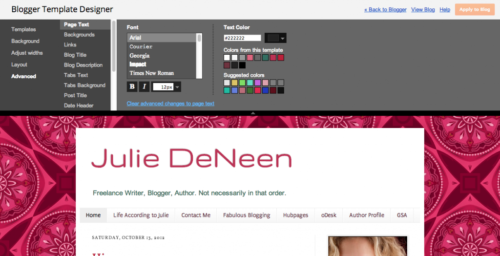
Now that you know approximately how wide your
header
needs to be, time to go to PicMonkey and make one!
1. Go to http://www.picmonkey.com. It’s a free photo editing site – no software (or registration) required. If you want the pro-options, it’s $4.95 a month subscription. You’ll get extra fonts, overlays, and textures if you sign up for the premium option.
2. Ask yourself this question: Do you want a header that is simply text and graphics or a photo (or collage)? If you want a graphics/text header, choose the DESIGN option. Once the canvas opens up, you can use the RESIZE option in the basic edits to adjust it to what you’d like. Skip to step 4.
3. If you’d rather have a photo collage, here are the steps.
- Click on the Create a Collage in Picmonkey instead of Design on the homepage.
- Where it says OPEN PHOTOS, click on it and upload as many photos as you want to use. You may just want one image or perhaps you want ten! They will all line up on the
left hand
side.
- Drag and drop your photo/s into the box. You’ll notice that you can eliminate boxes and spread the image out or you can add a bunch and make a collage. There are different default layouts you can choose, but don’t worry — you can delete and customize them by clicking and dragging.
- Choose a layout and play around with the
order
and the
size
of each photo. The Facebook cover photo layout is a good starting template since it’s about 815px wide. To readjust the size, put your cursor in the size field at the bottom of the screen. Change the width to 1000px (or whatever it needs to be) and it’ll automatically change the height to keep everything in proportion.
- Once you
are done ordering
the pictures as you like, click on the edit button at the top of the screen.
PicMonkey
will pull your collage into the editor where you can add text, overlays, and borders.
4. If you chose the option for text and graphics in step two, you should have chosen the DESIGN button on PicMonkey’s home screen. First have to resize it before doing much else. On the left hand side, hit the resize button.
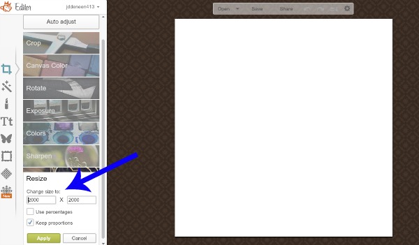
Change it to the dimensions you need (you may have to uncheck the keep proportions option).
5. Now you can edit! Add text, overlays, textures, and other fun elements. This article has a few tips for using Picmonkey. Or, if you prefer Canva, I have a post on Canva as well.
6. When you have it just right, click save again.
7. Now it’s time to upload it into your blog. If you are in WordPress, you’ll want to go to your dashboard > appearance > header. In Blogger, you need to go to layout and click edit header area.
Taking it to the next level…
Okay, so those are the basics. But what if you want something similar to Marie Forleo’s header?

I can make one similar using my own custom fonts using a combination of PicMonkey and Canva without spending a penny.

I have a 30 minute training video that shows you exactly how I did it.
It includes the following:
- Where to find free to use custom fonts for your header so you don’t look generic and “template-y” {def. what happens when too many people use the prebuilt fonts in free programs}
- The trick I use to install those fonts and use them in Canva even though Canva doesn’t allow them
- How to use the transparent feature in PicMonkey so you aren’t stuck with blocky white backgrounds
- How to create a Photoshop-type shadow on your text without Photoshop
- How to edit a photo so you can get nicely blurred edges and fade ins
- Finding the exact color code so you aren’t guessing with the tones
- How to install your header on the Genesis framework for WordPress and adjust the default size, even if your theme only allows for a small logo
- Tips for navigating Canva and using cool features like the multi-select, filter codes and more
Grab the [FREE] workshop here
Final thoughts
- When you are done with all this design awesomeness, you can go back to Picmonkey and create another one to use as your Facebook cover photo on your fan page!
- I have another post that talks about the elements of a professional
header
.
- Have you thought about whether or not your blog needs a logo? A logo is slightly different than a header in that it is a smaller symbolic representation of your blog or brand. I wrote up a quick tutorial about the elements of a great logo too!





![Toni Kroos là ai? [ sự thật về tiểu sử đầy đủ Toni Kroos ]](https://evbn.org/wp-content/uploads/New-Project-6635-1671934592.jpg)


