Color Meanings in Business Branding

Colors play an important role in business branding. Brands can use colors to evoke certain emotions or attract certain customers. So, most company logos, packaging, and websites are designed with a specific purpose in mind rather than just using colors that look nice.
What do colors mean in business branding? This article will look at what each color means and how popular brands have used it.
Mục Lục
Why Are Colors Important in Business Branding?
Colors are important for branding because they’re a form of nonverbal communication. They can give customers an idea of what a company is all about without using any words. Using the right colors can be a great way to make a first impression.
So, if you’re trying to design logos, websites, and advertisements for a business, you need to consider what emotions you want to convey and which colors will best represent those feelings. Then, you can get to work on creating a brand that accurately represents your business through colors.
Color Meanings in Business Branding
Below are some of the meanings colors can have in business branding, along with examples of companies that use each color.
Red

Red is a popular marketing color because it’s bold, vibrant, and catches people’s attention. It’s associated with energy, action, and excitement, and it may also trigger an appetite. Thus, it’s popular for fast food restaurants and companies that focus on entertainment.
Using red in an advertisement is a way to encourage viewers to act fast. It helps them focus on the branding and makes them tempted to buy something on impulse. It’s a great color to use in ads promoting a sale or special event.
Red might seem like a great color to use for any brand, but every color has its downsides. Too much red could be overwhelming, scaring people away instead of pulling them in. An excess amount of red could also be viewed as a sign of danger. So, if you want to use it to capture someone’s attention, you need to have a good balance of red with other colors.
Examples:
- Target
- Netflix
- Lego
- Coca-Cola
- CNN
- Nintendo
- YouTube
Orange

Orange is another eye-catching color that helps pique the interest of viewers. Like red, it can be overwhelming when used in large amounts. Yet, when used properly, it’s a great way to advertise a company that’s fun, energetic, and adventurous. Orange branding is often approachable, and it’s associated with friendly people.
Adding orange to branding can make the company seem more exciting, and it may encourage an appetite. It may be used for travel companies, communication brands, and brands with a wide range of products. It’s often used to represent creative companies too.
In some cases, orange can symbolize affordability, so it may be used to advertise a sale. However, too much orange may make a company seem cheap, which could lose the interest of potential customers.
Examples:
- Nickelodeon
- Amazon
- Fanta
- Crush
- Harley-Davidson
- Home Depot
Yellow

Yellow is a joyful, positive, and optimistic color to use in branding. It’s another color that can grab the customer’s attention and increase appetite. So, it’s often used for restaurants and companies that focus on making their customers happy.
Even if yellow isn’t the main color in a brand, it can be used to draw attention to a certain aspect of a website or advertisement, such as an area highlighting a deal or feature. This color more commonly represents affordability rather than luxury.
If you use too much yellow, the result may not be as positive. An excess of yellow could make customers think of caution and deceit, so make sure you don’t overdo it with this cheery hue.
Examples:
- McDonald’s
- IKEA
- National Geographic
- Best Buy
- Denny’s
- IMDB
- Sprint
Green

Green is associated with nature, so it’s seen as healthy, environmental, and soothing. It’s the perfect color for eco-friendly brands and health food packaging. It may also represent growth and harmony, so companies that use the color green may be perceived as friendlier and more welcoming.
In some cases, green is associated with money, so the brand may be seen as generous or affordable. It may be used in advertisements to show that a product is safe and trustworthy. However, using too much green may make a brand seem envious or greedy.
Dark green is a good option for brands that want to come across as calming or mature. Light green is a good color to use when drawing attention to a specific area, such as a special offer on a website.
Examples:
- Animal Planet
- Whole Foods
- BP
- John Deere
- Spotify
- Girl Scouts
- Starbucks
Blue

Blue is a great color to use for companies that want to come across as loyal and trustworthy. Blue is a calming, confident color. So, even though cool colors don’t stand out like warm colors might, it helps showcase harmony and stability.
Blue is a great option for authoritative brands like government, financial, and medical companies. It’s also a common choice for social media platforms. People may feel more compelled to trust a company that has a calm blue color scheme as opposed to vibrant colors.
However, blue can have downsides if not used properly. Too much blue could be viewed as depressing and cold, making people not as compelled to use a brand. Blue works best when it’s paired with a neutral or optimistic color.
Examples:
- Oral-B
- Walmart
- Oreo
- Lowe’s
- NASA
- WordPress
Purple

When used in branding, purple is powerful, luxurious, and creative. It can add mystery and imagination to a brand. It’s most commonly used to advertise high-end products or brands that focus on women and/or children.
Not many companies use purple as the main color of their brand, but it’s a common accent color due to its uniqueness. When people see purple in a brand, they may see it as something interesting or different. Purple can symbolize nostalgia, relating it to antique or hand-made items.
Using too much purple could frustrate customers. Brands with an excess of this color may also come across as arrogant. Purple works best when paired with pale or neutral colors.
Examples:
- Hallmark
- Yahoo
- Taco Bell
- FedEx
- Claire’s
- Twitch
White
Most brands use white to some extent since it’s an easy color to fill empty space with. Yet, if the main parts of a logo or design are white, it could represent innocence, cleanliness, or peace. Outside of North American culture, white could have opposite meanings, so consider where your brand’s location is.
White is often used for brands that sell everyday objects, such as medicine, household objects, and baby products. It may also be related to technology, such as cell phones and informational websites.
Using too much white could make a brand seem empty and cold. On websites, white is already the most commonly used color, so using lots of white in logos and advertisements could make them uninteresting.
Examples:
- Wikipedia
- Apple
- Cartoon Network
- World Wildlife Fund
Black

Black is another common color in brands, even if it only appears in small amounts. It can give brands a sophisticated, elegant, and authoritative feel. It’s used for high-end brands or companies that want to be taken seriously.
Black is commonly paired with white to give it some balance. It’s the most common text color because it’s easy to read, especially on a white background. Black is sometimes used as a trendy color, so it may be linked to fashion, music, and technology companies.
However, black is an overpowering color, so it should only be used sparingly in any design. Too much black can give off negative energy, making customers feel sad, angry, or scared. So, the only time it’s used in large amounts is if it’s advertising something dark and/or spooky.
Examples:
- Adidas
- Chanel
- Nike
- The New York Times
Pink
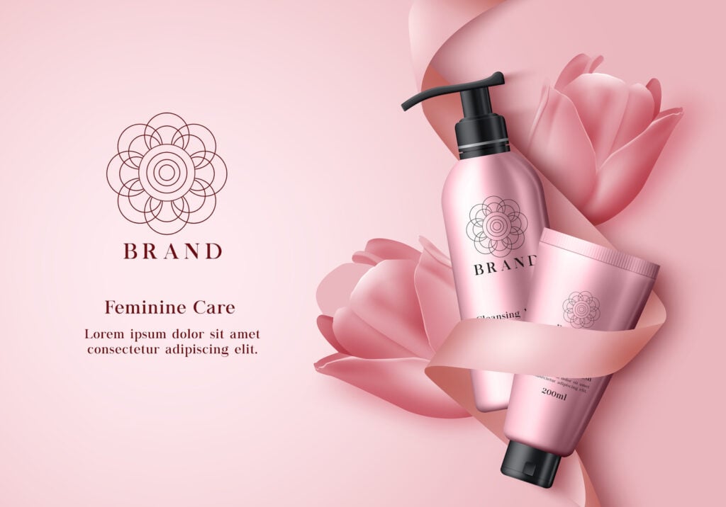
Pink is known for being used on brands with feminine customers, but it can be used for a variety of other purposes. It represents innocence, gentleness, and playfulness. It’s often used for things that are considered fun, such as toys, desserts, and vibrant clothing.
Some brands use pink in their logos or product packaging because pink stands out. The pink will often be noticed before other colors, making the brands more recognizable. Pink brands are often charitable or geared toward children.
Pink rarely gives off negative meanings, so it generally has a positive response. People may see brands with pink as friendly, warm, and calm. Using pink provides a welcoming atmosphere for customers.
Examples:
- Barbie
- Baskin-Robbins
- Lyft
- T-Mobile
- Dunkin Donuts
- PINK
Brown

Brown is an earthy color that’s often used for healthy, natural brands. It can also be viewed as a symbol of comfort, stability, and reliability. It’s often used to advertise durable items, such as tools, garden products, and men’s clothing. It’s great for brands that want their designs to feel simple and down-to-earth.
This color can also be used for certain food brands, especially those that are considered classic or rustic. Since chocolate is brown, you can also expect to see it on food labels that have chocolate flavors in them.
Brown doesn’t evoke as many emotions as other colors, but many brands can use that to their advantage. It can make customers feel less stressed and more confident about the brand they’re choosing. Brown can make a brand feel more organized.
Examples:
- M&Ms
- Hershey’s
- UPS
- A&W
- Cracker Barrel
- Nespresso
Gold
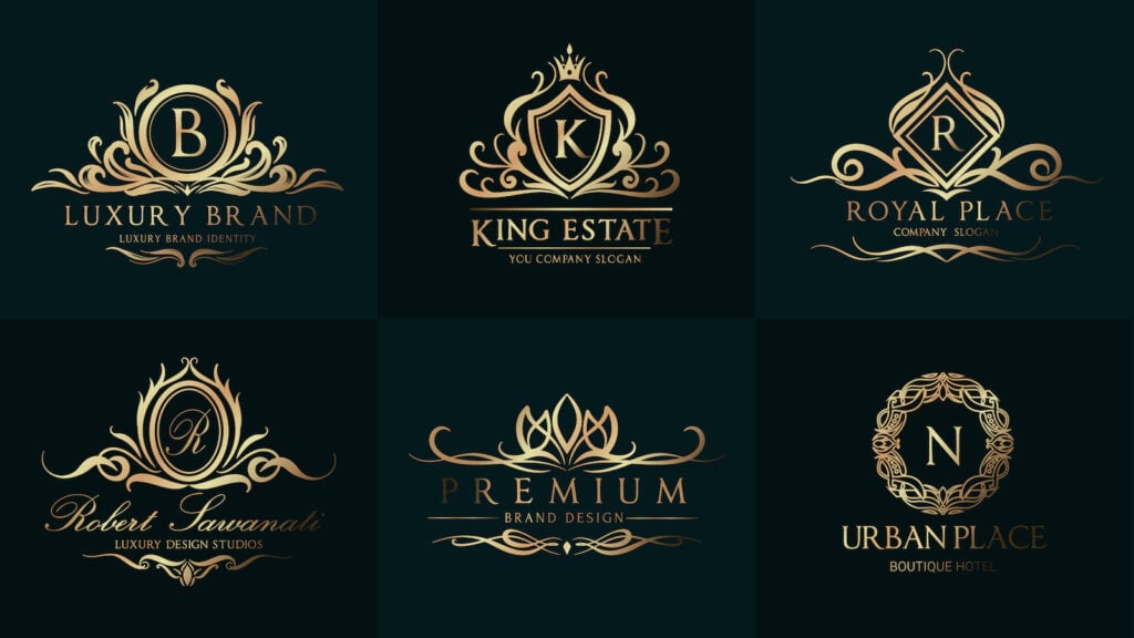
Gold is commonly associated with success, luxury, and wealth. So, it’s most commonly used for high-end brands, such as luxury clothing and jewelry. It’s often paired with darker colors to symbolize mature and bold companies.
This color can also be linked to entertainment, especially in companies that have been around for a long time. Companies that focus on gold may also value knowledge and want to spread helpful information to others.
Too much gold can be overwhelming and tacky. Customers might see a company as greedy if they showcase gold too often.
Examples:
- Versace
- The History Channel
- Pantene
- Rolex
- Dove
- Warner Bros.
Silver

Like gold, silver is a color that’s commonly associated with luxury and elegance. It can be used for high-end products, but it’s unique because it also creates some mystery. Silver branding often relates to modern companies.
Silver is the most common color for car company logos because silver is linked to current technology. Car companies that use silver are often seen as new, trendy, and reliable. So, it makes cars look good in advertising.
Too much silver might come across as cold and impersonal. It should be paired with other colors to avoid those negative meanings.
Examples:
- Mini Cooper
- Mercedes-Benz
- Hyundai
- Jaguar
Colorful

Some brands don’t have a single color, but instead, they focus on three, four, or maybe even five colors. The most common instance is using the primary colors in a logo, sometimes with green included. Brands with multiple colors stand out more than other brands. They’re seen as fun and unique.
Brands with many colors are often trying to represent diversity. They offer services for a wide range of people, and they have a variety of products or information available.
Examples:
- Microsoft
- NBC
- eBay
Choosing Colors for Your Business

Color is important for any business, whether it’s a fast food chain, TV channel, or news site. The colors in a brand can affect who’s attracted to a company and how those customers feel about that business. So, if you’re trying to come up with a logo and website for your own brand, consider what emotions you want to portray. Then, select the colors that effectively represent those feelings.












![Toni Kroos là ai? [ sự thật về tiểu sử đầy đủ Toni Kroos ]](https://evbn.org/wp-content/uploads/New-Project-6635-1671934592.jpg)


