Best Ambient Outdoor Advertisements
Ambient is a form of outdoor advertising that stands out because it involves using unusual object and places as an advertising medium, and some advertisers take it to a whole new level. Certain ambients are so innovative that you’d think you were projected in the future. Also, it’s not as expansive as it looks. Sure, it may require a lot of creativity, but once the idea is there the execution unfolds seamlessly.
Something to keep in mind when it comes to ambient advertising is that it can allow advertisers to interact with the audience. Some examples of interactive ambients include giving gifts or samples of the product advertised. We’ll discuss more examples in the following sections.
The Inaccessible Transit Shelter
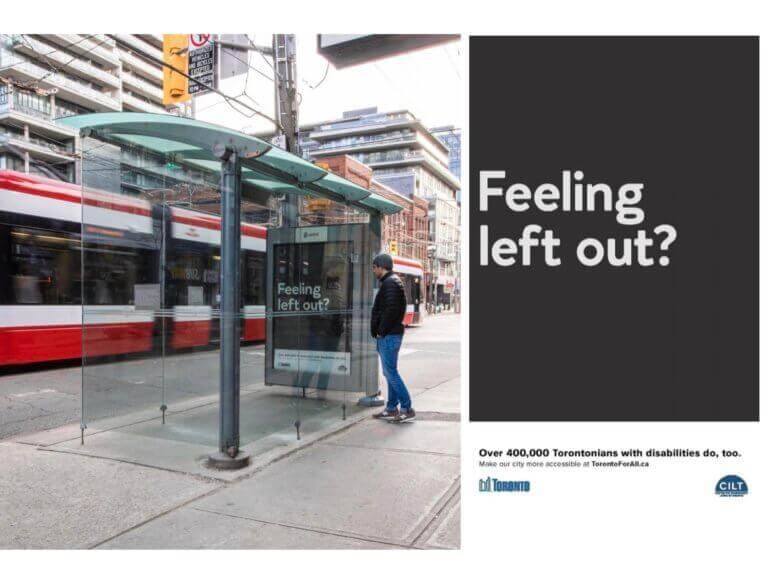
Public Inc. did an appealing ambient ad for the Center for Independent Living in Toronto (CILT). It consisted of closing a transit shelter with a glass door, preventing riders from getting in. There was a poster inside with the phrase “Feeling left out?” and further down the sign it said, “Over 400,000 Torontonians with disabilities do, too.” It was a simple, yet impactful, way to convey their message. The best way to make someone understand another’s situation is to put them in a similar one, or at least something close.


The Walking Billboard
Ambient advertising can also be interactive. A perfect example for that would be Primark’s walking billboard. To commemorate the re-opening of one of their flagship US stores, they used ambient advertising and, as expected, they stood out. It took place in the King of Prussia Mall, one of the largest, busiest shopping destinations of America located right outside of Philadelphia, PA. They filled big versions of their shopping bag with clothes to employees and some customers to carry around the mall as moving billboards. No two messages on the bags were the same, showcasing versatility in the ad messages. Some of them read, “closet space might get tight”; others read “amazingly huge hauls”; “spend a little. Get a whole heck of a lot.”.
But people didn’t carry those bags just for fun, because there was a prize to win in the end. They had the opportunity to win a Big Bag Shopping spree at a value of $500. Who wouldn’t carry a billboard for such a sweet deal? For the second part of the campaign, they hired paparazzi to follow everyday Primark shoppers around the mall. It allowed them to create a unique experience for shoppers while promoting their brand identity. Primark’s fantastic fashion and affordable prices mean that dressing and feeling like a celebrity are at everyone’s fingertip.


IKEA Real Life
If you know the brand well, then this ambient won’t be surprising for you. Indeed, the Swedish brand has been doing a lot of advertising lately involving decorating rooms with their articles. They executed one on a billboard in which they glued pieces of furniture to it and made a room out of it. But, this time, there was no glue involved. The campaign took place in the UAE and, since it’s a market mostly made of expats, it was challenging to talk to every single culture at once. So to appeal to this diverse market they decided to replicate rooms from famous TV shows loved by everyone. They spent two months doing research to find the same types of furniture featured in those shows but made by IKEA. The nearly identical pieces were then chosen and sent to a 3D studio where they brought the famous rooms to life. This resulted in an astounding version of the rooms as seen on TV, made for real families in the real world.


Trapped Under The Ice
This one might be one of the most shocking ambient advertisements I’ve ever encountered. The Frankfurt fire department in Germany did this campaign to make people realize how dangerous it is to mess around frozen rivers, lakes, and other bodies of water. Even though there are laws and signs prohibiting going around those places, people still sadly lose their lives. They found an effective way to make their message heard with pictures showing people trapped in the frozen waters. It’s so realistic that it gives you chills, literally. And it’s honestly a brilliant idea. If this doesn’t scare the population away from the frozen waters, I don’t know what will.


Solar Graffiti
This ambient advertisement by Engie is the reason why I love advertising. It’s creative, useful, and unique. We’re in Álvaro Obregón District, one of the three most dangerous and polluted districts in Mexico City. They’ve got all the dirt, from assault to robbery to pollution. In fact, one assault happens there every 25 minutes, and one robbery every 19 minutes. 86% of these crimes take place at night, so Engie and Publicis France cooked up a brilliant campaign idea: solar graffiti. What is it? Simple: they hired a bunch of local graffiti artists and gave them solar films to use as their canvas. They created graffiti that illuminates the neighborhood at night. The light came from free and renewable energy of the sun. Yes, it was free light. How amazing is that?
In 4 months, everyone was talking about that corner of the district and the outcome of this incredible ambient ad. They noticed that there was no more robberies nor assaults. In 4 months! It happened on April 2018, and I hope it’s still illuminating to this day.


OMO Tag
OMO is a detergent brand from Unilever and are an advocate of an active lifestyle for kids and grown-ups. Their signature slogan is “dirt is good.” OMO is also a brand that’s been known for its creative ways when it comes to advertising. This time, for their ambient ad, they chose to go with sampling in the advertising campaign OMO Tag. Instead of doing their sampling the traditional way, by giving it away at grocery stores, they went directly to the clothing stores. They made tags to be put on clothes, so people can use them when their new clothing gets dirty. The tags are all made up of OMO detergent power that dissolves once they’re put in water, as shown in the picture. This form of ambient advertising serves as a product extension and solution for people.


The Mud Soldier
Ambient advertising can also be used to revive history. Visit Flanders and Ogilvy teamed up to create just that. Flanders, also known as the Flemish region, is one of the three regions of the Kingdom of Belgium. Historically, it was the scene of one of the deadliest battles of World War I, the Battle of Passchendaele, killing over 500,000 soldiers in 3 months. Surprisingly, many of these deaths were caused by weather increments instead of the war itself. It had rained ceaselessly for a long time, resulting in the craters and trenches becoming deep with mud that drowned soldiers and their horses.
As a way of remembering these soldiers, Visit Flanders made a statue using the mud and sand from the battlefield. It was a soldier’s statue that dissolved every time it rained and ended up disappearing completely within a few days. However, the memories of the soldiers were revived, and this ambient advertisement turned out to be impactful worldwide. It resulted in 3.6 million in earned media, 21 million Twitter impressions during the first week, more than 100 million people reached in over 65 countries and 9% increase of foreign visitors Flanders Fields from 2016 to 2017. This is a campaign done right.


Historical Jersey
This is probably one of the simplest executions, as far as ambient advertising goes. It doesn’t make it any less brilliant, though. In 2018, many events happened, but it was a particularly special year for Panama. The 2018 World Cup took place in Russia, and Panama was part of it for the first time in history. It was easy to predict that in celebration of their involvement in such a prestigious event, everyone would proudly wear their Panamanian jersey. That’s what inspired the ad agency Independiente Panama and TVmax, one of the sports channels of the country, to work together on this campaign.
Because their country wouldn’t be what it is today without those historical figures, they decided to show them some gratitude. They made this possible by making them wear the national soccer team jersey. They did it all during the night, and every citizen woke up to their usual monuments wearing the colors that made them so proud. Needless to say that it made them even more excited about the event.


A Body to the Middle Finger
I know it sounds terrible, but keep reading, you’ll love it. To promote the third part of its iconic show, La Casa De Papel, or “Money Heist” in English, Netflix completed an incomplete work of art. They created an ambient advertising campaign that fits perfectly with the first sculpture both physically and in context, as well. For those who don’t know about the show, Money Heist is about a modern day Robin Hood, who is known for taking over symbols of financial power.
Going back to our ambient, Netflix placed a giant statue of a red hooded thief near an already existing statue of a middle finger, in front of the Italian stock exchange. By the way, the statue represented the way the thieves dressed in the show. And that middle finger was created by visionary artist Maurizio Cattelan. See how it all fits together? This is the power of advertising. Also it made a lot of noise, with more than 57.3 thousand posts published and over 1.6 million interactions generated online.


After looking at all these iconic examples of ambient advertising in our world, it’s no question how successful and poignant each campaign is in drawing more attention to outdoor advertising living among us.
References:
https://www.adsoftheworld.com/taxonomy/media/ambient









![Toni Kroos là ai? [ sự thật về tiểu sử đầy đủ Toni Kroos ]](https://evbn.org/wp-content/uploads/New-Project-6635-1671934592.jpg)


