Anatomy of a Magazine Layout – Yes I’m a Designer
Mục Lục
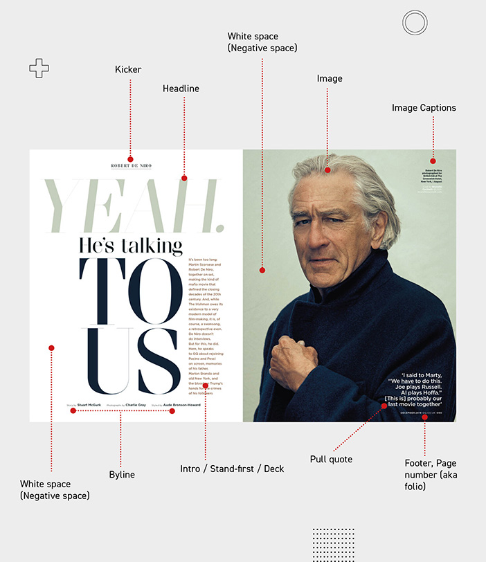
Editorial Design and in particular magazines always fascinated me. There are a lot of things you need to learn to be good at designing contemporary, stylish magazine spreads.
But today I want you to get familiar with some Editorial Terms which is a must if you are planning to design magazines. We will learn about kickers, stand-firsts, bylines, pull-quotes, and so much more by analysing the work of my favourite Editorial designers and art directors. In additional I will share tutorials on Typography and Compositional techniques that will help you create stunning magazine layouts.
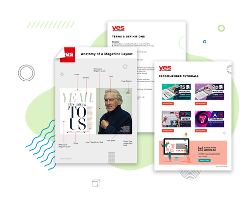
Free Guide on Magazine Anatomy
Get familiar with 15 Key Editorial
Terms you need to know
for magazines layout
s.
Best Practices
Three most important features to engage readers to stay on a spread:
-
Layout
-
Main image
-
Headline
- Most visible parts are outer, upper sections on the spread (use these to engage reader)
- Never think of a page individually, always design spreads as a whole, even if there is an ad on one side
- Plan the viewing direction (usually top left to bottom right) Don’t overcomplicate the flow
Principles of Design
Here are a few things to consider for your Magazine Layout
-
Purpose
: What’s the purpose of the magazine/layout you are working on?
Is it image-based, story-based, formal, funny? etc.
-
Balance
: Make sure your content is evenly distributed over the page/spread. Don’t put too much in one part of the page/spread. Unbalanced layouts will feel uncomfortable and lose viewers interest.
-
Hierarchy:
Do the right pieces of information stand out? Establish what is the most/least important information for a viewer and indicate the levels of priority visually.
-
Readability:
Is the text easy to read? Watch out for your point size and the font you use. Colour choice is also crucial, making sure that there is enough contrast between the copy and the background.
Typography
Typography plays a crucial role in Editorial Design. An article that you design could include text in the form of a story, interview, opinion etc. so it is pretty vital to make sure the copy you use is easy to follow and understand.
Point size
– Make sure the size of your text is readable for your audience and consider if they will be looking at a page or screen.
Line length
– The ideal line length is between 50 and 70 characters per line. Shorter lines will break too often, causing the reader’s eyes to jump back and forth way too often, while longer lines will make it hard to find the next line at each break.
Amount of copy
– Where possible break up big blocks of copy, they can appear intimidating and might put readers off. Use paragraphs, columns, threaded text frames, lists etc.
Entry points
– Define clear starting points for your reader by using visual hierarchy and features like Drop Caps and highlighted text blocks (usually used for quotes or interesting parts of an article).
To conclude, Magazine design can be complex, there are tons of terms you need to get familiar with and so many layout rules you need to consider. Don’t worry; it does get easier to learn them, the more you practice creating layouts!.
I hope you found this blog post inspiring and excited to start creating awesome magazine layout! Be sure to tag us #yesimadesigner on Instagram if you create any designs using our tutorial!

Confused where to start?
Join our Survival Kit for Designers newsletter and start your creative journey!









![Toni Kroos là ai? [ sự thật về tiểu sử đầy đủ Toni Kroos ]](https://evbn.org/wp-content/uploads/New-Project-6635-1671934592.jpg)
