Welcome, Creatopy! It’s Time to Shine – Creatopy
3
minutes read
Bannerstack. Bannerstock. Blannersnack.
We’ve seen it all over the last 12 years. But it’s all in the past because everything is changing.
The Glowing Upgrade is finally here.
As of today, February 8, 2021, Bannersnack is now Creatopy.
We have a new brand identity that we’ll discuss in more detail over the coming weeks.
So you might be wondering, what led us to this decision?
When we started this company in 2008, we built an app that would help Flash developers create banners. Then, it turned into a platform that was easy to use even by those who aren’t professional graphic designers.
Over the years, what was widely known as the original online banner maker, outgrew not only the brand name (we became more than a banner maker) but the platform as a whole.
In 2012, with no outside investment, we reached our first million dollars in revenue, so I can confidently say we were quite successful.
However, our ambitions and long-term goals needed an entirely different setting to thrive.
We knew it was time to evolve into something bigger.
So we stopped and reassessed our plans to establish a clear vision of what we want to achieve. It was an essential step that made us realize our brand was not exactly aligned with our goals.
Starting fresh was the only option.
And This Is How Creatopy Was Born
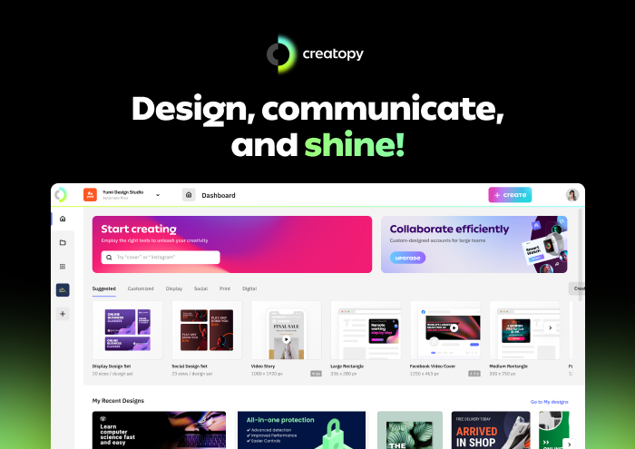
Creatopy is the efficient and intuitive visual production platform, delivering a well-crafted creative experience for communicators and teams.
A blend of two words, “creation/creativity” and “utopia,” the name stands for the concept of perfect creation and vast imaginary potential, the best place for creativity.
The Creatopy logo encompasses three main elements:
- The C-monogram—Creatopy, creation;
- The Ideal—a sphere (utopia);
- The Glow—idea, creativity, intelligence.
The wordmark uses the Ping typeface, which is designed by the Dutch foundry Typotheque. In 2019, Ping received the Gold European Design Award. According to its creators:
Ping is a fluid sans serif font with a geometric structure, but unlike other geometric typefaces, Ping doesn’t reject the influence of the human hand, […] is resolutely modern, rational but not faceless, full of respect for the past while exploring the possibilities of the present moment.
Creatopy is the place where you can reach peak creativity and productivity. It’s where communicators and teams can come together and create whatever they want in terms of design through a well-crafted creative experience.
The rebranding was not only a matter of updating our brand’s look. We needed to do a reset from within, a 180-degree shift.
That’s why we not only have a new brand identity, starting with name, logo, font, brand colors, and illustration style, but we also redesigned the product experience.
So I invite you to discover Creatopy and embark with us on this new journey.
*Click on the image below to sign up for an account.
We’re excited to finally reveal our new brand identity, and we deeply hope you’re as enthusiastic as us.
In the coming weeks, we’ll be sharing more details about what went on behind the scenes of the rebranding process. Vasi (Head of Product), Gery (Head of Design), and Teodora (COO, former Head of Marketing) are eager to share insights about their work, so stay tuned.
In the meantime, feel free to share this news and spread the word on social media.



![Toni Kroos là ai? [ sự thật về tiểu sử đầy đủ Toni Kroos ]](https://evbn.org/wp-content/uploads/New-Project-6635-1671934592.jpg)
