The Ultimate Guide to Effective Blog Design
“46.1% of people say a website’s design is the number one criterion for discerning the credibility of the company.” (Source: HubSpot Marketing Blog)
Confession time… I’m not a blog design guru.
What I am good at is observing, learning and applying what works for other people in my own unique way. That’s what this post is going to be about; how I have consumed so much information online, that it somehow regurgitates itself as a nice looking, highly optimized blog.
But before we start, let me give you the context for why I’m writing about blog design. A little while ago I added a question into the very first email that gets sent to new Blogger Sidekick community members.
“What is the one thing you are struggling with right now?” (See below)
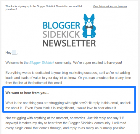
That one simple question has achieved a couple of things;
- I’ve connected with some really cool people on a much more personal level
- It helps me understand exactly what our community is struggling with – My mission then becomes helping you overcome these struggles with epic content
The blog design tips in this post are a direct result of a few of the responses to that email. One in particular is below;
“I want my blog to stand out from the crowd, but don’t know where to start when it comes to design. What are the common elements of effective blog design?”
Awesome question.
Whilst intuitively I love my blog design, I had never broken it down into the core components of what mattered and exactly how I could help others implement that. So I set out on a mission, a mission to bridge the gap between what I thought I knew about blog design, and what I actually knew.
Turns out there was a ton of stuff I have been doing all wrong. Plus quite a few things I was doing well, that I didn’t even realize! (This has resulted in a nice little to-do list I’ve set myself, which I’ll share at the end of this post. I’d love to know what you’re committing to learn and change about your blog design too)
The great thing is, I have collated everything I learnt from this expedition into 17 principles for effective blog design. Now instead of spending days and days researching what works, this post will shortcut your journey by putting everything in one place.
So what makes a sleek looking blog design that will increase your conversions, bolster your credibility and make your visitors feel right at home?
Disclaimer: I flip back and forth between visual design and functional design, both are essential elements to the layout of your blog and how a user experiences it.
Mục Lục
1. Start with your home page
People are busy, they have short attention spans and are flooded with a sea of content every day. Emails, blogs, Tweets, sales pages, Ebooks… So first impressions matter more than ever. You only have about 3 seconds to draw a website visitor in, tell them what you do and make them take action.
That’s why the design of your home page is integral to the success of your blog, most people are landing here first.
I have gone back and forth about what to include on our home page. For a while I had a form capture that offered tailored blog tips to visitors. Now I have a form capture that asks visitors what they are struggling with, in an endeavour to strengthen those bonds I was referring to with our community. Both have been effective ways of connecting with new visitors, BUT, I am ready to make a change. What I have learnt is that sentiment isn’t going to engage visitors. It’s a nice thing to ask how people are going, or what they are struggling with, but the visual nature of the form I use looks more like a 1990’s Geocities site than a reputable business blog. Good idea, poor execution.
Instead, here are six essential blog design ideas the best home pages include (I have added these to my to-do list for re-jigging our home page here at Blogger Sidekick);
- Graphic header image – A header image or professionally designed banner can exponentially increase the perceived credibility of a blog.
- Catchy and informative tagline – The idea of the tagline is to inform your visitors about what you do. It needs to be short, sharp and punchy so the visitor automatically understands what it is your site or business is designed to achieve.
- Call-to-action – Your home page is a prime opportunity to capture an email address or get your new visitor to take action. Don’t miss it!
- Guidance on where to start – This is a big one, and one I still haven’t got to fixing myself. It is so simple, yet so important. When someone new comes to your site it is your job to guide them exactly where they should go next. You’ll see what I mean in the examples below, but a common way to do this is to create a ‘Getting Started’ page so new visitors know what content to start with and where to find it. You can take them on whatever journey you want.
- Social proof – if you have worked with any significant brands, contributed to some well known publications or have any amazing testimonials; include them on your home page! The quicker you build your credibility with a visitor the better.
- Show off your personality – Let your personality shine through. If you’re an individual blogger, include a photo. If you’re a business, create a home page that shows off everything you are about, and depicts your value set.
To help you understand what I mean by these six elements, let’s have a look at a couple of examples.
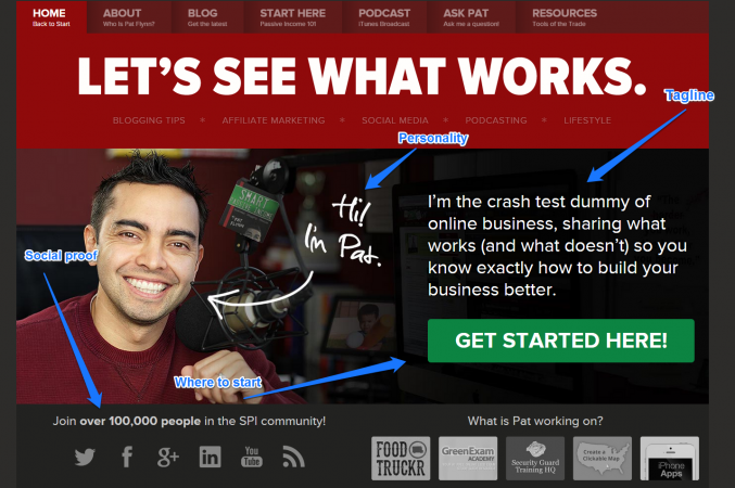
First up is Smart Passive Income by Pat Flynn. Pat is a marketer I have enormous respect for, and I’ve made a habit of listening to his podcast a couple of times a week. It’s epic, give it a listen if you have the time.
You’ll notice on the home page of the Smart Passive Income blog Pat has ticked off the six design elements I mention above. He makes it human, lets you know where you should start, pumps up his credibility with some social proof and best of all, you know exactly what the site is all about in one sentence. Nailed it!
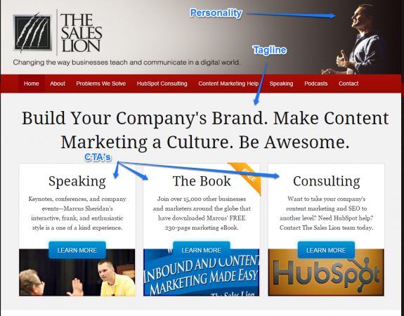
To emphasize the point, I’d like to show you the home page of The Sales Lion, a content marketing consultancy founded by Marcus Sheridan. Once again, Marcus has made it personal. He’s also caught my attention with a really catchy tagline that explains exactly what they do as a company. Below this tagline there are three very specific calls to action. He wants us to pick our path, depending on what it is we came to the site for.
If I end up hitting your home page for the first time, it’s up to you to impress me and then tell me what to do next. Professional images, call-to-actions and some personality is what you need.
To-Do: Create header image, CTA and getting started link for the home page.
2. Create a style guide for your brand
Your blog should be a direct extension of your brand. This means you need to create a style guide (if you don’t have one already) that fits your brand and personality. The goal is to create a consistent experience for your customers as they research what you are all about. An effective brand style guide builds trust, increases your perceived credibility and gives you some much needed web design inspiration.
A typical style guide will include the following;
- A brief version of your brand’s history
- Primary choice of font, and a back-up font if the primary is unavailable
- Your colors. Typically you will need a HEX color code if you want to use it on your website. You can find every HEX code you’ll ever need right here.
- Logo variations, and how they should be used
- Types of images, the photography style and color schemes
- Writing style and tone of voice to be used
- Examples for every point that highlights exactly what is expected
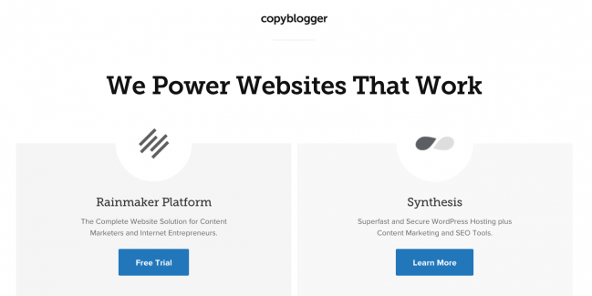
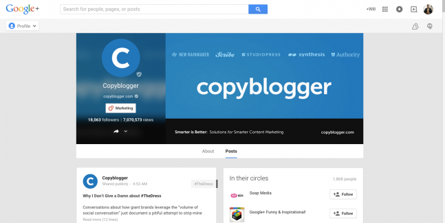
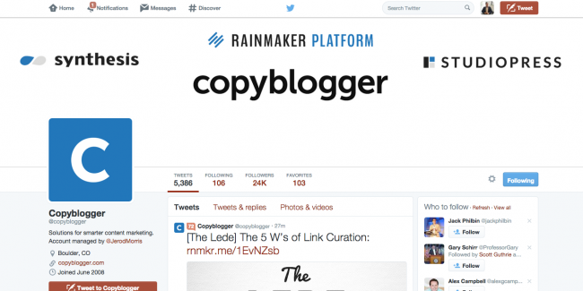
An example of a brand that has nailed this across all of their platforms is Copyblogger.
Here is their home page;
… Google+
… and Twitter
3. Use lots of white space and reduce the clutter
“White space” is a web designer’s best friend. It helps our eyes make sense of what we are reading and draws them to the most important points, highlighted by other colors. Readers can consume information much easier when the amount of white space is optimized, and they can easily scan the page for valuable text or imagery. Essentially more white space declutters a web page and makes the user experience more enjoyable.
White space provides a nice buffer between the useless information and the most important stuff, guiding us to exactly what it is we should be doing. One very famous example of an online company maximizing the use of white space is Google; they want the focus to be in the center of the screen.
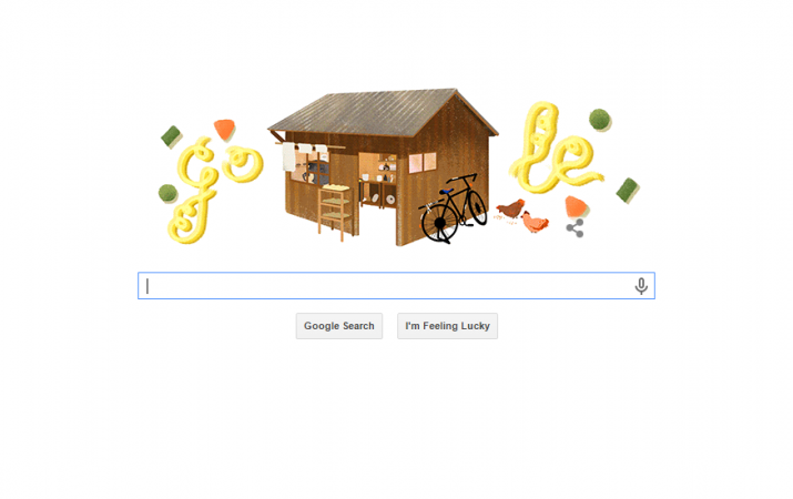
To help your readers navigate your blog or website, sufficient white space is a key ingredient.
4. Go mobile with your design
“We spend 119 minutes on our mobile device every day on average” (Source: Econsultancy)
We are moving faster than ever before. People walk down the street and bump into each other because they don’t want to spare a second to look up from their mobile phone. We rush from meeting to meeting with only moments to think, but we spend that moment consumed in our smart phones. In 2014 mobile internet users surpassed desktop internet users.
Your readers are using mobile phones to access your blog, so make your blog design mobile responsive. Simple.
If that isn’t enough to convince you that mobile is important to your blog design, Google announced in February that mobile responsive sites will rank higher in search queries. And as society becomes more and more attached to their phones, this ranking factor will only become more important.
If you’re not sure whether your site is mobile friendly, and don’t know where to start – check out this resource from Google.
5. Make navigation easy
I used to think ‘navigation’ was all about how well the top menu was set up on a site, and how nice it looked. But it’s far more than that. Navigation is about helping your visitors find their way around your site, usually in a very targeted and specific manner. Effective navigation is a win-win. You get your visitors to go exactly where you want them to, and your visitors save time by following a specific path rather than fumbling around guessing where they should go next.
When I was designing and writing the copy for this site I overlooked some of the fundamentals of navigation. Now in hindsight, it makes a lot of sense that my average bounce rate is far higher than it should be.
What should you consider when designing the navigation architecture of your blog?
- Include a ‘Getting Started’ or ‘Start Here’ page and link to it straight from your home page. On this page you want to provide a suggested path new visitors can take when coming to your site. For example, which blog post should they read first, second and third? Create an experience for your visitors.
- Cherry-pick your blog categories, and definitely don’t have more than 10. This simplifies the journey for your visitors.
- Reduce the clutter in your top menu, keep it clear and simple about what your site offers and where people can find what they want
- Include call-to-actions, internal links or related post links in your right sidebar and at the end of blog posts. You don’t want someone to read a whole post and then leave your site immediately, give them a reason to stay!
Two examples of bloggers who have followed this exact formula and nailed it are Michael Hyatt and Pat Flynn (who I mentioned earlier).
Pat’s ‘Getting Started‘ page is personal, specific and targeted

…and so is Michael’s ‘Start Here‘ page.
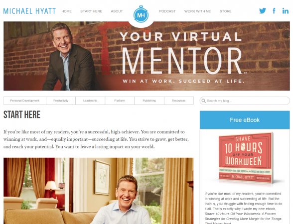
To-Do: Create a ‘Start Here’ page and link to it from the home page. (Note: I just reduced my blog categories from 14 down to 8!)
I hope you’re keeping up with my to-do list, I’m specifically telling the world about it so it creates accountability and forces me to take action!
6. Eliminate dead-end streets
Have you ever been to a site, clicked on a link and been taken nowhere? Or perhaps you’ve been taken somewhere but it was not the page you were expecting, or it’s a 404 error page.
This is essential when it comes to perception and conversions. If you have a form or a link that doesn’t take your visitors anywhere, it is likely going to result in them leaving your site and never coming back. I am making this mistake right now.
On the landing page for the ‘60-Day Blog Strategy Program‘ there is a form capture for people to enter their details. But once they enter there details, nothing happens! See below.
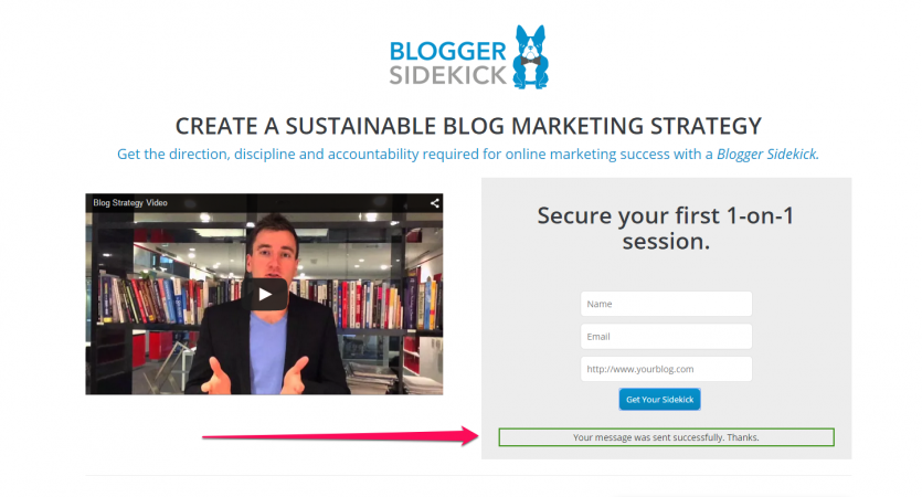
There is just a tiny message that pops up saying ‘Your message was sent successfully. Thanks’, which no sane person is going to see or care about. Thanks for coming, and we will never see you again.
Alternatively, what I SHOULD be doing is redirecting them to a ‘Thank You’ page that includes a number of other actions they could take instead of leaving the site. For example, I do this after all of our resource downloads, see the Blog Strategy Canvas example below.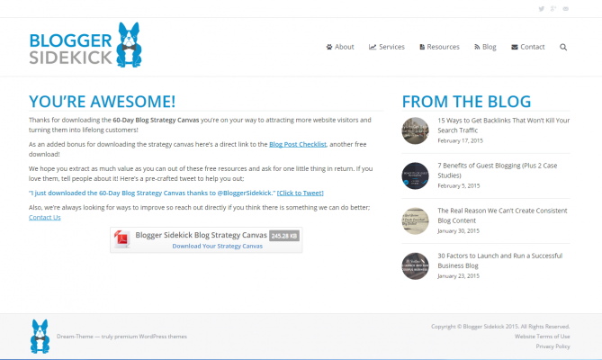
As you can see once you hit this page you have a bunch of options; sure you can leave the site if you want, but you can also download another resource, share your experience on Twitter, read something from the blog, or do any number of things from the main navigation. Your chances of staying are exponentially higher just from this simple extra page.
To-Do: Create ‘Next Steps’ or a ‘Thank You’ page for any form captures and landing pages.
My to-do list is getting pretty lengthy, how are you shaping up?
7. Personalize at every opportunity
People want to connect with people, not brands. So every opportunity you get to personalize your blog you must grab with two hands.
Here are some ways you can personalize your blog to increase engagement and connect with your readers;
- Include author bios for anyone that contributes to your blog with a photo and short blurb.
- Clearly show the comment count of each post on the main blog page, as well as the social shares. The amount of comments on a blog is typically a good measure of engagement, and will encourage people to read a post.
- Include images of yourself, your staff, your family or your clients wherever you can. The most common place for this is on the ‘About Us’ page but there is an opportunity to personalize your site with images just about everywhere.
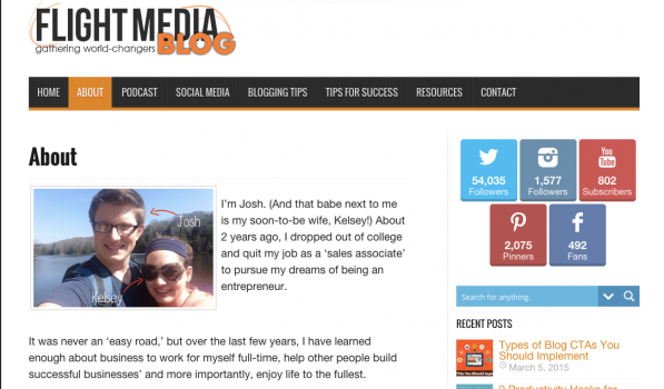
You’ll see below how Josh Coffy from Flight Media has personalized his ‘About Us’ page by including a photo and story about him and his soon-to-be wife Kelsey.
8. Nail your ‘About Us’ page
The ‘About Us’ page is one of the most visited pages on any website. If someone goes to your ‘About Us’ page they are eager to find out more about what you do and who you are. It is a great opportunity to turn these visitors into community members and eventually customers – something that many sites fail to capitalize on.
So what should you include on your ‘About Us’ page?
Must-have’s
- Communicate only a few key things, the page is easy to navigate and straightforward to understand.
- Show off your personality – Use imagery to put a face to your brand, or use images of your employees and office environment. Tell a story about why you exist and how you got to where you are. Help people connect with you by being human, not a superhero.
- Make it about them, not you – Why should a visitor care about what is on your site? What challenges are you helping them overcome?
- Forget about the jargon – Use a unique tone of voice and writing style, make it conversational and strip back all the buzzwords and corporate jargon.
- Include a ‘Contact Us’ link – It is essential that visitors to your ‘About Us’ page have a direct way to contact you after reading. This may be a link to another contact page, or it could simply be your contact details or a form capture.
Additional Choices
- Make it aesthetically pleasing – Remember all the visual stuff I spoke about earlier in this post? White space, consistent branding and colors. Give your visitor the best possible experience on the ‘About Us’ page with clean, crisp, engaging design elements.
- Use humor – If you’ve got it in you, include a joke or two. Readers will resonate with your willingness to not take life too seriously.
- Include social proof – Let your customers or readers do the talking for you by including testimonials, case study snippets or embedded social media commentary about your brand.
- Values, mission or purpose – What unique purpose are you pursuing? – This usually takes the form of a catchy tagline (the same one you used on your home page). What values underpin the way you and your team work together?
- Calls-to-action – Don’t miss the opportunity to capture an email address on your ‘About Us’ page, it can be a huge converter.
- Let visitors know where to go next by including links to recent blog articles, media releases or a ‘Start Here’ page on your site.
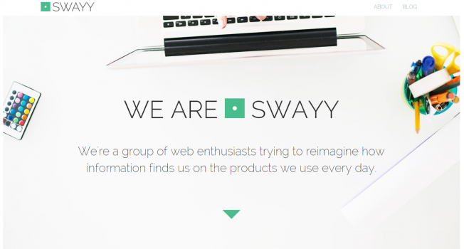
Swayy is a company who has a compelling ‘About Us’ page. Swayy is a platform that helps you discover and share content from all over the internet through your chosen social networks.
In the first screenshot below you will see how Swayy have used lots of white space, a simple yet compelling tagline and some nice consistent branding.
Next, the team at Swayy give you a look into who they are. Once again they have created visual consistency, used imagery to personalize their message and made it easy for the reader to know what they are talking about.

Finally, they boost their credibility with some social proof and a way for the reader to contact them.
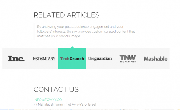
Swayy is just one example of a company that has used a number of these principles on their ‘About Us’ page. It all comes down to choices, what fits with your brand and how you would like to represent that both visually and in written form. There is no perfect answer, but you’ll find what works for you.
To-do: I’m pretty happy with the look and feel of our ‘About’ section at the moment, but it is valuable to assess and re-jig regularly. So on my to-do list for this one is an ‘audit and optimize’ for the ‘About’ section of Blogger Sidekick.
9. Optimize every page for calls-to-action (CTAs)
Attracting traffic is just the beginning, once people are on your site you need to persuade them to take action. But what do you want them to do?
Every single page on your site should have a purpose, and it should be very clear (to you at least) what you want a visitor on that page to do. This is what a call-to-action is, you are encouraging a reader to take action on something specific to the content on that page.
Some common CTAs include;
- Email list subscription sign-up forms
- Resource downloads such as an e-book, template or cheat sheet
- Social shares
- Product or service offering
- Affiliate product or service links
- Encouraging readers to comment on a post
- Internal links to other pages on your site
- External links to valuable resources or partner pages
- Market research responses, such as online surveys
Where should you include CTAs on your site?
- At the bottom of blog posts – HubSpot are the benchmark for using this tactic. Depending on where you are in their customer journey will determine what CTA you see at the bottom of a blog post – awesome right.
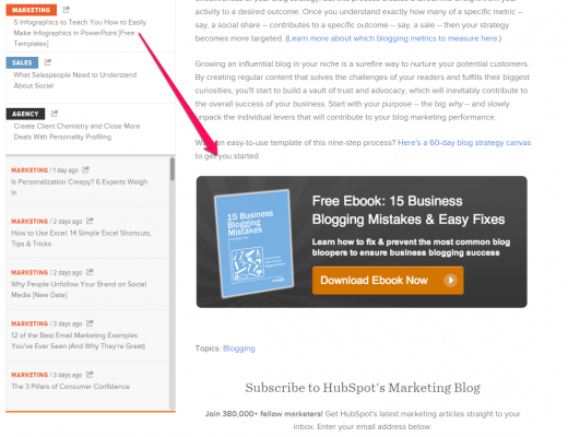
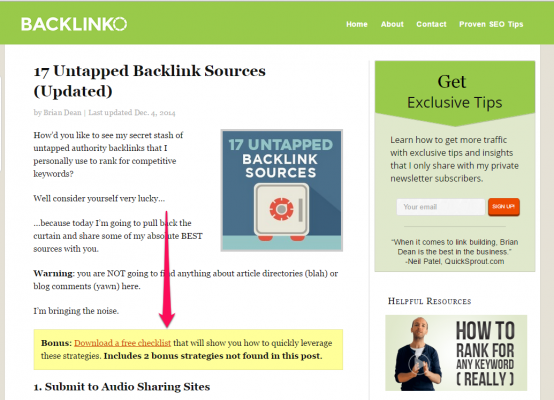
- In-text CTAs. You can link specific words to landing pages on another part of your site, or include a banner within the paragraph of a blog post. Below is an example from Brian Dean’s blog Backlinko.
- Social sharing CTAs – Some examples include using the Click-to-Tweet functionality within posts, showing ‘Connect on Social’ buttons in your right sidebar or using social sharing plugins such as SumoMe.
- Slide-in, pop-up or top bar CTAs – Pop-ups and slide-in boxes are designed to increase conversion rates when people are visiting your site. The great thing is technology such as SumoMe allows us to include these types of CTAs without overdoing them or seeming spammy. Below you will see an example of two of these in action from Bluewire Media.
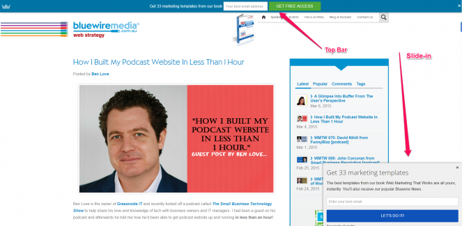
- Right sidebar – I talk more about what you should include in your right sidebar in section 16 of this post, but it is a great place to include a variety of CTA buttons or links.
- Top banner – Another spot to include high-converting calls-to-action is in a banner above your text and below your main navigation menu.
To reinforce these examples I thought I’d have a look at the conversion experts, so of course I went straight to LeadPages. You’ll see in the image below that on the LeadPages blog they have a bunch of CTAs all blended into their crisp design. One thing to take note of is that they include all of these CTAs in the top section of the page; this is known as the area above the fold. The idea being that CTAs will have a higher conversion rate if they are visible to readers before they begin scrolling down the page.
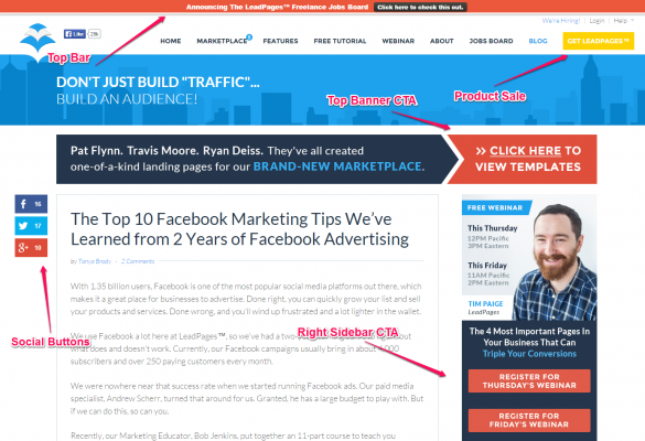
To-do: Whilst I include a whole bunch of CTAs here at Blogger Sidekick, there is an opportunity to jazz these up with some imagery and compelling text. On my to-do list for this section of the blog is to assess all my CTAs and adjust them to be visually aligned with my brand.
10. Include social proof wherever you can
“63% of consumers indicate they are more likely to purchase from a site if it has product ratings and reviews” (Source: Search Engine Journal)
Even if your product or service is the best in the market, people may not believe you if it is just you telling them. Instead, if you leverage the positive recommendations of others your chance of influencing potential customers or readers increases. This is what social proof is all about.
So what type of social proof can help make your blog design more effective, and where do you include it?
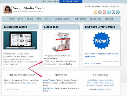
- Testimonials from customers, experts or advocates are a great way to assure your website visitors believe in your credibility. Cendrine from Social Media Slant uses them on her home page in the screenshot below, but you may like to use testimonials on sales pages, in your right sidebar or on your ‘About Us’ page too.
- Social proof can also come in the form of product reviews or ratings. Amazon is a high profile example of this tactic contributing to popularity and sales. If you write a book for, or sell a product on Amazon, the likelihood of it being found in searches or on the ‘Best-Seller List’ is determined by a number of factors; one of which is the amount of positive user reviews. iTunes have a similar algorithm for podcasts. Tip: Authors and podcasters VALUE reviews on these platforms, if you are hoping to connect with them this is a great starting point.
- Use media logos to show off where your brand has been featured. For example, many bloggers guest blog for credible brands in their niche as a way of boosting their own authority and include those logos on their own site. Another example of this is if your brand has got some traction in the news with well known publications, you may like to include these logos on your site. Bryan Collins from Become A Writer Today uses his right sidebar to do so in the screenshot below.
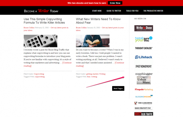
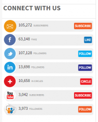
- Subscriber counts and social connections reinforce your credibility as a thought leader. The Content Marketing Institute use this element of social proof extremely well by strutting their follower counts in the sidebar of their blog, see below.
- In a similar way to testimonials, customer stories deepen the belief your potential customers have in what you have to offer. The idea of a customer story is to capture the exact challenge one of your customers has had and how they solved that challenge with your help. This way other people that have a similar challenge will be able to see themselves overcoming it too. It is common to use this type of social proof in an automated email series, but these stories will also add value to the layout of your blog in a post or on a case studies and testimonials page.
- For each individual blog post the number of social media shares and comments associated to that post is a way for readers to determine if it is worthwhile reading. If lots of other people have already shared or commented on a post, readers feel more compelled to click on the link and read it themselves. Therefore it is important to show your ‘Comment Count’ and ‘Social Media Shares’ for blog posts.
11. Vary your media
Video is awesome. People love engaging with it, it personalizes the website experience and gives visitors the opportunity to consume lots of information in a short period of time.
But don’t over do it. Using too much video (or any one form of media) results in a loss of impact.
instead what you will want to do is pick the most important pages on your website, and include simple yet engaging videos that accompany the other copy on the page. Usually these will be sales pages and the ‘Home’ or ‘About Us’ page.
I made a mistake by using YouTube as my video host. It has an unprofessional feel about it and ends with snippets to external content after a user watches the video. Wistia or Vimeo are far more professional alternatives.
To-do: Move video hosting over to Wistia
12. Use snippets on your main blog page
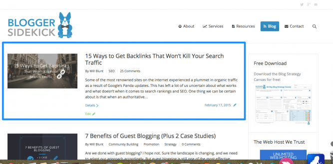
On your main blog page (for some sites this is the home page) it is important to show a preview of your blog posts rather than the whole thing. This preview is called a snippet.
Why should you show a snippet instead of the whole post?
- It reduces duplicate content – Duplicate content on your site can result in a penalty from the Google search algorithm. If you show a stream of entire posts on your main blog page, as well as links to the actual post, this can create duplicate content.
- It reduces your bounce rate – If a new visitor lands on your main blog page and they can read all of your posts there, they have no reason to click onto another page of your site. Instead if you entice them to click on a post by displaying a snippet, this reduces your bounce rate for the main blog page. Bounce rates are another factor search engines take into account when ranking pages.
- It allows readers to scan your content. Your most recent blog post may not resonate with a new visitor. However, they may be interested in a post you made 3 or 4 blogs ago. By showing short previews of your post, it displays more of the available content near the top of the screen allowing readers to scan for content they may like.
See an example of how snippets are used on our main blog page below.
13. Make commenting easy and visible
Comments on your blog are a clear indicator of audience engagement. There are some high profile sites and bloggers that have disabled comments on their blogs. This may be due to spam, or perhaps they don’t feel they have time to respond to comments so they choose to disconnect them.
Please don’t do this!
As an avid blog reader I love the opportunity to connect with bloggers via their comment section. By taking this opportunity away from me as a reader, you are creating distance. This distance feels cold and unwelcoming. If your goal is to build a community (which it should be), then the last thing you want is to create this feeling among your visitors. The most inspiring people empower readers to feel like they can do it themselves, not that they are reading something from a superhero.
There are a few things to consider when designing your blog comments section;
- You must make it easy for readers to comment in only a minute or two
- Readers should have a choice to include a link back to their own site in your comments section – usually this link is embedded in their name, depending on what comment system you use
- Include the comment count on the blog snippets page so people can see how much engagement a post has received
- Monitor your comments so that spam and ping backs are not cluttering the space. (Akismet is a WordPress plugin that can help reduce spam in your comments)
I recommend the Disqus commenting system, which is what we use here at Blogger Sidekick. It is visually appealing to readers, connects to your social networks and is integrated across lots of other popular blogs.
14. Encourage social sharing on every page
Social media is is one of the core ingredients for promoting your blog content and building your community. Therefore you want to make it easy for your readers to share each and every post.
From a design perspective there are a couple of things you can do;
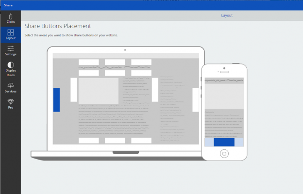
- Use social sharing plugins to encourage readers to share your content on every page. The best type of social sharing buttons are ones that float as the reader scrolls down your page. Neil Patel from QuickSprout experienced an increase in social traffic of 27% by including ‘floating buttons’. I use SumoMe for Blogger Sidekick – It is free, easy to use, looks fantastic and also shows you some nice analytics. Plus it is mobile optimized! Have a look at the screenshot below for all the places (The white and blue rectangles) you can choose to include the social sharing buttons on your blog using SumoMe. Adam Connell wrote a great post about WordPress social sharing plugins on Blogging Wizard if you want to look at alternative options.
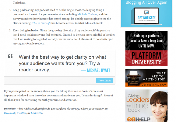
- Include Click-to-Tweet boxes (There is a WordPress plugin for this!) within your posts that help readers promote bold statements or quotes from your copy. See an example below from Michael Hyatt.
- Show your Twitter or Facebook feed in the right sidebar on every page – I talk more about what to include in the right sidebar in section 16 of this post.
- Have ‘Connect on Social Media’ links where you think it is relevant. Some examples include your right sidebar or the header or footer of your page.
15. Choose a blog design layout that is easy to read
If you want visitors to read your content, optimizing your font and blog design for readability is important.
Here are some simple principles to increase readability on your blog;
- Use font that is big enough for readers to consume, 12-point is the optimal size. Some of the most successful online publishers such as Search Engine Land and Mashable use 12-point font size.
- Break up your posts with sub-headings and dot points so readers can scan your copy and quickly consume the key points.
- Make headlines much larger than the body of your text. Typically headline fonts will be between 17 and 25 point.
- Have a light background with dark text – 98% of the best blogs use this combination as it increases the users ability to comprehend what you are talking about.
16. Include a right sidebar
I’ve been mentioning the right sidebar of your blog quite a few times during this post. The right sidebar offers an opportunity to include a bunch of great information for your readers, without detracting from the core content on a page – the actual blog post. It’s important that the sidebar is on the right hand side with the main content on the left hand side. This prevents any confusion about what readers should focus on as a priority.
So what should you include in the right sidebar of your blog?
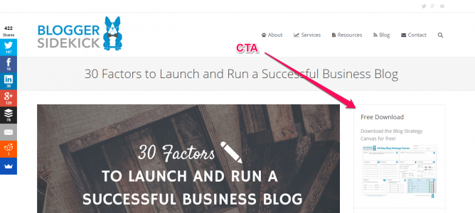
- Calls-to-action (CTA); Your most important CTA should be at the top of your right sidebar, this is one of the highest converting areas on your website. Some common CTAs you may like to include in your sidebar are; a link to download a free resource, a promotion, social media follow buttons, email list signup, affiliate links or links to other valuable content such as podcasts and videos. Below you will see the CTA I use here at Blogger Sidekick to the Blog Strategy Canvas download.
- Popular posts and categories; Once someone is reading a blog post, your right sidebar is a great opportunity to get them to discover more of your content. The easiest way to do this is to include ‘Recent Posts’ or ‘Categories’.
- Social media feed; Including your Twitter feed in the right sidebar will let your readers know what type of content you are sharing in real-time and increase your chances of growing your social following. You can see an example of this in the right sidebar on this post.
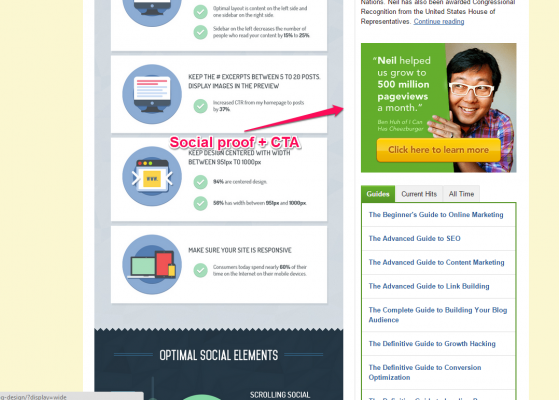
- Social proof; Your right sidebar is a good piece of real estate to include media logos or client testimonials that boost your credibility. You can take this to the next level by combining a testimonial with a CTA like Neil Patel has done below on his Quick Sprout blog.
17. Use header images in every post
As an extension of your website design, brand style and blog look and feel you want to include a header image on every post. Blogs with a header image attract more readers, and its because they simply look better. If you can, it may depend on what type of site you run, it is a good idea to replicate the header image both at the top of your blog post AND on the main blog page next to your preview snippet. This is something I do here at Blogger Sidekick.
Your header image plays a big part in the experience your readers have on your blog, as well as adding to your brand style and perception. With this in mind you want to create some consistency with the type of images you use. It’s best not to use stock images; these create a cheap, generic feel about your blog. They don’t add any value to your brand and won’t connect with your readers. See an example of a stock image below.

Instead, create images that are unique to your brand. Think about using a service such as Canva to create an image with text on it, this text will most likely be your blog title or a catchy quote. I use Canva for all of our header images.
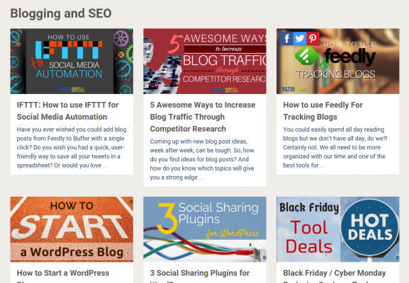
One of my favorite blogs is Razor Social by Ian Cleary. He has nailed it when it comes to creating a consistent look and feel about his blog and the header images he uses. Check out what I’m talking about in the screenshot below.
Conclusion
There is no perfect blog design. But the principles I have offered in this post will help guide you when you are making choices about how you represent your brand online.
As you can see, I am far from perfect. But I’m willing to learn from others, pivot and keep improving over time. I hope you decide to come on a similar journey.
Here is what I’m committed to doing;
- Create a professional header image for the home page
- Develop a ‘Start Here’ page for new visitors to the site
- Eliminate all dead-end streets by having a ‘Thank You’ or ‘Next Steps’ page after opt-ins
- Audit and optimize the ‘About’ section based on the principles in this post
- Visually align all CTAs with the Blogger Sidekick brand style
- Shift video hosting from YouTube to Wistia
What are you committing to? Let me know in the comments section below!
![]()
About the author
Will Blunt is the Founder here at Blogger Sidekick and Managing Editor at both JeffBullas.com and Bluewire Media. Get in touch to schedule a one-on-one chat and discuss how we can help you build an authority blog, without burning out or spending your whole budget.









![Toni Kroos là ai? [ sự thật về tiểu sử đầy đủ Toni Kroos ]](https://evbn.org/wp-content/uploads/New-Project-6635-1671934592.jpg)


