7 resume design principles that will get you hired
As anyone who’s ever been looking for a new job can tell you, job hunting is stressful. Not only is it infused with agonizing uncertainty, but you also need to put your best foot forward in a one-page resume that’s supposed to sum up who you are, what you’ve accomplished and where you’re going. That’s no short order, but don’t forget your resume design, too
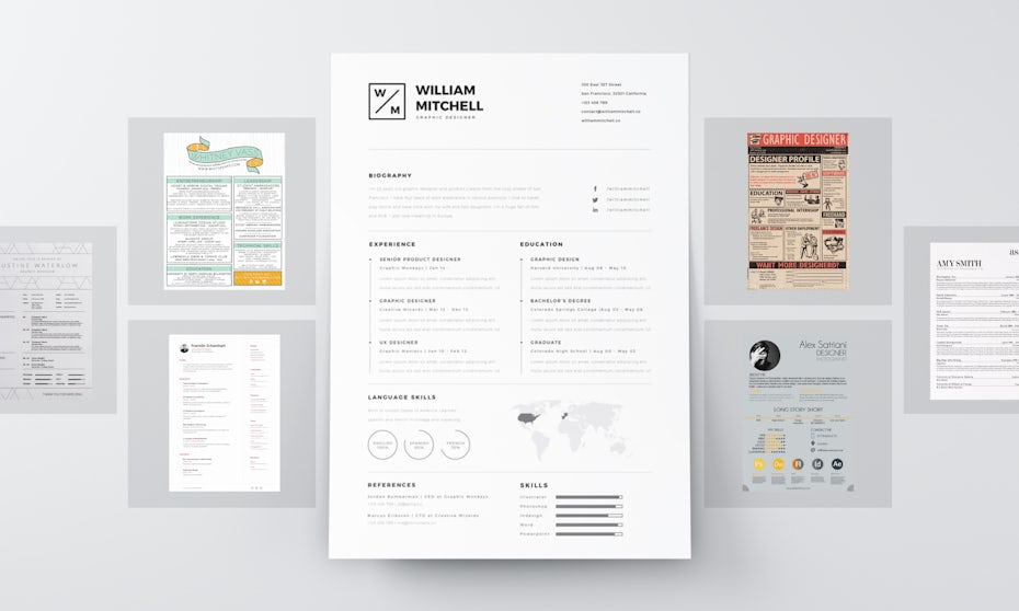
The way you present the information is just as important as the info you include, because hiring managers are going to notice your resume design before they even read a word.
While that might feel like even more pressure, it’s actually good news. By taking the time to refine your resume design, you’ll increase the odds that it will stand out from the pack. Take a look at these seven resume design principles that will help you rise to the top.
Mục Lục
1) Choose the perfect font
—
Using a unique font can be a simple way to make your resume stand out from a sea of Arial and Times New Roman. There is no right or wrong font when it comes to resumes, but here are a few basic guidelines to keep in mind:
- Make sure any font you use is legible both on a screen and in print. Keep font sizes between 11 and 13 points. Any smaller than that, and even the sleekest font risks becoming illegible.
- Be consistent with how you use different font sizes. For example, all headers should be the same size, as should all body text.
- Sans serif fonts are usually a good option for more creative or digital fields. Serif fonts still have their place in more traditional or old-school industries.
- Avoid using Comic Sans. Not only is it widely despised by people in the design industry, it gives off an childlike vibe. The same can also be said for Papyrus.
 Sans serif
 Sans serif + script
 Serif + sans serif
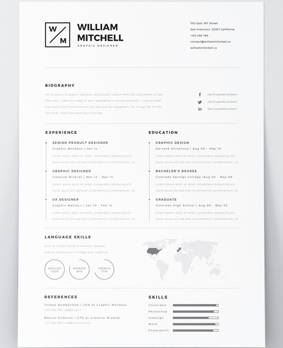
Example #1: Sans serif
This resume is using “Montserrat”, a font found in the Google Fonts database that can be downloaded for free. Notice how the font allows for the entire resume to be read with much more fluidity than a traditional “professional” resume. The font usage and overall design leads me to believe that this resume would be perfect for someone applying for a more creative or design-oriented job.
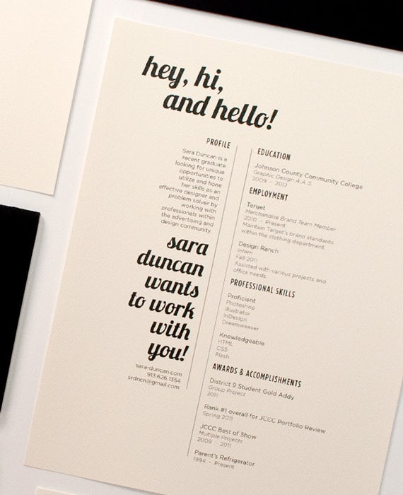
Example #2: Sans serif + script
This resume is using “Lobster” for the script headings and “Montserrat” for the body content. While this resume uses the same body font as the example above, the effect of the resume is much different. This goes to show that sans serif fonts, such as Montserrat, have a lot of versatility when used in resumes.
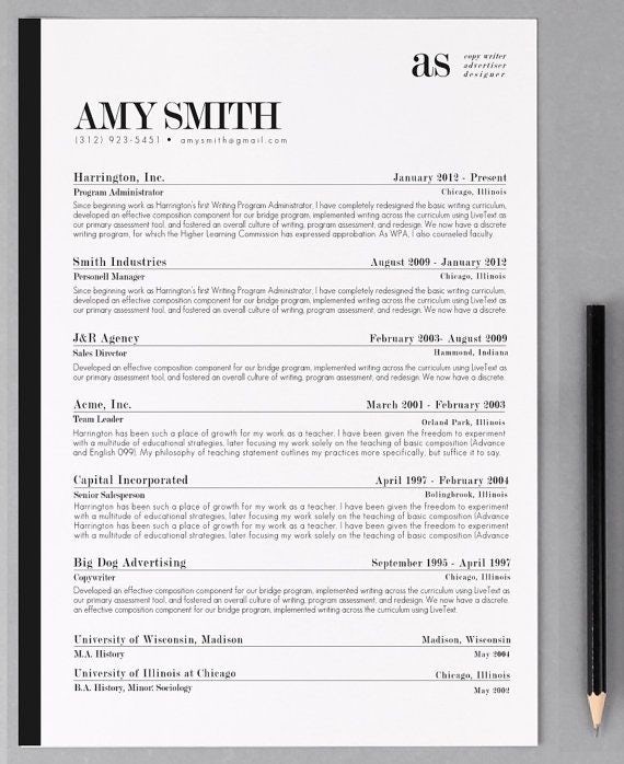
Example #3: Serif + sans serif
This resume is using “Playfair Display” for the serif heading fonts and “Futura” for the body content. Serif fonts can be successfully used to create a professional, yet captivating resume. The key to using a serif font with a sans serif font is to find two fonts that both compliment and contrast. Here are some great tips to help you pair fonts.
What do fonts say about you?
Details matter. And since your resume is the first thing a potential employer will see, you want every aspect of it to speak to who you are. The font you choose for your resume plays a big role in what the reader will think about you. Remember, this person has (most likely) never seen your face, met you, and doesn’t know anything about you. Your font can speak volumes about who you are and, if done well, provide the reader with a positive first impression.
Here are some basic guidelines for choosing a font to match your personality:
- Serif: Serif fonts come in a variety of different styles. They’re most often associated with professional settings. If you’re analytical, technical, and logical, try using a sans serif font.
- Sans serif: Sans serif fonts are much more clean and modern in their appearance. Like serif fonts, they come in a variety of different styles. If you’re creative and design-oriented, try using a sans serif font.
- Script: While not as widely used in resumes as serif or sans serif fonts, script fonts can be used successfully. If you’re fun, warm, relaxed or easy going, trying using a script font in your resume.
- Thin: Sometimes you need a font that isn’t going to stand out. In that case, a thin font would be best. If you’re more reserved, quiet, or calm, a thin font would work well.
- Blocky: Other times, you need a font to be in your face. For example, your name, certain contact information or important headings. If you’re extroverted, outgoing, or expressive, try using a blocky font.
Don’t be afraid to use two different fonts if they say something about you that you want to reader to know. Look at the examples above again. They combine fonts to create a distinct style and help the resume describe the job seeker’s career and personality in a way that words cannot.
Font resources
You don’t have to be limited by the fonts in your word processor. Use these resources to find new, unique and even unusual fonts to use in your resume.
2) Add visual emphasis to your contact info
—
If you want recruiters to contact you (and, if you’re applying for a job, presumably you do), make it easy for them.
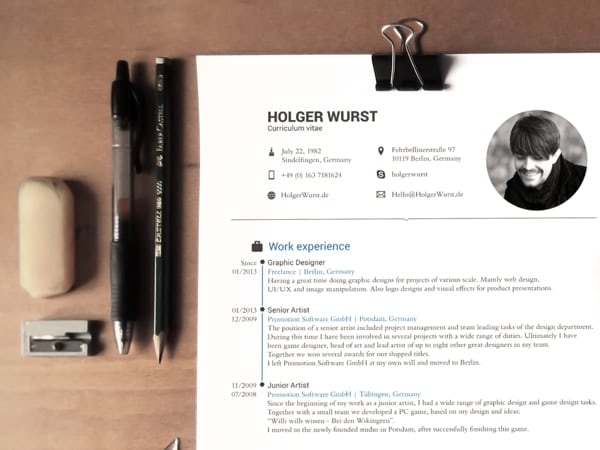
Make sure the contact section is visually prominent by placing it at the top of the page. If you’re submitting the résumé electronically, include a live link for your email address. Depending on the industry in question, it may also be valuable to include live links to social media profiles.
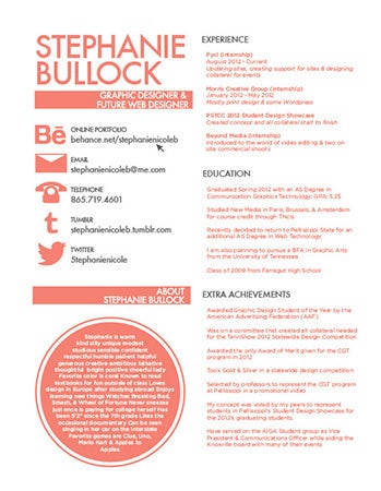 Use icons.
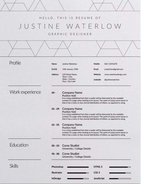 Use white space.
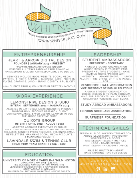 Use color.
Example #1: Use icons
Both elegant and effective, icons are one of the best ways to make your contact information prominent while not detracting from the “meat” of the resume. Font Awesome is a great icon resource you can use with your word processor, Photoshop or Illustrator.
Example #2: Use white space
If you’re going for a more professional or minimalistic approach with your resume, use space (or lack thereof) to make your contact information more pronounced. You’ll notice in the above example, it’s much easier for the eyes to go from phone number to email to website because of the appropriate use of whitespace to break up the content.
Example #3: Use color
One of the simplest ways to draw a resume reader’s eye to your contact information is through the use of color. This can mean sectioning off the contact information and using a different (complementary) background color like the above example or even just making the text a different color. The key is to make the contact information stand out but not in a way that is distracting to the reader.
3) Make content skimmable
—
The human brain is bombarded with content from the moment we wake up to the moment we go to sleep. Emails, text, breaking news—it’s almost impossible to read every single word. So, we found a way to cope with all of it by skimming content to get the gist.
Resumes are no different. Research shows that HR reps will spend about six seconds on your resume. Make the most of those precious seconds by ensuring your resume is skimmable.
Use columns
Columns allow you to fit in a lot of info without making the design look over-crowded or pushing your resume to more than one page (which is a major no-no in most industries). They also help make your resume more skimmable—leading to a higher chance of actually being read.
Your resume will look more visually interesting if you divide it up into two columns that are different sizes. Then, get creative with how you use these different columns. For example, the smaller column could highlight some of your most impressive achievements, while the larger column could list more detailed data such as job descriptions.
Format your content
Use headings and subheadings, and include bullet points for lengthier descriptions. Keep your copy as brief as possible, and leave plenty of white space on the page so it doesn’t look overwhelmingly cluttered.
While you want to include as much information as possible to properly describe your professional strengths, you don’t want your resume to become a wall of text. In this case, less is more.
4) Consider an infographic
—
Infographics can take your resume to the next level. They allow you to visually explain certain things that words cannot.
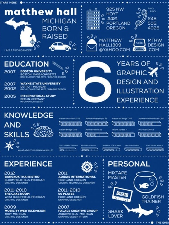

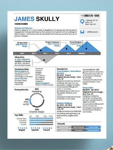
But don’t forget to know your audience. If you’re applying for an administrative role at a traditional company, a highly graphic resume design may push the bounds of conventionality. But if you’re applying for a graphic design job or a position at a younger startup, an infographic resume may be just what you need to stand out from the pack.
5) Follow industry norms
—
We’ll say it again. The type of role you’re applying for should influence your resume design.
If you’re applying for a job in publishing, consider using a classic font. A job as a web designer? Consider adding some colorful elements to a print resume or even whipping up a digital resume to really showcase your skills in action.
If you’re applying for a role as an administrative assistant, you may be better off steering clear of unconventional design elements. (In other words, columns are probably as wild as you should get.) Multiple jobs? Create multiple resumes depending on what turns up while you’re researching your target companies.
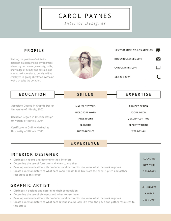 Interior designer resume
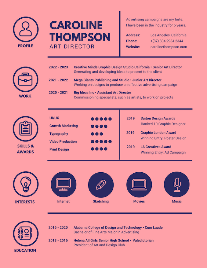 Art director resume
 Photographer resume
No matter your industry, you’re probably better off steering clear of anything that’s too over-the-top. Glitter, scented paper, folded-up résumés and the like will certainly stand out—but not necessarily in a good way.
The goal is to create subtle nods to creativity and innovative thinking without going so far beyond the bounds of normalcy that you turn off potential employers.
6) Add a personal design touch
—
Even if it’s not a good idea to use unicorn stickers on your résumé, you can still find ways to add a personal touch through design.
For example, you might utilize a custom typeface, borders, shading, tasteful pops of color and so on. Just remember that if someone prints out a resume that’s been submitted electronically, they may not do so in color. Make sure it looks good and remains legible even in black and white.
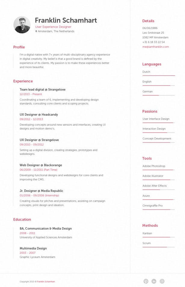 Go clean
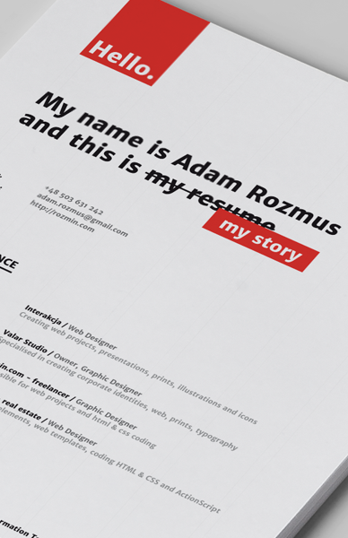 Go unique
 Go bold
Example #1: Go clean
This resume is clean, minimalistic and efficient with its use of text. While it’s conservative in its design, the pinkish color of the headings and important details adds a unique element that speaks volumes about the job seeker’s personality.
Example #2: Go unique
While somewhat similar to the first example, this resume shows the job seeker has an air of unconventional thinking. They show that they think outside the box by crossing out “my resume” and replacing it with “my story”. And that’s what your resume should be—a one page description of your professional journey.
Example #3: Go bold
This example shows it’s okay to be bold. Often times, there are hundreds of other candidates vying for the position you’re applying to. You want to stand out and your first impression is your resume. Don’t feel like you have to follow the conventional resume standards to get the job you want.
7) Use the right file type
—
You can invest hours in designing the perfect resume, but it won’t do you any good if you save it in the wrong format. Save your resume as a PDFs so there’s no risk of the formatting getting messed up when it’s opened by a hiring manager. If your resume looks wonky when it’s opened, that’s going to seriously undermine your professionalism.
Also, don’t ignore your filename! Just using the word “resume” can convey a lack of attention to detail. Include your first and last name and the word “resume”; you might also include the company’s name in the file name. This makes life easier for hiring managers and conveys thoughtfulness on your part. For example: “JaneDoe_Resume_ABCInc.PDF”.
Next stop: hired!
—
There’s a reason everybody says that searching for a new job is a lot like having a job: Taking the time to create a well-designed resume tailored to a specific job at a specific company takes time. But the good news is this time is well spent. A carefully designed resume that is pleasing to the hiring manager’s eye and effectively features your accomplishments (and even a little bit of your personality) will significantly increase the chances that your resume makes its way to the consideration pile.
Need some help designing the perfect resume? We’ve got graphic designers from all over the world ready to help you!
SaveSave








![Toni Kroos là ai? [ sự thật về tiểu sử đầy đủ Toni Kroos ]](https://evbn.org/wp-content/uploads/New-Project-6635-1671934592.jpg)


