21 Business Website Examples to Inspire You
Not all business websites are created equal. Some are jaw-droppingly amazing, while others can be uninspiring and a little untrustworthy – how about yours?
If you run a small business, your website design is as important as everything else you do.
A good business website shows that your brand is credible, professional, and worthy of people’s custom. So, are you ready to wow potential clients?
We’ve found 21 standout business website examples, with layouts that are guaranteed to inspire you.
Find the design elements that you love, and then get ready to create your own website.

Build, brand, and grow your business with Zyro
TRY FOR FREE
eCommerce
Launching an online store? See what design ideas you can pick up from these Zyro eCommerce website examples:
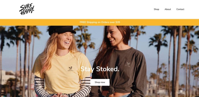
A bright color palette, smiling models, and photos of sunny skies – Surf Happy’s website reflects exactly what the brand is all about: positivity.
The homepage design is simple, with a clear call to action (CTA), a minimalist navigation bar, and clear brand values. As visitors scroll, more CTAs direct them to the product pages.
Check out the image hover effect used on the product thumbnails, which gives the user more detail without making the layout clunky or confusing.
Top tip: Combine the use of white space with big, bold photos that reflect the personality of your small business.
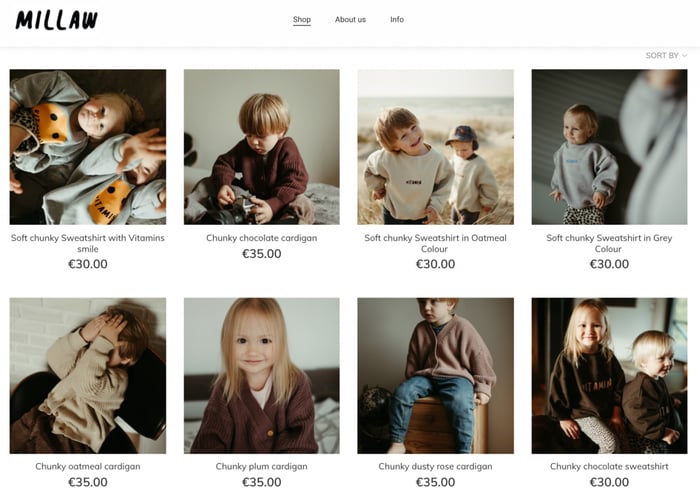
A lot of small businesses that sell products only have a small range – just like this cute kids’ apparel store. If your brand is the same, use the home page to your advantage.
This website displays its adorable products just below the hero image, so potential customers are drawn into shopping right away.
Each page has a minimal design that reflects the values of this small business. If your company has a simple objective, don’t be afraid to create a simple site.
Top tip: Fill your small business website with plenty of professional photos that do all the talking – especially if you don’t have much to say.
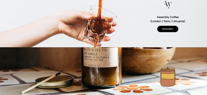
Some of the coolest small business websites have specific niches, just like this impeccably chic online store. Selling coffee, candles, and honey, Forrest is all about a lifestyle.
We love the cool scroll effect on the product landing page, which incorporates subtle animations above the CTAs to catch the visitor’s attention.
This brand does a great job of bringing together three very different categories by using muted colors, crisp photography, and clever website design.
Top tip: If it’s unique to your company, let your product line inspire the color palette on your small business website.
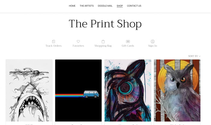
If you started a small business because of a personal passion, why not feature yourself on the home page? That’s exactly what Chelsea’s done over at The Daily Doodle – check it out.
Using a minimalist design and a monochrome color palette, this eCommerce site gives potential customers a great insight into the roots of the business.
In the navigation bar, alongside links to the shop and contact details, is a link called ‘Doodle Mail’. What is it? You’ll have to click to find out.
Top tip: If you offer unique services, don’t be afraid to make them stand out on the homepage. Let users be curious.
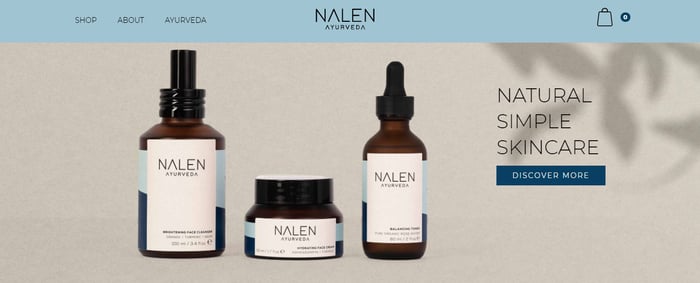
This small business website is an excellent example of subtle responsive design. From the top bar to the product thumbnails, the user can interact with the site using their cursor.
Subtlety is key with the web design here, which reflects the tranquility of the brand itself. In fact, the colors match those used on the product packaging.
An impressive hero section is essential to any website: this is the first part that people see. Make them pay attention, like this site, with strong branding and imagery.
Top tip: Interchange photos with illustrations as a way to inject some extra personality to your small business website.
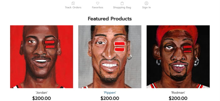
If you’re serious about creating a minimalist website and you have show-stopping products, take inspiration from this simple eCommerce website.
With a featured products section taking over the homepage, all eyes are on the bold colors of this small business owner’s artworks.
It’s a cool idea for a brand that already has customers or a following on social media – if people already know who you are, your website can be as simple as you want it to be.
Top tip: It’s always tricky for businesses to stand out, so only go super-minimalist if you know that your target audience will find your website user friendly.
Services
Want to impress potential clients with your professional services? Draw inspiration from these website examples from various different industries:
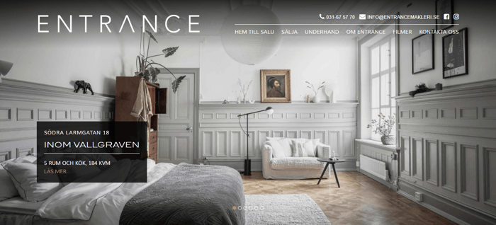
This real estate business, based in Sweden, puts standout photography at the center of its website design. Check out the high-impact homepage.
With a horizontally sliding deck of images which take over the whole screen, it makes sense that the website uses unobtrusive white typography.
The result is a sleek, professional layout that will stop visitors in their tracks. Who says all real estate businesses should look the same, after all?
Top tip: If you’re using full-page photography to help your business stand out, make sure your page loading speed is lightning fast.
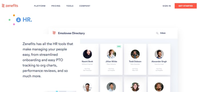
The homepage of this professional software website takes responsive design to the next level. Users get a comprehensive product demonstration, simply by scrolling.
This is a great example of a bespoke web development and design process, so if you’re paying professionals to build your business website, take note.
Using vibrant colors against a mainly white background, this information-packed website design is guaranteed to impress other businesses.
Top tip: Create and refine a flow chart to visualize what your brand’s scrollable product demonstration would look like – don’t overload people with too many details.
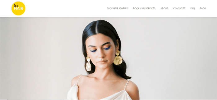
This small business website has many different purposes: it offers services, sells products, and features a blog, too. But there’s nothing confusing about the site layout.
Using a sophisticated palette with beautiful images overlaid by bold fonts, the website directs potential customers to the brand’s main services from the landing page.
In the meantime, users can find the store and blog via the navigation bar. This is a great example of how to organize your site when you have plenty of content to share.
Top tip: Use the same website design elements on every page, including features like the blog, contact page and online store.
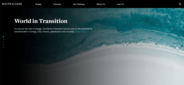
Legal websites – they’re boring, right? That’s not always true, and this site can prove it. Take a look at the dramatic full-page photos that fill the homepage.
If you want your company to be taken seriously, there’s no need to simplify the message you put out on your website – just simplify the web design.
This business website makes use of bright white text, minimalist navigation, and a library of high contrast landscape images. The result is serious yet sleek.
Top tip: Add authority to a small business website by using high-quality photos that you can guarantee are unique.
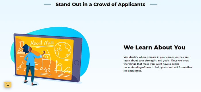
Go big with your small business website, and create a layout that wouldn’t look out of place on a popular startup site – use Upkey as your inspiration.
Providing careers tools to students, the company uses its homepage and a range of custom illustrations to describe the user journey. That way, users are hooked right from the start.
The clean and bright contrasting colors make the site feel super professional, and trustworthy enough for customers to buy into the digital products on offer.
Top tip: Consider color psychology when it comes to your website design. What will your choice of colors say about your business?
Restaurants
Can your homepage make people hungry? If you’re a foodie entrepreneur, these website examples will help you find a recipe for success:
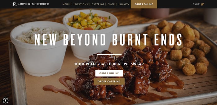
One advantage of having a business website is the number of growth opportunities. Want to set up a loyalty program or offer mail order? This is your chance to try.
Take a look at this appetizing site, which features a ton of different services. Thanks to a sleek black, white, and gold color scheme, the user journey doesn’t feel compromised.
Instead, the website design is easy to navigate and inspiring, too – if you like burgers, it’ll be hard to resist buying from this business.
Top tip: Divide your homepage into segments so that you can share information in a clear way – Zyro templates make this easy.
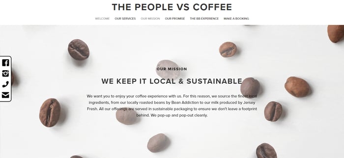
This coffee truck business website is packed with cute, responsive features. The logo moves as you wiggle your cursor, and there’s a fun illustration further down.
A lot of small businesses like this benefit from a simple one-page design. Not only is it on-trend, but it’s also an easy way to maintain a website.
With a one-page layout, all business information is on the homepage, which makes the user journey feel effortless. Could this be your new website design?
Top tip: Keep the user journey intuitive, and include a navigation bar at the top of the page – that way, visitors can jump to the section they need.
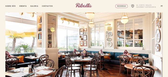
Who said a pizza restaurant website couldn’t be beautiful? This Lisbon-based business has an eye-catching and perfectly color-coordinated site.
There are some cool responsive features as you move down the homepage, like horizontal scrolling text and moving images, but the overall design feels effortless.
All of the photography used on the site goes perfectly with the background and typography colors, making for a remarkably zen user experience.
Top tip: If your small business has a physical location, use similar tones to the interior décor on your website to tie any location photography into the site design.
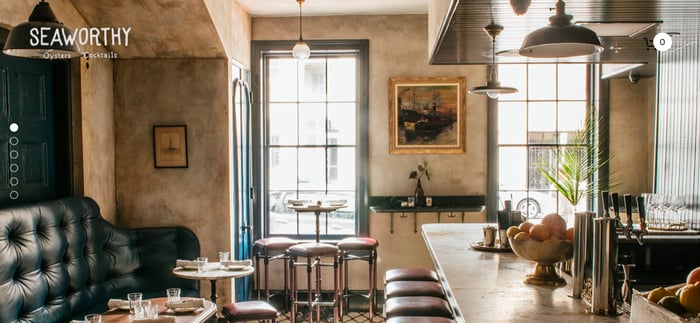
Of course, no business website can truly capture the essence of a physical location, especially if you run a beautifully-decorated location. But this example does a great job.
Showcasing a restaurant in New Orleans, the website uses a custom typeface, close-up photos, and sweet illustrations to bring the venue to life online.
If you’re visiting the area and you love seafood, it’ll be hard to leave this beautiful one-page website without booking a table first.
Top tip: Use your small business website to promote another small business. Know a great local illustrator? Ask them to produce some custom graphics for your site.

By now, you might be feeling hungry. The homepage of this pasta restaurant’s website is a vivid photo of delicious-looking pasta, with buttons leading to each location’s pages.
Once you click on your preferred location, slow motion videos of food being prepared take up the whole screen – talk about attention-grabbing design.
Although the rest of the website is well-considered, with a neutral palette and simple navigation bar, the real showstopper is the food imagery.
Top tip: If you’re making a small business website for products like food or fragrance, embed sounds and videos to give people a better understanding of them.
Agencies
Need your web design to do all the talking? Build a beautiful website using these showstopping design examples as your guides:

Creative businesses have to do a lot to stand out online, and this website doesn’t disappoint. The vibrant video reel on the homepage feels like an art exhibit.
We love the slot machine style text animation that happens when visitors scroll through the site, paired with ever-changing background colors.
Navigation has been thought about, too, with social media icons to the left, and a sideways link to a contact form on the right.
Top tip: Your business website is a chance to show off your brand’s achievements, so use Cult as inspiration and make it the main focus.
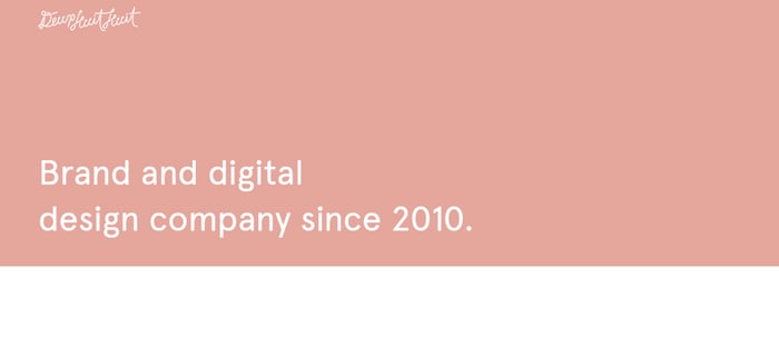
There’s so much to find cool about this brand agency business website, from the color-changing backgrounds to the oversized, horizontally-scrolling text.
Deux Huit Huit’s homepage acts like a newsletter for the brand, with features right below the fold about career openings and the latest business activities.
This is a fun way to boost website engagement by showing visitors some interesting features as soon as they arrive. Plus, all the in-house design is just really cool.
Top tip: Can’t decide on colors for your small business website? Use this site as inspiration and opt for an ever-changing, multicolored background.
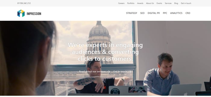
Another website that uses video to engage its visitors, this digital marketing agency puts its team at the center of the site design.
If you’re creating a small business website for client services, try incorporating features like video, image reels, and a blog to showcase what you can achieve.
With all the focus on what it is your team does, the website itself doesn’t have to be too fussy – use plenty of white space and a handful of highlight colors.
Top tip: Break down what you can offer potential clients in a simple way. Use icons to illustrate your business functions for them.
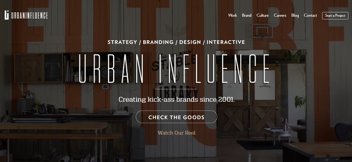
Video on the homepage? Check. Sleek text overlays? Check. Here’s another effortlessly cool example of a small business website for a creative agency.
Although it’s best to stick to only a couple of typefaces on your website, this one somehow uses several – all in one place – and it looks great.
If your brand’s identity is confident and daring, it’s often worth taking risks with your web design to ensure that you stand out. What design rules could you break?
Top tip: Find a strong tagline or hero statement for your business, and display it with pride in the hero section of your website homepage.
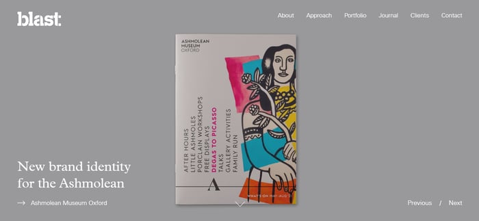
Using its hero section to catalog the company’s latest achievements, this website is instantly engaging. Visitors are able to control what they see using ‘Previous/Next’ buttons.
Beyond the impressive section above the fold, the rest of this site is simple yet colorful, utilizing a white background to help its featured pages stand out.
This is a great example of a small business website that makes a great first impression, even if it’s the only complex feature on the site.
Top tip: Write short but impactful statements about your business on all of the key pages, to make sure visitors go on a journey with you.
What makes a good business website
A business website is the online home of your brand – it should give at least an insight into what you sell and why your company exists in the first place.
The most effective business websites influence site visitors into making a purchase or relationship with the brand.
They’re also key to reaching new customers. Your business website is open 24/7, meaning people all over the world can see what you do at any time.
Here are the web pages every good business website can include:
- About us. Share your brand’s mission statement and values.
- Product pages. Show potential customers what you’re selling.
- Blog. Keep visitors up to date with business news.
- FAQ. Answer some of the most common questions your company is asked.
- Contact. Encourage people to communicate with your brand.

Build, brand, and grow your business with Zyro
TRY FOR FREE








![Toni Kroos là ai? [ sự thật về tiểu sử đầy đủ Toni Kroos ]](https://evbn.org/wp-content/uploads/New-Project-6635-1671934592.jpg)
