15+ Personal Logo Ideas and Examples – Weblium Blog
The personal logo is an important part of your personal branding, it is a trademark associated with a specific brand. This is an individual graphic sign (image), the font type of the mark, or the combination of these two fundamental elements of logo design.
The purpose of personal logos is to bring the idea of a personal brand to the target audience. But how to create the right, and, most importantly, original logo?
Someone thinks that the logo is just a beautiful picture. However, the creation of a logo is the first step towards the creation of a recognizable brand.
Also, it often seems that you can easily create your personal logo design yourself. But, please, don’t kid yourself! A professionally designed logo will help bring about the necessary, persistent associations with your brand, draw attention to it, make it stand out from the crowd, increase brand memorability and the effectiveness of advertising campaigns and, in general, become the foundation for building the image of every young brand!
We have prepared 15 best personal logo examples that might become great ideas for creating your own, perfect logo!
Obradov Design (interior designer logo)
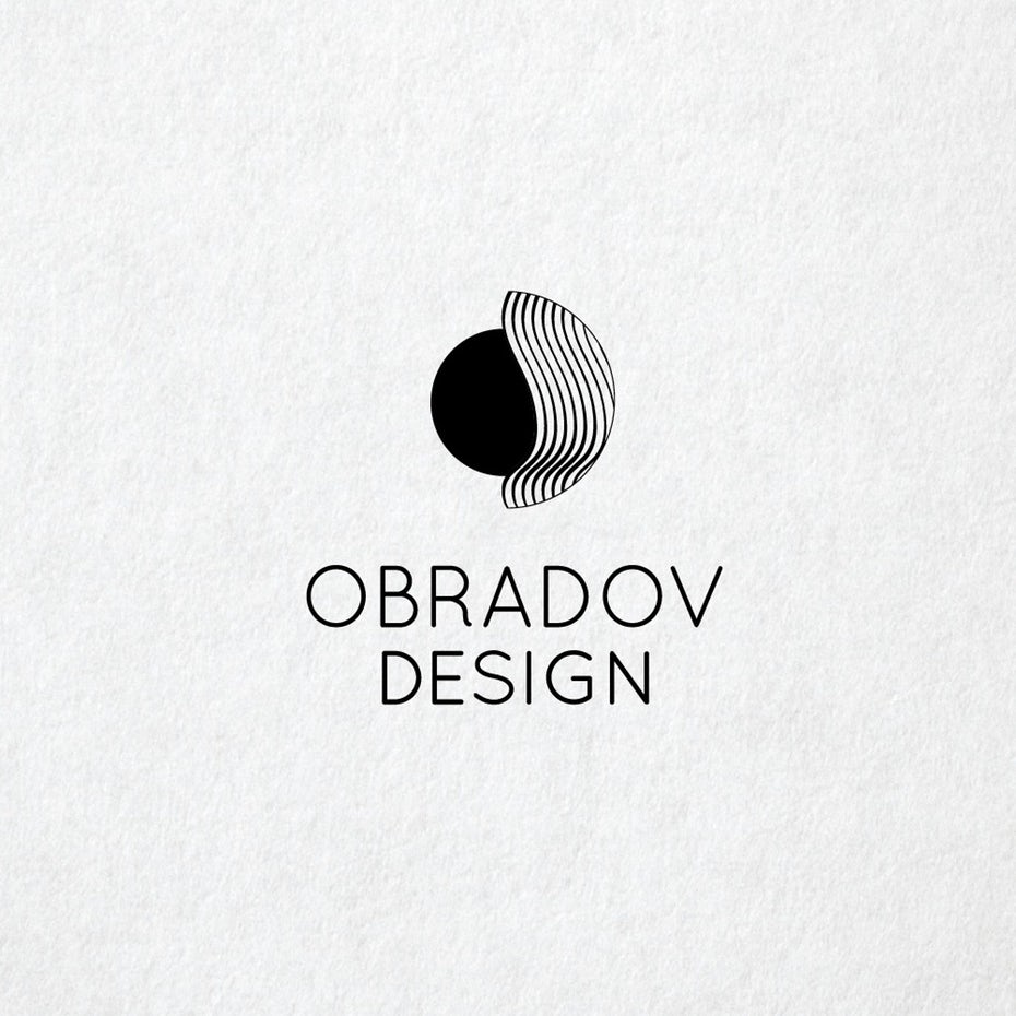
This is one of our smoothest personal logo examples. It perfectly conveys the essence of the service. The composition of the logo consists of a circle and a spherical shape framing it. The geometry of the picture shows the ideal relationship between two elements existing in space. It’s a great logo idea for the interior designer!
We’ve told you that the black and white logo can clearly show the idea of the brand!
Mon573 (graphic designer logo example)
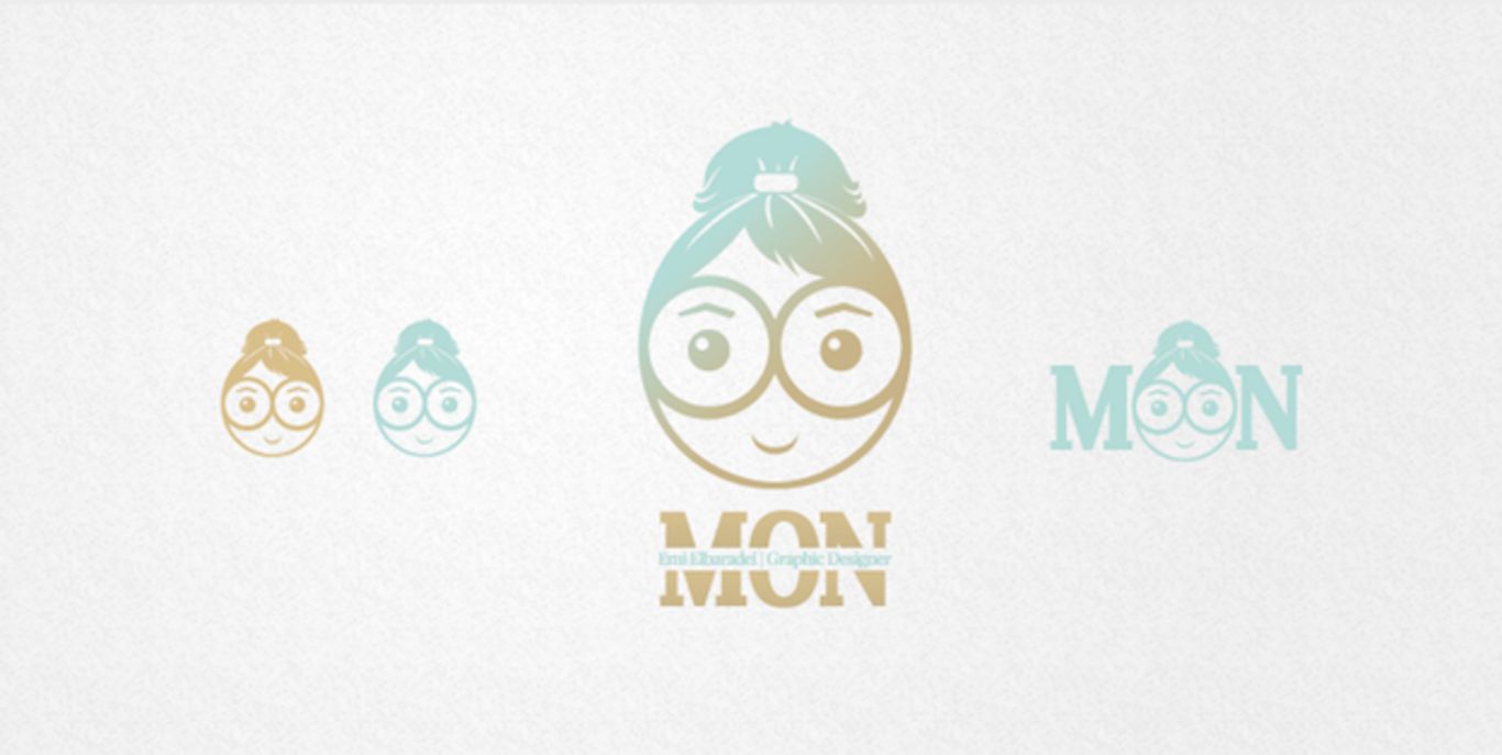
This is one of our favorite about me logos. Mon designed her logo using the soft pastel colors. It breathes with serenity and for some reason, it resembles… a wrapper of a bubble gum we remember from our childhood. It really creates pleasant, nostalgic feelings.
Indeed, there’s a kid still living in the designer’s personality. Here is how she describes her logo: “This is just my abstract portrait. Maybe this is what my face looks like when I’m creating something. I simply put on my huge glasses, make an updo, and stare at the monitor with my eyes open wide”!
Oliver.strom (graphic designer, award-winning personal logos)
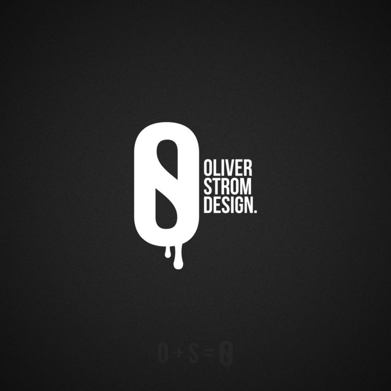 According to Oliver’s own words, this graphic designer’s personal logo idea comes from the good old days when the computers were bigger. The designer was making his sketches using the water coloring, then drying and simply scanning them.
The first draft of this personal logo was created with the help of pen tool in Adobe Illustrator. A bit later, this logotype has won the contest, and it was printed on 1,000 sport water bottles.
Actually, this logo represents the designer’s past. The two drops falling down from the letters is a secret meaning of two first Oliver’s logos. And, you’ve probably noticed already that the logo represents designer starting with watercolors and then moving on towards vector graphics.
Ricky Asamanis (graphic designer logo idea)
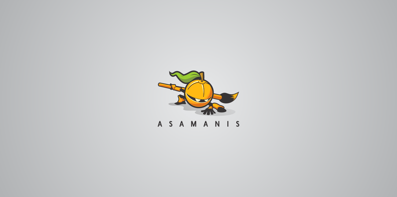
This is one of the most clever personal brand logos we have recently met. It combines successful imagery and type.
Let’s make it clear! Asamanis’ name consists of two words that stand for «lemonade taste» and sweet». We hope that he always makes his logos look so sweet!
As the logos have hides messages and usually are straight to the point, the designer has chosen the image of a ninja. Why not? Ninjas always ambush and hit straight.
Roland Huse logo
The concept of this logo design is quite simple yet solid. The social media designer simply uses his name. But how good the result is!
Lately, Roland was into font design, and he did his best to represent this idea. The letters in this logo are inspired by the antique Székely-Hungarian runes.
Taylor Marc Thompson (graphic designer)
In his «confessions», the graphic designer tells that he was too focused on the ideas that might look attractive but not on the meaning the logo should have. He made several attempts to create his personal logo but none of them pleased him. Then, the professional feedback helped him to see the important things he had not thought of.
Then, he just tried tossing ideas around. Finally, he has got the result that perfectly represented who he is as a graphic designer.
Pepe Villalobos (graphic designer, 3D+VFX, photographer logo example)

The dynamism of shapes, color, and scouting of different proposals and design elements – all these things are the signature of Pepe.
His individual logo looks very catchy and tidy. The designer chose a life-affirming font for inscribing the word “WillaWolf” on his personal logo. The combination of black and white colors on a blue background looks simply a win-win!
Tom Anders (creative intern/art director logo idea)
We just love these smooth lines and the flexibility of the use of this logo! The logo has a very nice type that reflects the organic concept of a company Tom works with.
Tom wanted to refresh his brand Identity, to create something that will perfectly depict both energy and youth. This personal brand identity looks more personal than corporate and, most important, it looks amazingly unique.
Jordan Powers (photographer logo example)
Today, graphic designers use many tricks in creating their personal logos. And we love the typography, smooth lines and rounded corners of this one! Jordan Powers created something unique, peaceful, natural, relaxing and inspiring!
We can say that the technique used in this logo perfectly compliments the overall look of the logotype really well.
This logo is really pleasant and elegant!
Antony Spence (graphic designer logo)
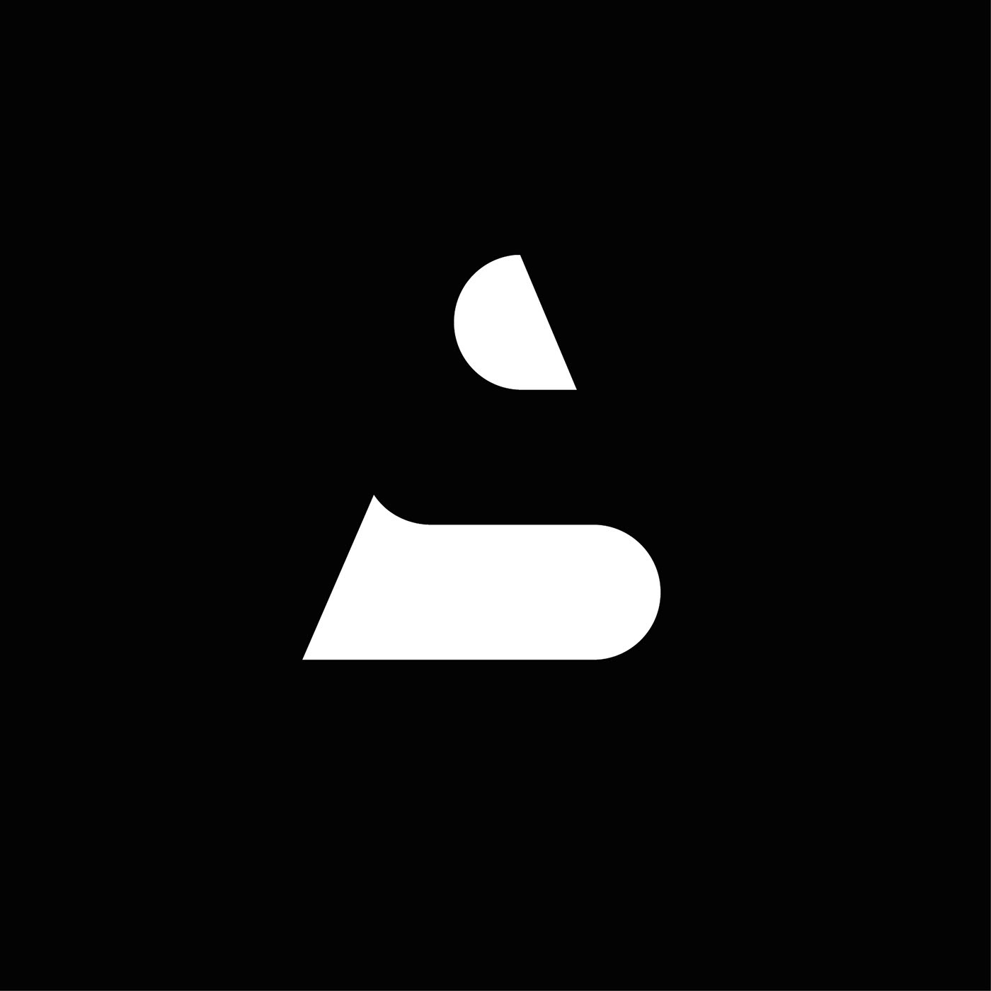
The well-crafted personal logo designs are able to turn a designer’s name into a solid brand identity!
You can either work with positive space or with the negative space – or you can work with both of them. As we can see, Antony brilliantly used the positive and negative space manipulation trick in creating his personal design. Here, he is manipulating two letters in his name that has helped to create a solid, memorable logo.
Narendra Keshkar (freelance graphic designer logo)
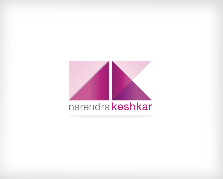
Narendra used the first letters of her first and last name in creating her own logo. The use of three shades of purple is not accidental. This color is dearly loved by creative people and perfectly contributes to inner deepening.
Also, the purple color creates a romantic veil that perfectly compensates for the angular shapes of the letters in this logo!
Luis Afonso (digital artist logo example)
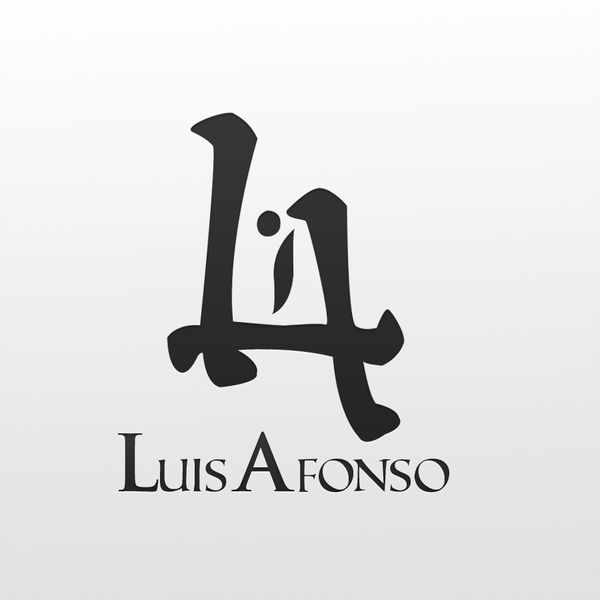
The idea of Luis’ personal log is quite simple: in his work, the “L” letters a part of the “A” letter and vice-versa. We really like this logo: it is so simple yet not too simple!
Ricardo Seco (fashion designer logo example)
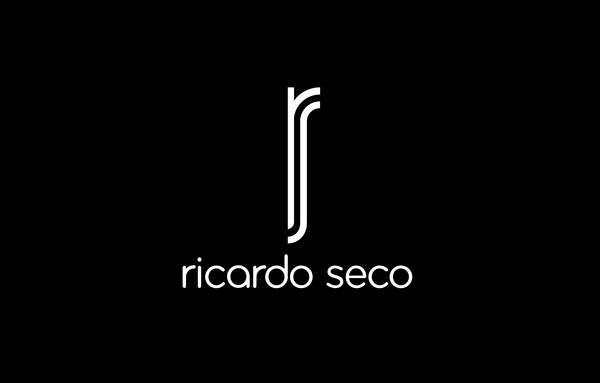
This Mexican fashion designer developed a new version of his personal logo just before participating in New York Fashion Week, after which he presented his own collection.
Ricardo, like many other designers, used the first letters of his first and last name in creating his personal design. The classic combination of white and black looks very attractive, and the elegant elongated symbols unambiguously tell about the author’s relationship with the World of Fashion and Beauty!
Jamie Evans (graphic designer logo example)
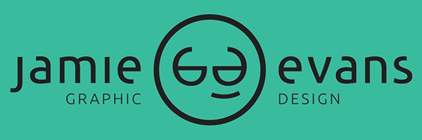
The designer proves that even such a small and widespread detail, like wearing glasses, can be given as an advantage and your own unique feature. In addition, the stylized G & D letters clearly define the professional activities of Jamie.
The soft green background color soothes and relaxes and symbolizes fresh ideas. Its physiological properties make it ideally suited as a background.
Son Do (graphic designer logo)
The designer used blue and blue colors for a reason. They are more often used in marketing because they relax and evoke a sense of calm and peace. Its use in the promotion of goods and services causes a feeling of reliability, stability, security, and responsibility.
How to design a logo? Tips and tricks
Mục Lục
#1. Make the logo image that will be clear and easy to read
This does not mean that if you sell furniture, you definitely need to draw a sofa on your logo. But a professional designer will always find ways on how to make a personal logo even using a simple product/service image. He will figure out how to show him appropriately and stylishly!
To make the logo easy to read, try to avoid using the decorative fonts for a small text.
#2. Use geometric shapes correctly
One of the first conspicuous elements of the logo is its shape. People react to different forms in different ways.
Putting personal logo ideas into practice, you can manipulate people’s perceptions.
Logo geometric meanings:
- square and rectangle cause a sense of safety and stability (Mitsubishi, Deutsche Bank, Facebook);
- tilted ellipse creates a feeling of dynamics, modern and innovative spirit (Hyundai, Samsung, Cadbury);
- triangle with its apex upwards causes a sense of purposefulness and power (Google Drive, Toblerone). Triangle with its apex downwards means development, depth (Novitec Pro, Trian, Innovative Electric);
- oval stands for community and globally (Pepsi, StarBucks, Total AT & T, General Electric);
- diagonal lines mean radicalism (Rambler, Adidas, HP, Microsoft Build, Ericsson);
- vertical lines indicate masculinity and development (Soundcloud, Cisco);
- horizontal lines symbolize peace and stability (New Balance, Giorgio Armani);
- wavy lines create a feeling of flexibility and creativity (Sony Vaio, McDonald’s).
#3. Use the appropriate font
The correct font sets the mood when reading the message. Only 6% of personal brand logos are images; 56% use a combination of text and image. The remaining 37% is just an inscription.
How fonts affect the consumer’s subconscious:
- Strict square fonts stand for authority and are more often used in the logo design of industrial products, technologies, attracting business partners and investors. This is one of the best options for business cards, for example;
- Light and beautiful oblique fonts with vignettes are ideal for product logos, oriented on the female audience (clothing, cosmetics);
- Handwritten fonts inspire confidence and emphasize exclusivity. Designers widely use them for creating the logos of attorney/consulting services, medical practice.
If you choose the perfect font for an inscription of your brand’s name, it can become your ideal personal design. This is a versatile option that is very easy to use in production. Need some proof? Remember Nokia, Canon, Google, Coca-cola logos!
#4. Think about the scaling
Most individual logos are expected to be applied on different surfaces for the brand’s popularization: business cards, pens, badges, advertising banners, etc.
Make sure that the logo is still readable at small sizes, and it looks attractive at the large size. All small details must be spelled out clearly and legibly and have lesser thin lines or complex patterns.
#5. Analyze the combination of graphic and inscription element
Did you think marketing personal logo is easy? Of course, it’s not!
Both elements of the logo have to match each other, but the matching should not be too close. If both elements draw attention, they will compete.
#6. Create a good logo descriptor
The best descriptor is a concise slogan or an indication of the main business activity. If the logo contains both the brand name and the descriptor, the elements may compete for customer’s attention.
An experienced designer, creating a brand identity, will use this simple trick: he will combine the labels or choose the strongest one. Just as in the logo “VW. Das Auto ”: the company name is missing because it is already read in the «VW» sign.
#7. Use the colors correctly
For 84.7% of consumers, color is the primary factor in buying incentives, 80% agree that color determines personal branding.
The color of the logo enhances the reading (by 40%) and understanding (by 73%) of the visual object:
- red means energy and drive;
- green tones are soothing and associated with money;
- gray symbolizes practicality and stability.
Check out the color combination table. And keep in mind that using more than 4 different colors in the logo is a fail! The best option is a combination of 2-3 colors.
#8. Don’t forget about your audience
Various types of personal logo designs work for different audiences and even different categories of products, Study your audience before creating your logo!
Create your potential customer avatar:
- Who is he/she?
- How old is he/she?
- What does he/she do?
- What does he/she like?
#9. Let your logo speak about the idea of your business
The logo is the face of the company. It has to speak about the main idea of the company, its values , and its primary business activity. The logo has to make your customers feel the identity of your brand.
#10. A few more tips on how to create the perfect creative design of a logo
-
look for personal logo inspiration
on competitors’ websites (but do not copy somebody’s logo!), try personal logo maker websites, sites for designers;
- your logo should be stand out from the competitors’ logos in shape, color, and idea;
- create a durable logo;
- avoid outdated ideas;
- start creating your logo in black and white. This will give you a wider field for creativity;
- always save the previous versions of your logo;
- try using the mind map. With its help, you will understand what else you need to work on and in which direction you should move. This will help structure and track your thoughts;
- save the logo as a vector image. This will help to scale the logo for different surfaces and sizes, without loss of quality and ratios;
- avoid standard fonts such as Times Roman and Calibri;
- try using different fonts;
- add the dynamics to your logo;
- do not use more than two fonts in one logo;
- remove all unnecessary parts. Think of how you can simplify the logo;
- use the logo ideas that will be suitable for updating.
The latest and most important logo design trends
-
«Damaged» logos. These logos have overly enhanced or overly weakened rounded corners.
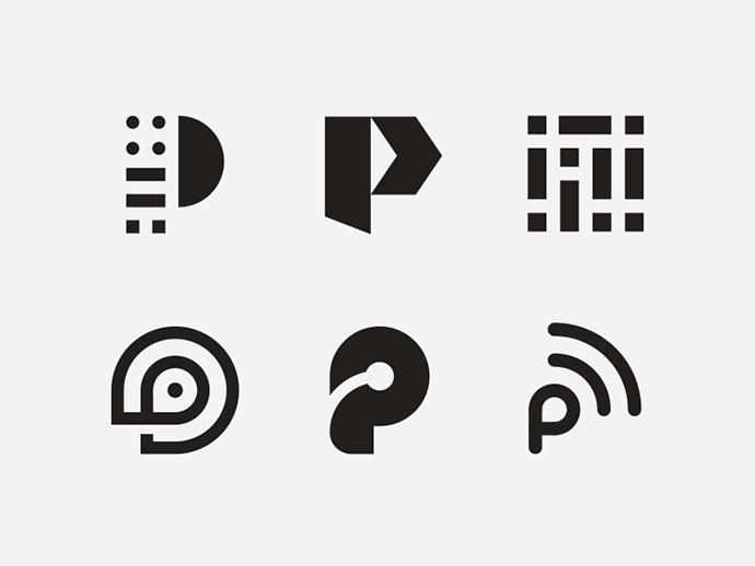
- Circled logos (contours). Like the classic logos of a sports team, an outline is added to the logo. This helps the unremarkable logo grab extra attention.
- «Neo-Vintage» logos. These are new vintage nostalgic logos. Often the font is placed on top of the supporting image.
- Black and white «Hipster style» logos. This is a «mature» version of the latest classic hipster logos. Designers use traditional elements. Used in a non-traditional way.
- «EST Trademark» logos. This implies creating an artificial heritage through a balanced design.
- «Fatty Fade» trend. This is the combination of past and present with modern aesthetics, often with bold lines.
- Dense lines. These logos have thick, consistently encircling lines resembling the golden era of logos.
- Cut out logos. Cutting letterforms for creating stylistic strokes and gaps helps in creating truly trendy logos!
- Serif Redux. The warmth, humanity, and charm inherent in serif fonts are opposed to heartless chopped ones that have been trending lately.
- Punctuation. Commas, periods, colons – everything is used to convey a specific message.
- Simplicity. The essence lies in the reduction of the constituent elements, the abandonment of eye-catching graphics decorations and the individualization of the color palette. One shade comes to the forefront, revealing all its facets.
- The trick of composition. This style involves the vertical construction of words, often decorated with graphic elements.
- Lettering. Logos that use this artistic technique are perfect for coffee shops and restaurants, creative and thematic places, as well as for the author’s emblems.
- Simple shapes. Simple and accessible font, text, accompanied by geometric shapes, straight lines, and dots.
-
Use of negative space. This trick allows you to hide the “additional” picture within the visible. The foreground here is not a graphic, but a textual component.
-
Gradient transitions and overlaps. Such an effect does not look pretentious, but at the same time, it favorably emphasizes monophonic text, allowing to create really
beautiful logos
.
Conclusion
Brand identity and logo are created so that a potential client remembers the brand not only on a conscious but also on a subconscious emotional level. Modern logos are completely different. Some of them deliver obvious information, others are more abstract. However, both of them should have a certain idea, which is tightly connected with the business.
Do not forget that not only the logo is important for your business, but also a harmonious design of the website, which will reveal all your advantages!
Today, web design is a unique art form that obeys certain rules of aesthetics and usability. Four of its main (but not the only!) aspects are aesthetic beauty and attractiveness, modernity, convenience for users and focus on conversion.

Create your own modern website using unique Weblium templates, based on a deep study of market niches and developed by experienced experts in the field of web design!






![Toni Kroos là ai? [ sự thật về tiểu sử đầy đủ Toni Kroos ]](https://evbn.org/wp-content/uploads/New-Project-6635-1671934592.jpg)


