15 Instagram Stories Design Tips to Create Stunning Visuals –
Mục Lục
Summary
To help you captivate your audience in your Instagram Stories, we’ve put together 15 Instagram Stories design tips that will have you creating high-quality visuals your followers will go back to view again and again.
You will learn
- How to incorporate brand fonts and logos for stunning designs
- Insider tips on formatting and graphics, backgrounds and overlays
- How to create stunning highlights covers and templates
Your Instagram feed isn’t the only way to engage your audience and stand out among the crowd anymore.
In fact, since the feature was launched in August 2016, Instagram Stories have quickly grown to over 500 million daily active users, meaning at least half of Instagram’s overall user base create or view stories every single day.
This means you have the potential to connect with your Instagram audience in two different places on the app, and you don’t want to waste that opportunity with dull Stories and visuals.
To help you captivate your audience in your Instagram Stories, we’ve put together 15 Instagram Stories design tips that will have you creating high-quality visuals your followers will go back to view again and again.
1. Start with a storyboard
There are many different ways to use Instagram Stories. From promoting new blog posts to sharing new features and more, Stories are a great way to engage with your audience without having to be as polished as your feed.
This means you can take live video, behind-the-scenes footage, and iPhone photography without having to worry if it matches the rest of your content.
However, when it comes to your Instagram Story graphics, you still want to ensure you’re putting together visually appealing designs that make your audience want to tune in.
A great way to get started is by using a storyboard to fully plan out your story before you even start on the design.
If you’re wanting to promote a recent blog post, build a storyboard around several of your key tips or points that entice viewers to click through. Or you might put together a storyboard that showcases how to use your product or service.
The possibilities are endless, but having a plan in place can help make your entire design process that much easier.
2. Stay in the lines
Think back to your coloring days in elementary school (or maybe just last Tuesday in your adult coloring book). Learning to stay within the lines is a big deal.
Your Instagram Stories have some pretty important lines and parameters you want to stick between as well.
The top and bottom areas of your story graphics are covered by your username and ways to interact with your story, respectively. You don’t want to include any pertinent information or design elements in these areas.
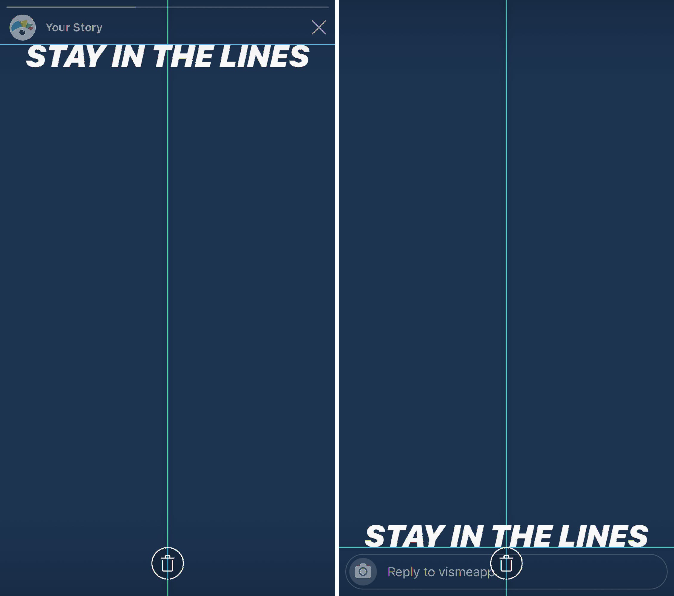
Thankfully Instagram will warn you if you’re about to move an element too far up or down on the screen, but it’s important to ensure that anything you design outside of the app also stays within the lines.
So while Instagram Stories dimensions are 1080 x 1920 pixels, Instagram recommends keeping all key design elements between the center 1080 x 1420 pixels, leaving 250 pixels at the top and bottom.
3. Create a Story-specific style guide
While you can utilize fully produced graphics and short video clips for your Stories, Instagram also offers tons of design elements you can use to embellish your content.
Consider putting together a style guide specific to which font choices, filters, GIF types, and more, that your company can utilize from IG Stories to continue to stay branded.
You can create this style guide in many different formats to keep handy anytime someone on the team is creating and sharing Instagram Stories. Since there are many different design preferences, having a Story-specific style guide can help improve brand recognition even further
4. Use your brand fonts and colors
Keep everything you create on brand. Even your Instagram Stories.
This means you want to have your brand kit ready to go with your color hex codes, your fonts, your logo and more.
Incorporating your brand fonts and colors helps with brand recognition when your followers are simply scrolling through their stories. They’ll see one of your graphics and automatically know it belongs to your company, without even having to see your username.
5. Incorporate photography
Your Instagram Stories don’t have to consist of entirely custom graphic designs. It’s a great idea to switch it up and incorporate photography every now and then.
The beauty of Instagram Stories is that not everything you publish has to be high-quality and professionally created. Instead, use that smartphone camera and take some behind-the-scenes photography right in the app.
And don’t forget about the millions of free stock photo options that are available to use as well. Just make sure they’re relevant to your brand and the content you’re sharing!
6. Take boomerangs
Boomerang is an Instagram-owned app that has been incorporated directly into their Stories. Users can easily access it by opening the Stories camera and navigating to the option directly to the right.
A boomerang is a quick 1-2 second clip that loops and can be a fun way to create content. Use this instead of taking photos every now and then to add some personality into your Stories.
7. Add a text shadow
Get creative with Instagram’s in-app design assets. You can add a text shadow right in the Stories creation dashboard by adding two different colored layers of the same text.
Simply type out your text in either a lighter or darker shade and place it where you want it to sit on your Story. Then do the exact same thing with your primary shade, placing it overtop the shadow at a slight angle.
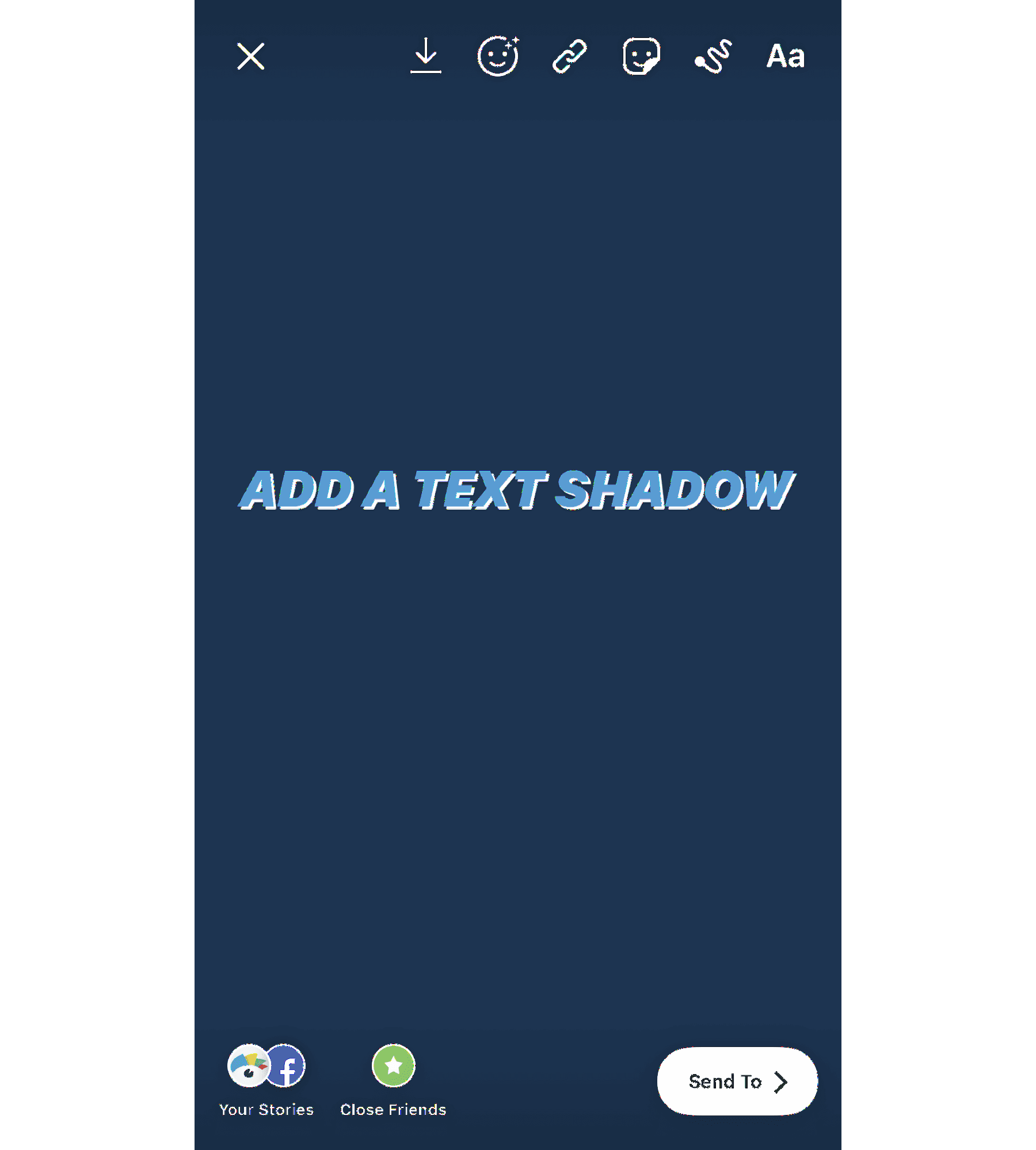
This gives you a fun way to add text overtop a photo or video that you took right in the app, making it quick and easy to design your Instagram Stories before publishing.
8. Create design elements with symbols
Instagram Stories has five different font options to choose from: Classic, Modern, Neon, Typewriter, and Strong.
This means your letters and symbols have five different styles. If you take some of these letters and symbols, rotate them, and blow them up, you’ve got some pretty cool design elements to help spice up your Instagram Stories.
Take a look at this example below. Each of these elements have been added with a different symbol, right in the Instagram Stories dashboard.
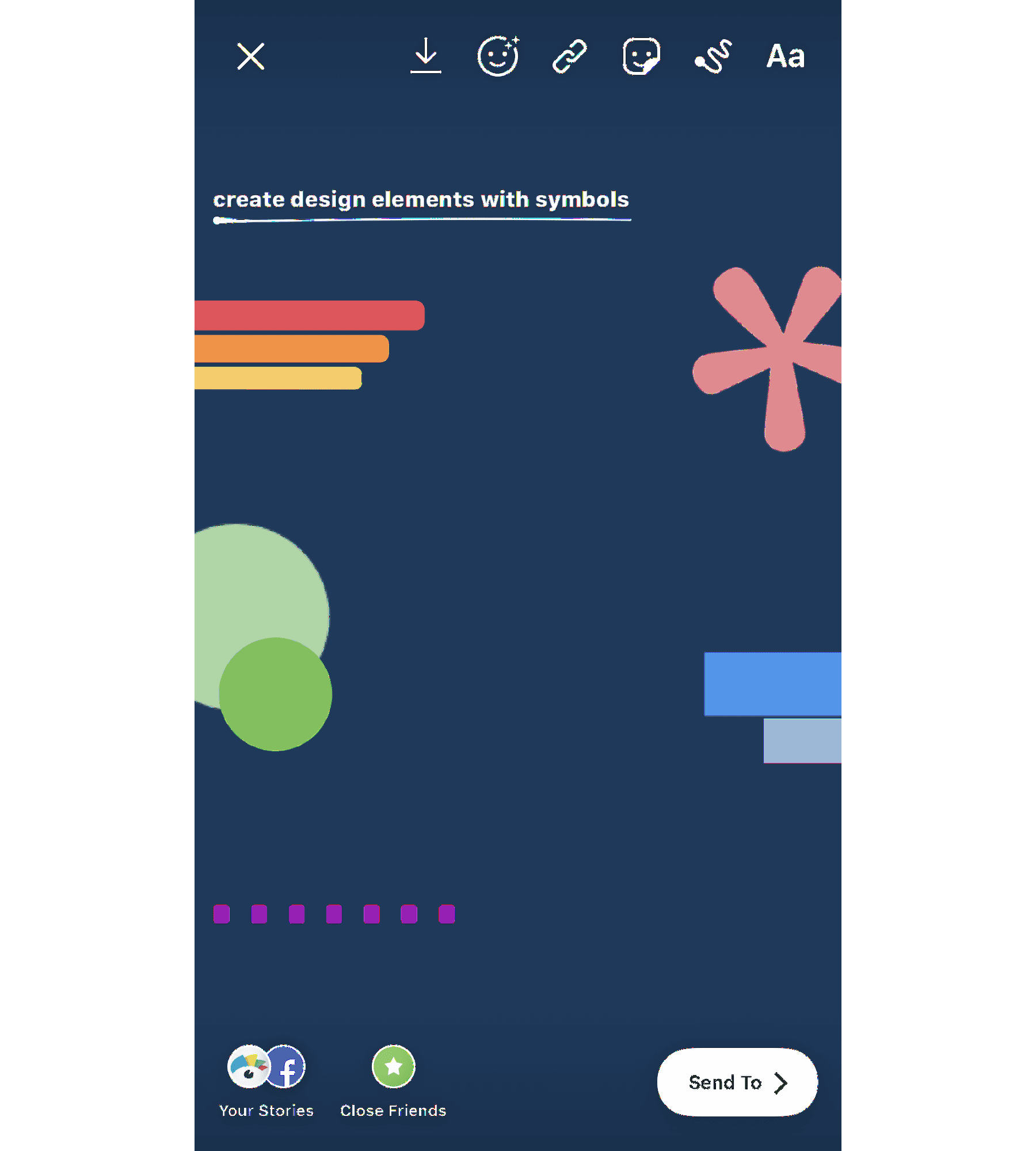
The top left design was created with capital I in the Modern font. Rotate it sideways, and you can create a bar chart or an underline/backdrop for your text.
Across from that, you see a pink asterisk also in the Modern font. Use these to create stars or snowflakes in your photo or video.
The green circles are periods in the Strong font that have been blown up and overlapped to create a funky design.
Then there are two blue hyphens in the Classic font, and the last element in the example above includes a line of periods in the Modern font that create a dotted line appearance.
See if you can play around with the different letters and symbols in each of the fonts to create accents, backdrops, and more.
9. Access even more colors
When you open up the text or drawing features, you’ll automatically have access to three pages of color options, but you’re not limited to only those 27.
Holding down on one of the available colors opens a spectrum of even more colors for you to choose from.
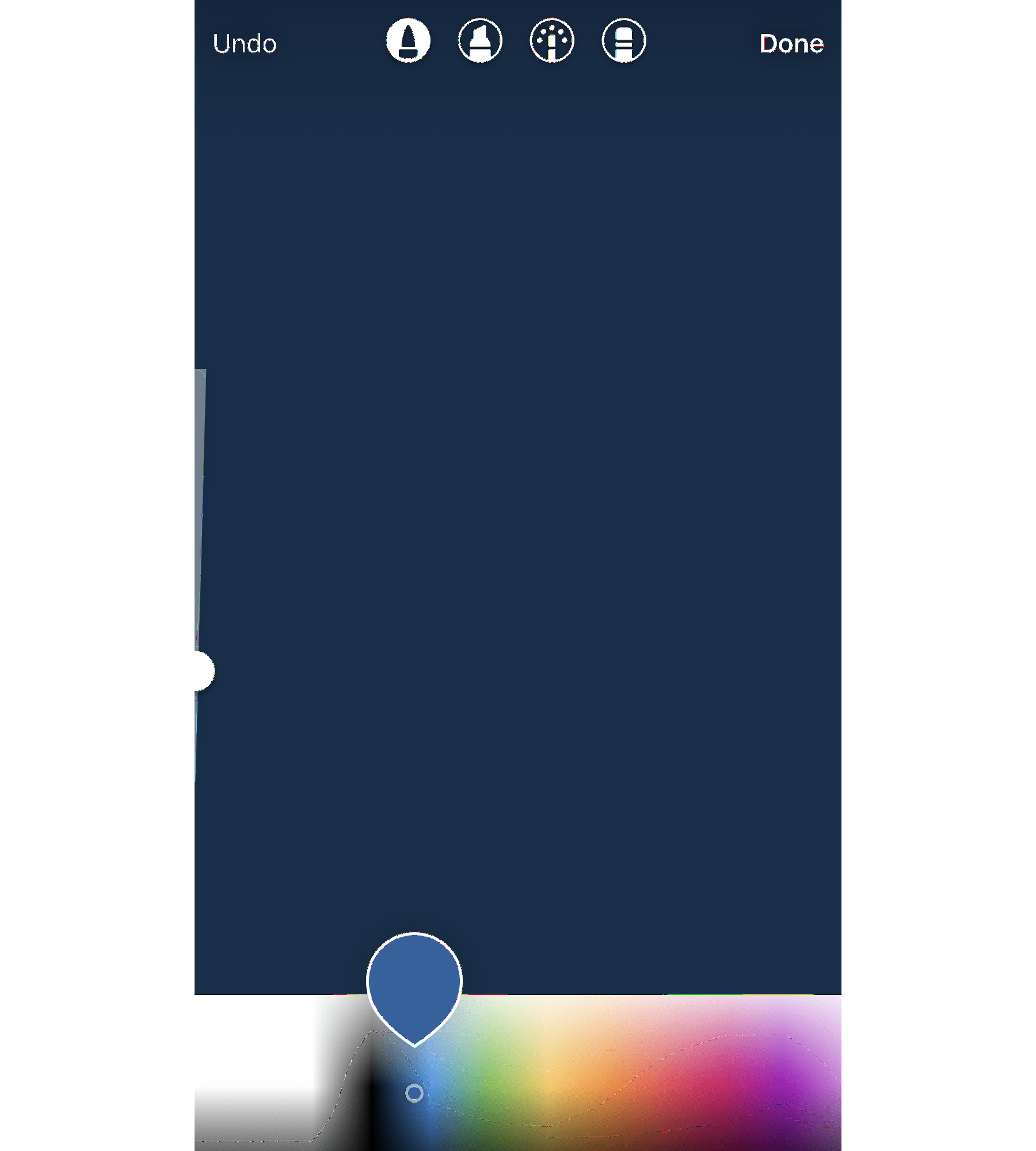
You can also use the color picker to grab a shade right out of your graphic or photo. If you have your logo in the graphic you upload, this allows you to add additional elements in your brand colors, or simply match them to the colors in your photo.
10. Give your text a rainbow or ombré effect
Let me start with a disclaimer: this is tough to master. But the end result is very cool. In order to achieve this effect, you need to type out your content before selecting it all, or the word(s) you want to ombré.
Then you’ll need to first hold down the screen on top of the first letter before then holding down the screen on top of the color you want to start with.
To create a rainbow effect, you’ll slide across the color spectrum while also sliding across each letter simultaneously. To create an ombré effect, you’ll go from top to bottom or bottom to top.
You can watch this in action in the GIF below:
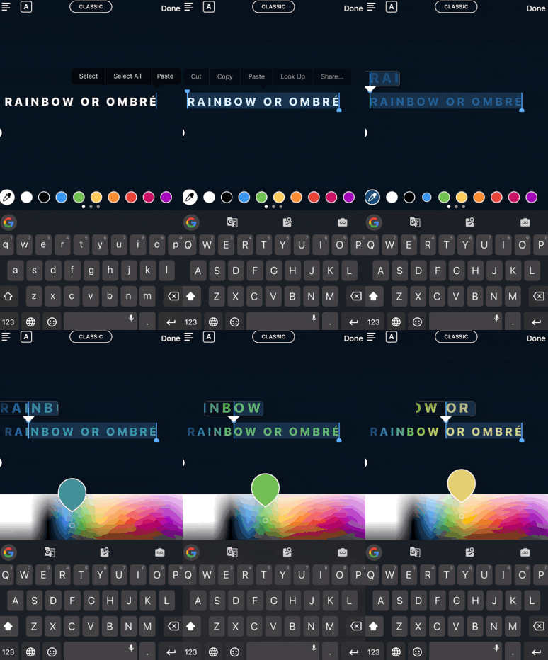
If you move either of your fingers off the spectrum or off the letters, it can mess the entire thing up, so definitely practice this one a few times before putting it into play.
11. Create backgrounds and overlays
The drawing tool can do more than simply color or highlight information in your story. It can also help you to create backgrounds and color overlays.
If you want to share an announcement on your story without having to find a photo, simply open up the pen tool, find your background color, then press and hold until your entire screen turns that color.
You can also create a translucent color overlay by using the highlighter tool to do the same process – choose a color, then press and hold the screen.
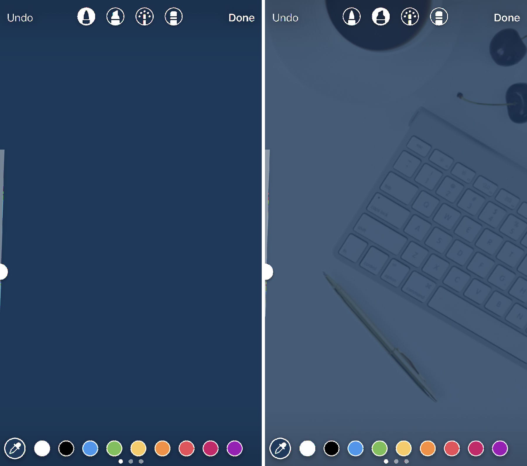
You can also have fun creating sneak peeks by adding a background color overtop your image and moving over to the eraser tool to remove some of the color.

Use this feature to tease new products, blog content, and more.
12. Use Stickers and GIFs
Instagram Stories offers tons of different sticker and GIF options to add humor and pizzazz to your designs.
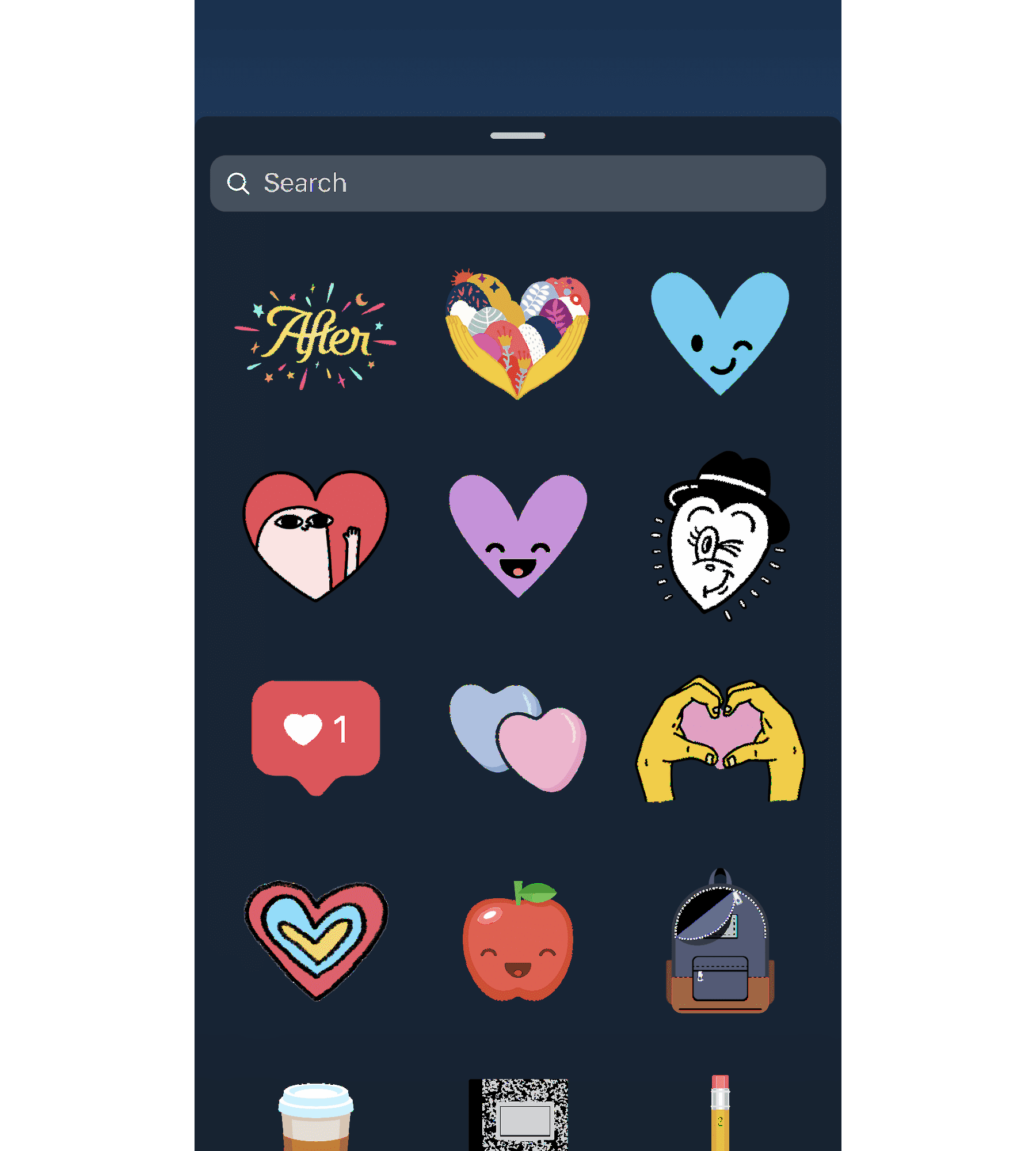
Scroll through the options or search for something specific to add to your Story. There are many different styles of icon, and you can even add polls, quizzes, Q&As, or hashtag stickers to further engage your audience.
Users can even create and submit their own stickers and GIFs for users to add to their stories, or for your own brand to easily access. Become a verified brand on Giphy to get started creating!
13. Show users how to access more content
Users with more than 10K followers get the “Swipe Up” feature in their stories. If you’ve met this milestone and you add a link to one of your Stories, use your story design to show/tell users to swipe up.
If you don’t have this feature quite yet, and users have to go click a link in your profile, use an arrow or other type of design element that draws their attention to exactly where they need to click.
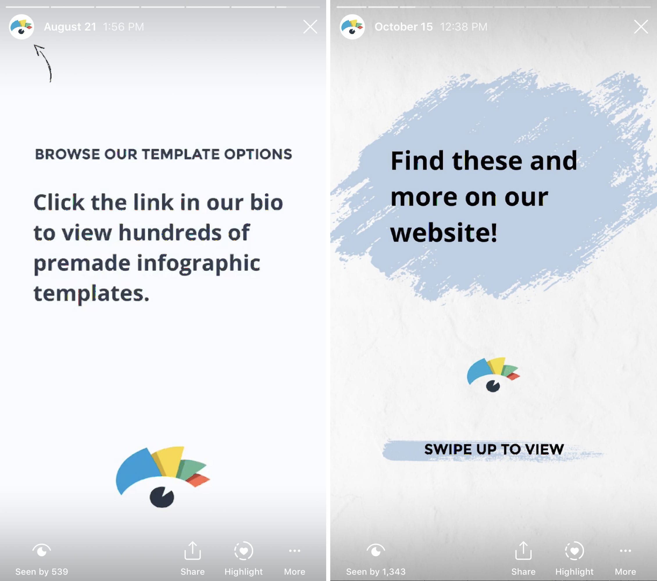
This creates a call-to-action that lets your Story viewers know exactly what they should do next. Plus, there are tons of arrow stickers to choose from that can further spice up your design.
14. Create branded highlight covers
If you want to save stories for longer than 24 hours, you can add them to various highlights at the top of your profile. There’s no limit to the number of highlights you can create, but only the most recently updated five will appear on your profile. Users will have to scroll to view the rest.
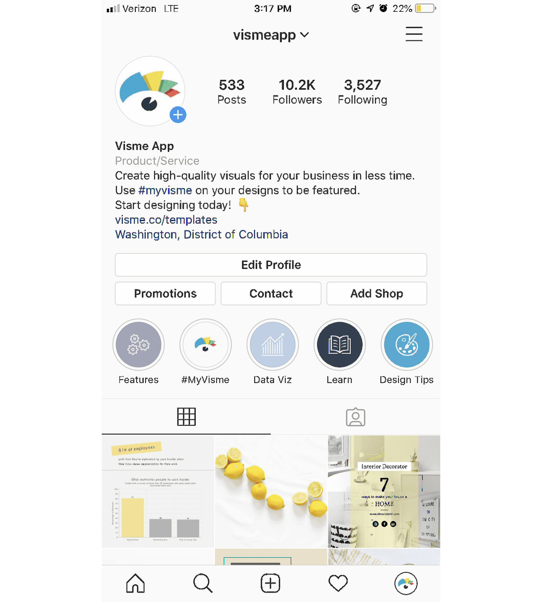
You can create custom covers for each of these highlights, and we highly recommend you do so. Make sure these covers also match your brand and mesh well with your feed since they’ll be viewable at the top of your profile.
15. Start with a template
If you’re still not sure about your design eye with your business or personal Instagram Stories, there’s a solution for that. Start with a template instead of trying to create a Story from scratch.
You can find templates for nearly any purpose, like sharing your #ootd, recent blog posts, inspirational quotes, new product photos, and so much more.
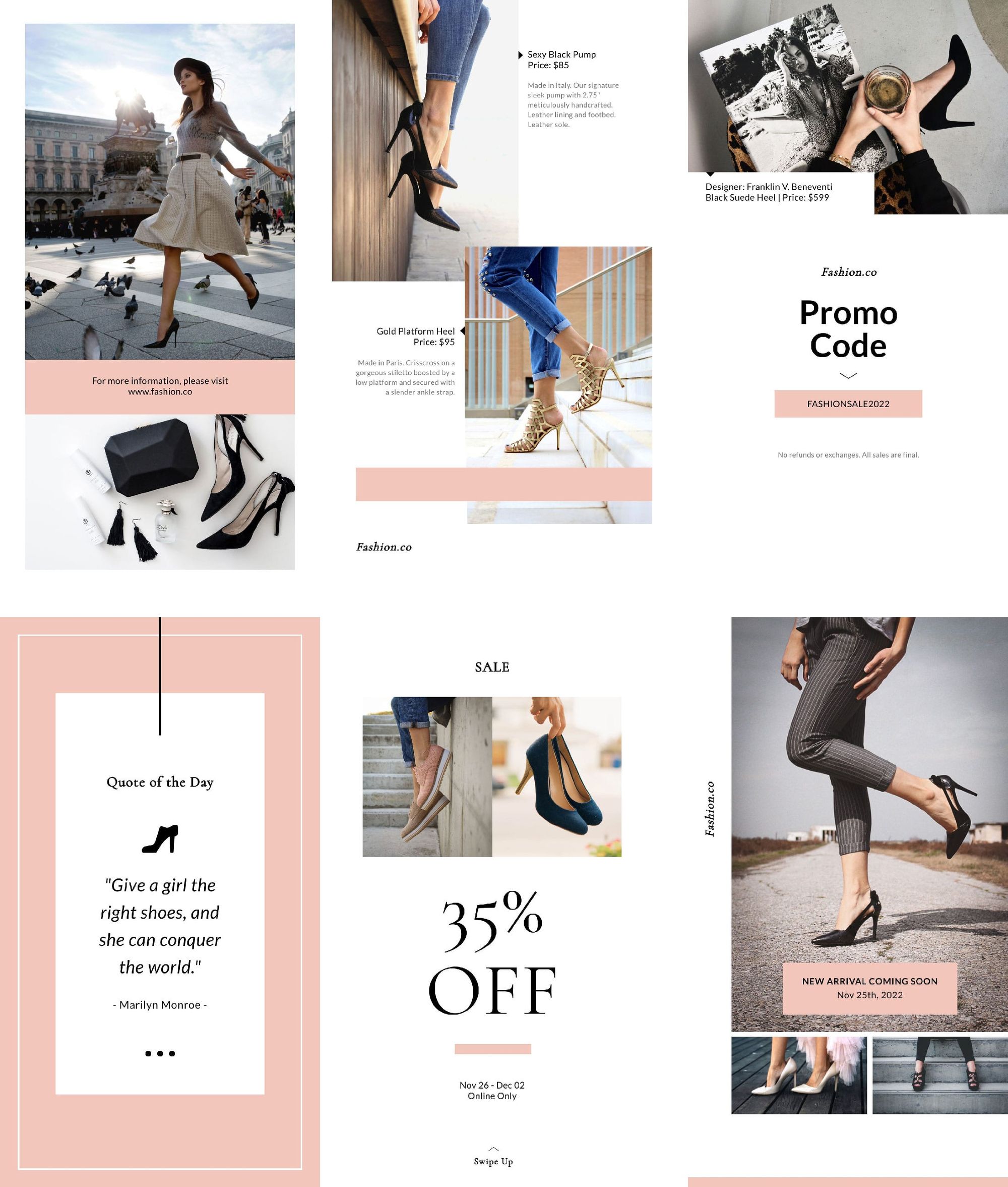
Using fully customizable templates like the one above gives you a starting point for your design, while also allowing you to add in your own brand fonts, colors, and other flair.
Start designing today!
Get started creating your own stunning Instagram Stories and wow your audience. Use your Stories to create calls-to-action to your website, to engage your audience with polls and quizzes, to showcase what’s happening behind the scenes, and more.
And to stay organized, you can easily schedule your Stories and simply get a notification when it’s time to publish!
What are your favorite Instagram Story design tips? Reply to our Tweet below with your ideas!
To help you captivate your audience in your Instagram Stories, we’ve put together 15 Instagram Stories design tips for creating high-quality visuals your followers will love! ✨ https://t.co/ShXeEedED5
— Buffer (@buffer) July 2, 2020
Brought to you by
Did you find this article helpful? You might also like our all-you-need social media toolkit.
Get started for free now







![Toni Kroos là ai? [ sự thật về tiểu sử đầy đủ Toni Kroos ]](https://evbn.org/wp-content/uploads/New-Project-6635-1671934592.jpg)


