
10 Tips For Making Your Blog Posts Easier To Read
Dear blogger,
You have such wonderful ideas to share!
Your content is excellent; it’s just that I find myself skimming your posts, because, to be frank, your posts are … kind of hard to read.
It’s not that your writing isn’t “correct”, it’s just that things have changed since you learned to write.
In fact, it might be time to forget a lot of what you learned about writing at school.
Can we chat about making your blog posts easier to read?
With thanks,
A hopeful reader
Getting a blog post together isn’t easy, is it? You have to put all the distractions on your computer aside and focus on one task: tapping away at the keyboard and organizing all your thoughts until your post takes shape.
So, of course, you want people to actually read your post. Whether your audience is students, parents, or educators, you have an important message to share.
There are many personal benefits to simply writing too. Many bloggers describe how writing helps them organize and develop their thinking. However, if this is the only reason you’re writing, you probably wouldn’t be publishing on a public blog, would you?
So how do you encourage your visitors to not only start reading your blog post but also stick around to the end?
Maybe the solution isn’t changing your words. Maybe it’s simply changing your styling and post layout.
Here are ten tips for making your blog posts easier to read. I hope you’ll share your ideas in a comment too.
Mục Lục
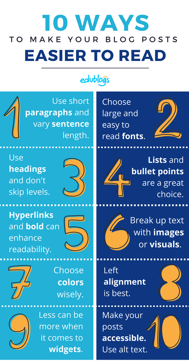
1) Paragraphs and Sentences
Is there anything more off-putting than clicking on a blog post and seeing a great big block of text?
You want to read it but there is nothing for your eyes to grab on to. Try as you might, you find yourself skimming and not fully comprehending the content.
The truth is, a digital paragraph is different from an analog paragraph. The way we consume media online is different to the way we consume media offline.
There was a popular post on The Slate a few years back called “You Won’t Finish This Article“. It shares data demonstrating that most people don’t even scroll down after they arrive on your post; they leave your blog almost immediately. The data published in The Slate estimates that most visitors read about 50% of your content. 50% might even be optimistic when looking at similar statistics from other sources.
Short paragraphs make your posts more readable.
Instead of starting a new paragraph when the topic changes, consider keeping your paragraphs only a few sentences long and play around with length and rhythm. Sometimes you’ll have slightly longer paragraphs, and sometimes you might have a paragraph that’s only one sentence long for impact (that’s not what your teacher taught you at school, is it?).
When it comes to writing online, paragraph structure is more of an art than a formulaic science.
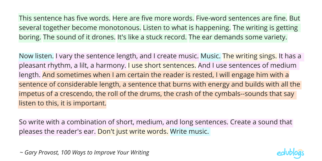
The same rhythmic variation works well for sentence structure and length as well.
Gary Provost demonstrates,
2) Fonts
There is a lot of debate and research out there about typography or font choice. Personally, I find a common issue is bloggers using a font that’s too small.
Professional bloggers generally opt to use larger sized fonts now as it enhances the readability of online text. Some bloggers haven’t caught onto this. Combining a small font with long paragraphs is a sure fire way to have readers skim a post and close their tab, no matter how good the content is.
If you’re using Edublogs, there is a handy plugin called Supreme Google Webfonts. It allows you to change the type and size of the fonts in your post. Have fun playing around but obviously look for a font that will be easy to read. Another useful tip is to stay consistent with your font choice.
3) Headings
Sub-headings are an excellent way to break up the text while enhancing the readability and comprehension of your post. This sounds like something we covered at school now, doesn’t it? Or maybe not?
I admit, it wasn’t until last year (after many years of blogging) that I discovered I was using headings all wrong. I thought the idea was to pick a heading based on size and appearance.
It turns out, there is another layer to heading choice on blog posts.
Heading tags not only enhance your blog post visually but help organize the content of your blog. This helps search engines like Google scan and categorize your information.
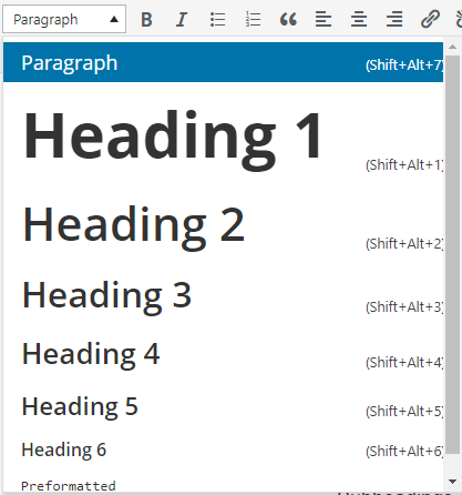
If you want to follow blogging best practice, you technically aren’t supposed to skip a heading level.
Heading 1 will already be used for your blog post title. When you’re writing posts (or pages) you should use Heading 2 for post sub-headings. Then if you nest other sub-headings under that, you’d use Heading 3 and so on. You probably wouldn’t have a need for Heading 5 onwards.
Structuring your post with this hierarchy can also assist blind readers who rely on screen readers to access your content (find out more about accessibility issues in point ten).
4) Lists and Bullet Points
Most writers know the value of bullet points. Listicles, or posts with numbered lists, are hugely popular too (hey, this whole blog post is a listicle!).
Here are five reasons why numbered lists or bullet points are great:
- They make your content easier to digest
- They break up information and offer more white space on the page
- They offer your eyes something to grab onto
- They keep you moving through the content, rather than skipping over a paragraph
- Readers can easily chunk or categorize information
Need I say more?
5) Links
Hyperlinks are one way that digital writing is very different from traditional writing. In fact, this is a topic that we could really invest a lot of time in exploring with our students. If you’re interested in learning more about hyperlinked writing, check out some of the posts by Silvia Tolisano (Langwitches).
From a visual point of view, hyperlinks or bold words are another good way to make key pieces of information in your post stand out. It draws you in when you’re skimming or scanning the page.
Of course there are other reasons why hyperlinks enhance your post:
- It’s polite and ethically correct to acknowledge your sources
- It can add depth to your topic if readers can go elsewhere to learn more
- Linking to credible sources can back up what you’re saying
- Your readers will hang around your blog longer if you link to other relevant posts you’ve written
Here are two things to remember about using hyperlinks:
- Try to make your links descriptive and weave them into your sentence, rather than saying “…click here, here, and here“. (Yep, I used to be guilty of the latter once upon a time).
- Don’t go overboard with links. Stay relevant and focus on quality over quantity.
6) Images
When you’re scanning posts, no doubt your eyes are naturally drawn to images. Breaking up your text with some visuals can definitely make your blog posts easier to read.
But not all images are created equal.
Firstly, make sure you’re not using copyright images. I’m sure you know, you can’t just use anything you find on Google Images. We have a post all about copyright, Creative Commons, and fair use if you’d like to learn more.
Also, make sure your images are enhancing your post and helping your readers to gain an understanding of what the post is about. Too many decorative or abstract images might be confusing.
Finally, remember that you can use more than simple pictures. You can embed all sorts of media in your blog posts such as comics, quizzes, polls, videos, social media, and more. We have a help guide about embedding media if you need more information about this.
7) Color
Color in blog posts is a contentious topic. Certainly on professional blogs, you’ll generally just see bloggers sticking to the traditional black fonts.
But what school teacher doesn’t like color? I used to use color a lot on my own class blogs.
Some teachers of very young students use different colors to type their students’ responses in a blog post. Then they could tell the student to show their parents the “blue comment” when they get home, for example.
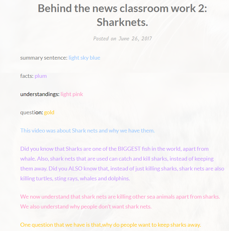
Sometimes color is used for tasks on student blogs. For example, Zehra responded to a news video by using color coding for summary, facts, understandings and questions.
If you do use color, remember:
- Be consistent: For example, I used to always use red for my closing questions on a class blog post. It helped students know what to look out for when responding to the post.
- Choose colors wisely: Clearly darker/contrasting colors are going to be best. Yellow or aqua on a white background is not going to enhance the readability of your post.
8) Alignment
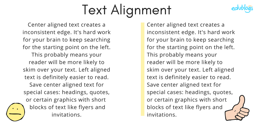
I’ve shared with you a few of my “mistakes” from my early years of blogging. Here is another one: I used to center align all of my text. Oh dear.
When I look at blog posts with center aligned text now I find them very hard to read. The starting point of each line constantly changes, so it’s hard work to keep track of where you’re up to.
Left aligned text is best as demonstrated below.
9) Widgets
In my experience, students love widgets! Many teachers do too.
Some widgets add a lot of value to your blog. They help visitors find relevant content and related blogs. They can offer families the chance to subscribe to the blog or stay up to date via a class calendar.
There are also a plethora of fun widgets out there: jokes of the day, virtual pets, music widgets, weather widgets, random facts … the list goes on.
If you want visitors to be reading your blog posts, you probably don’t want them distracted by too many widgets on your sidebars. Furthermore, excess widgets can slow down the loading time of your blog.
Like many aspects of blogging, it’s worth considering how you can strike a balance. Maybe less is more.
10) Alternative Text And Accessibility
You want to make your blog posts readable for everyone, including visitors who are vision impaired. This is an issue that is overlooked by many bloggers.
You might not realize that vision impaired visitors to your site may be using assistive technology like screen readers or other software which reads the page out loud.

This software will read the alternative text (alt text) instead of the image.
You can see how it would be difficult for a vision impaired visitor to take in your content if it is full of images that they can’t access.
Adding the alt text is easy. When you upload an image, there is a box where you can write your description before pressing ‘Insert Into Post’.
You can describe what you image looks like. Or write a brief description of the content if it’s a graph, chart, or other visual.
Alt text is just one way you can make your blog more accessible. The American Foundation for the Blind offers more tips for making print more readable, including selecting appropriate fonts and colors.
There are also more barriers to consider apart from vision impairment, including language and other physical restraints.
You can read more about making school websites accessible in this CampusPress post by Rachel McCollin.
When it comes to styling, a lot of ideas come down to personal preference. However, it’s always great to be open to trying new things and you might find yourself with a larger or more engaged audience as a result.
Maybe there are a few tips here that you or your students could try on your next blog post?
What can you add to this list? What sorts of things encourage you to read through a whole blog post? What do you find off-putting?
We haven’t talked about language. Do you prefer a conversational tone, or posts that are written in a more formal style? Share your thoughts.
Share This Post:
Share This Post:


![Toni Kroos là ai? [ sự thật về tiểu sử đầy đủ Toni Kroos ]](https://evbn.org/wp-content/uploads/New-Project-6635-1671934592.jpg)