10 Best Blog Fonts to Improve Readability
Disclosure: This post may contain affiliate links, meaning I get a commission if you decide to make a purchase or sign up through my links, at no cost to you. Please read my disclaimer for more info.
A bad font choice can send wrong messages, strain the eyes, and affect your blog engagement. We listed 10 of the best blog fonts to enhance your blog readability.
When it comes to setting up blogs, font choice is something a lot of blog owners refuse to give the time of day. This negligence is especially dangerous in today’s age when readers are primarily visual.
Blogging is my favorite side hustle and I’ve spoken about it at length in my free increasing your income course.
Truth is, even if you have premium content, choosing the right font spells the difference between good reader retention and soaring bounce rates.
What you say is just as important as how you say it, and choosing the right font matters if you’re aiming for good traffic.
Let’s find out more about the importance of fonts in blogging.
What is the difference between font and typeface?
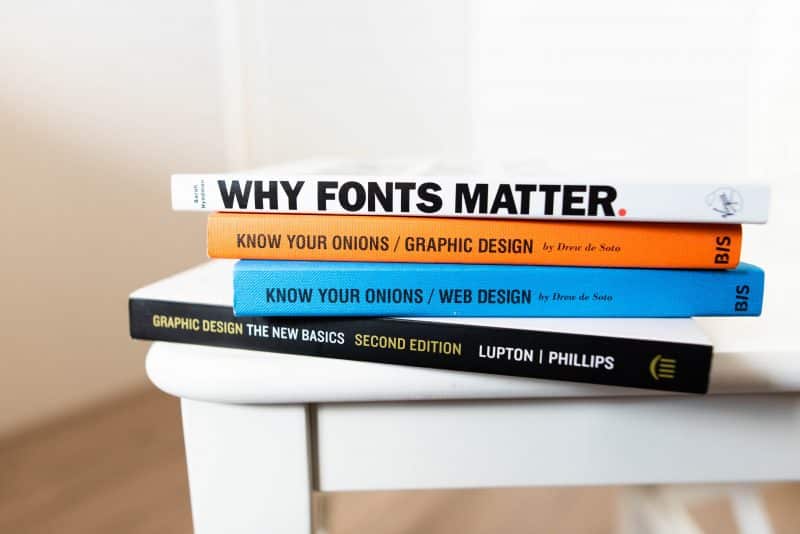
Before diving into the best blog fonts, you need to understand the difference between fonts and typefaces. Most people use the words “font” and “typeface” interchangeably, but they are not the same.
Typefaces are a group of letters, characters, and numbers that share the same design. Examples of these are Arial, Helvetica, and Comic Sans.
Contrary to popular opinion, these are not fonts. So what exactly is a font?
Fonts are made up of a typeface, including its size, weight, and width chosen for that particular typeface. If Arial is a typeface, then “10-point Arial Italic” or “12-point Arial Bold” would be its fonts.
An easy way to set the two apart is to consider typefaces to be a creative design group of characters while “font” is its mechanism of delivery.
Both fonts and typefaces are an elemental part of what we call “typography” – the art of arranging type to make written language readable, appealing, and legible when displayed.
Other typography elements include negative space, color contrast, hierarchy, kerning, and more.
Want to start a blog? I suggest using Bluehost to get started as they will give you a FREE domain name by signing up.
You can read how I started a blog from scratch and grew it to over $200,000 of value in a year by visiting my step-by-step guide on how to start a niche blog that actually makes money.
START BLOGGING NOW
Now let’s find out why fonts matter with blogging.
How a font can improve readability
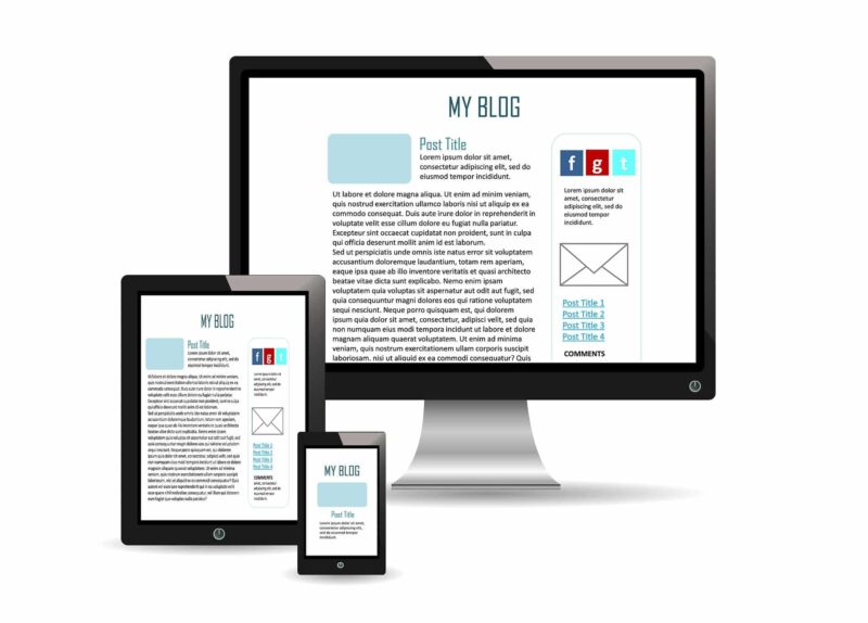
The world’s leading publications choose their font designs carefully and deliberately, and this isn’t a surprise.
Today’s discerning readers can easily determine a professional website from an amateur blog just by the smallest detail – and your font choice is one of the most obvious criteria.
Here are two reasons why choosing the best font for a blog is important for readability.
1. Different font styles convey different personalities.
Different fonts convey different feelings. While serif fonts convey tradition, respect, and reliability, sans serif fonts may convey stability and objectivity. If you’re building a legal business, you may opt for serif fonts.
If you’re managing a wedding photography blog, script fonts or sans serif fonts are a better choice. The wrong font can spell disaster for a business.
Can you imagine a law firm using Comic Sans as its main blog font?
2. Your font affects your reader’s ability to read your blog better.
Who’s your blog’s target market? Font size for blog matters for a variety of reasons.
A blog with older readers benefits from having larger fonts and basic typefaces to help seniors better decipher your text.
Is your headline font different from the font of your body text?
Choosing different fonts for your blog’s various sections may help your readers better understand the hierarchy and organization of your content.
3. It expresses professionalism.
The correct use of typography in your blog reflects your professionalism. The right use of text size and font spells the difference between gaining the trust of your customers or driving them away to blogs with a more readable content.
When was the last time you left a website just because it looks bad? Chances are, quite a lot.
If you’re serious about your blog, small design choices like these are incredibly important. If your website is based on business, choosing the right font also improves your product’s marketing.
See Related: What is Automated Blogging?
4. It helps you become easily recognizable.
Using the same set of fonts and presenting them in a harmonious way enhances brand recall, as readers are likely to remember the font you use in presenting your visuals.
The best blog fonts can specialize your company and help viewers better identify your website.
Finally, if your readability is improved users will stay on your site longer. If you run an ad network on your blog, your revenue will increase as people are spending more quality time on your site.
The 10 best Google fonts for blogs
While more than 200,000 fonts are available for use, I’ll be focusing on the best Google fonts for blogs for a variety of reasons.
Apart from being free for commercial use, users will not run into any trouble with licensing. These fonts are also very easy to implement on websites, so you’ll have no problems with font embedding.
Using Google fonts also enhances your page loading speed. You may opt to combine your Google font choice with a web host that uses Cloudflare CDN like Bluehost for even faster loading times.
Feel free to grab any of the fonts suggested below on the Google Fonts website.
1. Roboto
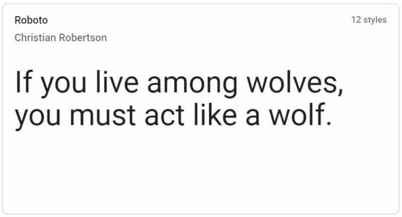
BEST WHEN PAIRED WITH: Roboto Slab, Lato, Open Sans, Montserrat, Oswald, and Futura PT
Roboto is the font used in Google searches, making it one of the most popular blog fonts. Featuring a mechanical skeleton with geometric forms and friendly curves, this font designed by Christian Robertson is one of the best blog fonts. It’s so popular that it’s the most used Google Font, according to Google Analytics. With letters settling into their natural widths, Roboto allows a more natural reading rhythm.
The font was first released in 2011 for use in Android 4.0, and up to today is the default font used in Google and Android services.
This font, which can be used alongside the Roboto Slab and the Roboto Condensed family, is also the font of choice for Illustrator, Photoshop, and Sketch software.
2. Open Sans
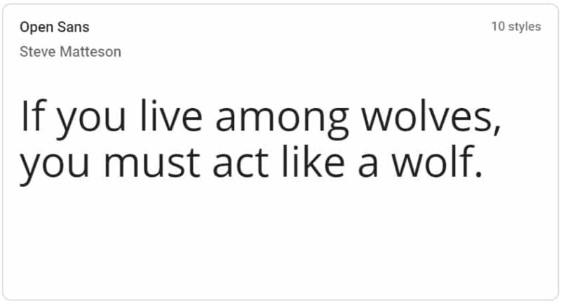
BEST WHEN PAIRED WITH: Alegreya, Montserrat, and PT Sans
Created by typeface designer Steve Matteson, Open Sans was originally designed for mobile, print, and web use, making it one of the best blog fonts.
It features great legibility, and as such, it is used by a variety of popular design-centric blogs such as Creativebloq, a popular art and design blog. Open Sans shares similarities with Source Sans and Nunito Sans, and is used regularly in combination with pitch-black backgrounds.
See Related: Best Blogging Platforms to Make Money
3. Lato
BEST WHEN PAIRED WITH: Shares similarities with Today Sans and Freight Sans. Use together with Cardo, Merriweather, Yellowtail, and Firra Sans
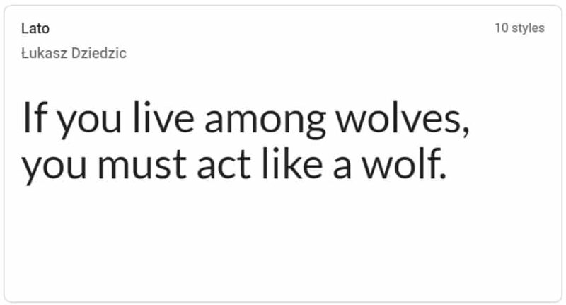
Named after the Polish word for “summer”, Lato is a sans-serif typeface created by Lukasz Dziedzic. Released in 2015, more than 9.6 million websites have used the font since 2018, making it the third most used font on Google Fonts. With an average of over one billion views per day, it is widely considered to be one of the best fonts for blogs.
Lato was originally created for a Polish bank in 2010 and was later added to Google Fonts where it became massively popular. Lato features semi-rounded letters that evoke a feeling of warmth, while its strong structure expresses seriousness and stability.
Lukasz describes Lato as “Male and female, serious but friendly. With the feeling of the Summer.”
It shares similarities with Today Sans and Freight Sans, and often used together with Cardo, Merriweather, Yellowtail, and Firra Sans.
Websites like Convince and Convert as well as Goodreads uses Lato on their websites.
See Related: How to Get 100,000 Monthly Pageviews in 6 Months
4. Oswald
BEST WHEN PAIRED WITH: Roboto, Arial, Manus, Garamond Premier, Quicksand, and Merriweather
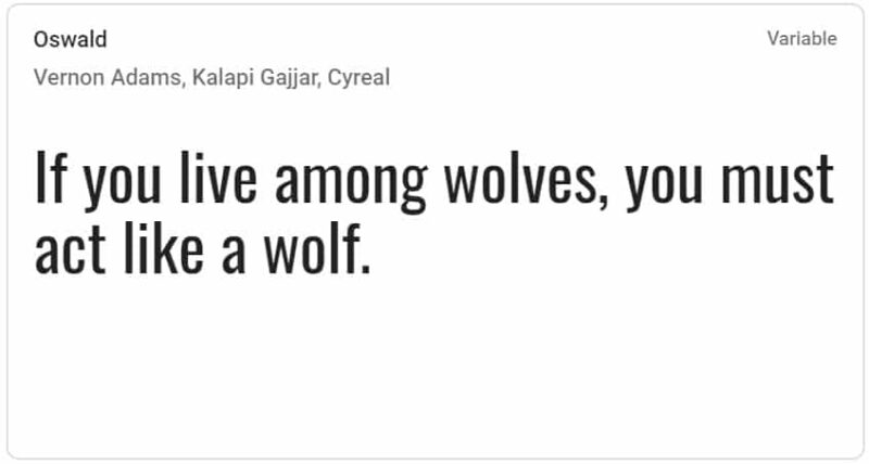
Launched in 2011 by lifelong artist Vernon Adams, Oswald was inspired by the Alternate Gothic sans serif typefaces and was re-drawn to align with the pixel grid of common digital screens. This font was specially created to be used freely on web browsers on laptops, desktops, and mobile devices.
Since its launch, the font was continuously improved by Adams until 2014, who added support for a variety of Latin languages, the addition of Bold and Light weights, improvements on kerning and spacing, and a variety of glyph refinements based on feedback.
See Related: How to Make Money Online
5. Montserrat
BEST WHEN PAIRED WITH: Source Sans Pro, Open Sans, Georgia, PT Serif, Lato, Esteban, and Lora
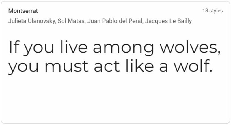
To create Montserrat, graphic designer Julieta Ulanovsky took inspiration from the old signs and posters of Buenos Aires’ traditional neighborhood, Montserrat.
Imbued with urban appeal due to its great simplicity and geometry, Montserrat was updated in 2017 and redrawn by Jacques Le Bailly, who adjusted the full set of weights and made the Regular version lighter and better optimized for longer texts.
Montserrat is the normal family with two sister families: Subrayada and Alternates. The font comes in 36 styles and is the closest completely free alternative to the Proxima Nova and Gotham fonts.
6. Source Sans Pro
BEST WHEN PAIRED WITH: Open Sans, Work Sans, Industry, Novecento, Wolpe Pegasys, and Courier New
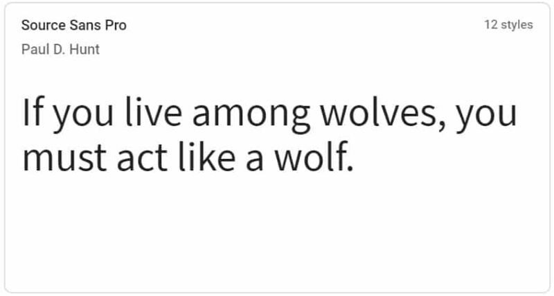
Designer Paul D. Hunt, with the help of Robert Slimbach, developed Source Sans Pro to be Adobe’s first open-source typeface family specially created for user interfaces. The font’s design was inspired by the legibility and clarity of 20th-century American gothic typeface designs.
Hunt took a rational design approach in creating Source Sans Pro, making glyph shapes simpler by removing excesses and highlighting their essential form while including a variety of details to differentiate similar letter shapes.
Source Sans Pro comes in six different weights with versions of regular and italic: Book, Light, Normal, Bold, Semi-Bold, and Ultra-Bold.
See Related: How to Create a Blog on Instagram
7. Raleway
BEST WHEN PAIRED WITH: Barlow, Open Sans, Cabin, Avenir, Droid Serif, Calibri, and Playfair Display
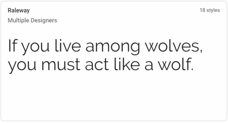
Raleway was created by American designer Matt McInerney, the same person behind the styling of popular font, Orbitron. It’s functional, sharp, and shares appearances with other Grotesque-style fonts.
The name “Raleway” was selected to highlight the font’s most unique and characteristic letters which include an “e” with an overbite, and numerals bouncing below and above the baseline without losing their aesthetic.
Raleway was first designed as a single thin weight, and later blossomed into a 9 weight family when it extended by designer Pablo Impallari and Rodrigo Fuenzalida in 2012.
This elegant sans-serif looks great when used as a heading or other large-size purposes.
8. PT Sans
BEST WHEN PAIRED WITH: PT Serif, Crimson, Trend Sans One, Lucida Grande, Poppins, Droid Sans, Paytone One, and Open Sans.
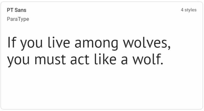
PT Sans was designed by Olga Umpeleva, Alexandra Korolkova, and Vladimir Yefimov and launched by ParaType, a company that distributes and develops a plethora of multilingual typefaces in a variety of scripts.
Among ParaType’s most popular projects include PT Serif, Circe, and Pragmatica.
The font was developed for ParaType’s project named “Public Types of Russian Federation”. The project’s main aim is to offer Russian people the capability to read and write using their native languages.
Featuring contemporary humanistic designs, PT Sans has 8 styles: 2 small size caption styles, 4 basic styles, and 2 narrows styles.
See Related: Ad Arbitrage Guide
9. Merriweather
BEST WHEN PAIRED WITH: Futura PT, Proxima Nova, Unit, Roboto, Replica, DIN, LL Replica Mono, and Open Sans
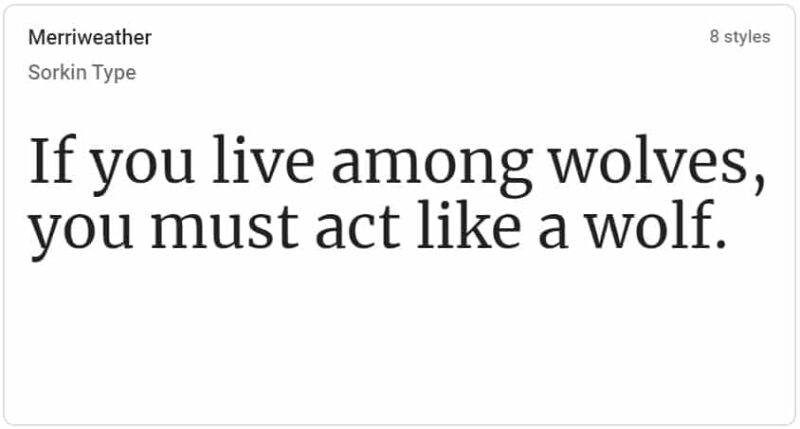
The design of Merriweather is led by Eben Sorkin of type design foundry Sorkin Type. Created especially for easy on-screen reading, the font features a tall x-height and heavy serifs which give it great legibility.
In a blog post by Sorkin, he described wanting to create something pleasant and easy to read, which meant adapting Merriweather’s design elements to screens and as many operating systems and web browsers as possible.
Merriweather draws inspiration from 16th-century French types such as Jannon, Garamond, and Elzevir, as well as the Aldine 15th century Italian type.
As it needed to work at small sizes on screen, Sorkin adopted a few structural features of modern and screen types as well.
See Related: Best Blogging Tools to Make Money
10. Ubuntu
BEST WHEN PAIRED WITH: Lato, Journal, and Merriweather.
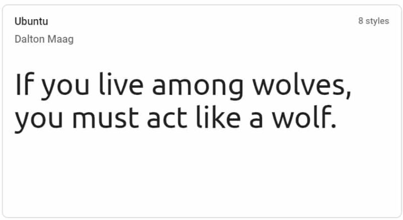
Developed during 2010-2011, the Ubuntu font was designed by Dalton Maag, an international font foundry that specializes in digital font and type design production. Its development was funded by Canonical Ltd.
The Ubuntu Font Family’s final font OpenType/Truetype files and design files are distributed under an open license. This means that everyone is encouraged to modify, experiment, improve, or share it. With a sans-serif typeface and OpenType features, the font offers clarity on both mobile and desktop computing screens.
Ubuntu’s philosophy expresses that all users should be able to use software using their own languages. As such, the Ubuntu Font Family includes all of the languages utilized by Ubuntu users around the world.
If you’re looking for more ways to improve your site’s engagement, this free four-day audience building course teaches you expert strategies on how to build more email subscribers and in effect, make more money.
What do you think are the best blog fonts?
Related Resources
Follow me on Facebook, Pinterest, YouTube, and Twitter.









![Toni Kroos là ai? [ sự thật về tiểu sử đầy đủ Toni Kroos ]](https://evbn.org/wp-content/uploads/New-Project-6635-1671934592.jpg)


