10 Examples of Blog Design Done Right (+ Tips to Create Your Own)

Whether you already have a blog or are considering starting one, learning how to design a website is paramount for gaining readership and retaining visitors. Once you have an idea of the type of content you want to create, the next step is to create a blog. Then, you’ll need to spend some time crafting a design that entices people to want to keep exploring your posts.
In this article, we’ll lay out the most important elements of blog design and offer examples that can help inspire your own.
These include:
-
Homepage
-
Headers
-
Logo
-
Empty space
-
Simple navigation
-
Article thumbnails
-
Related posts
-
Social media sharing
-
About page
Elements of blog design
When you decide to start a blog, you have two options: either your website is solely dedicated to your blog or it’s a separate section of your website. Either way, the core purpose of having a blog to begin with is to entice people to read your posts. Therefore, it’s important that your written content be the sole focus. No flashy animations or complex imagery needed here; in fact, simplicity will get you much further when it comes to expanding your readership.
Here are some tips on how to optimize the different elements of your blog design:
01. Design an eye-catching homepage
If your website were a house, the homepage would be the front door; it’s the primary gate to your online space. Your published posts may be featured here or on a dedicated page, but either way, your homepage needs to convince visitors that your blog is worth exploring. It should grab their attention and inform people immediately what the core purpose of your website is.
Spend time considering your web design, including layout, font and colors. And because your blog is a central part of establishing your online presence, you’ll also need to think about how to best navigate visitors to it from the homepage using a menu bar.

02. Include headers
Another way to draw in people’s eyes is to utilize headers on both your homepage and your blog page. A header is the top strip of each page on your site, and it helps set the tone and conveys what readers can expect from their experience. You can even customize your headers for each page if you wanted to.
You should include the name of your website, your logo and even a high quality image if it’s in keeping with the tone of your site. You may also want to use a navigation menu so visitors can easily make their way from page to page.

03. Create a logo
Creating a logo is an essential part of professional branding. Whether you want to start a fashion blog or a food blog, associating your name with a logo helps solidify your brand identity and makes your website more memorable. It’s a visual representation of who you are, what you stand for and the type of content you create.
You can use a logo maker to generate the perfect emblem to represent yourself and your blog. Then, incorporate it throughout your site, most importantly, on her headers. You can also include it on the footer of each page along with other valuable information, such as contact details so people are sure to remember you.
04. Incorporate empty space
Within a few seconds, a person visiting your site will decide whether or not your blog is worth exploring. While you may have read articles about what features to include in your blog, it’s also worth emphasizing what not to include. This is where empty space, also known as white space, comes into play.
Empty space refers to areas of your blog that you simply leave blank. Too much text and an abundance of images can appear messy and unorganized. Your blog should flow seamlessly so visitors can easily navigate from one page to the next. Empty space allows readers’ to make sense of the components on each page, guides their eyes and helps frame the written content.
05. Use simple navigation
While some websites, especially those in the UX or web design sphere, may incorporate complex design features, a blog design should remain simple. This allows your written content to shine through as the star.
If your entire website is dedicated to your blog, your primary goal is to attract readers. They need to be able to find your posts easily and navigate the various pages on your site. Don’t steal focus with too many fancy features which can distract potential readers. Let the quality of your written and visual content speak for itself.
06. Display article thumbnails
Whichever page of your blog site that houses your articles needs to be engaging, colorful and easy to explore. Displaying thumbnails of each article in a grid or listicle format is the best way to do this. It keeps all of your content organized and accessible, and allows readers to quickly scan the various titles.
Make sure to include a title, date and an image that goes along with each post. Visuals are going to be a key component of drawing in readers’ attention.

07. Show related posts
To keep site visitors engaged on your site for longer, include a Related Posts section. You can include this in the middle of an article, so readers are sure to scan past it while reading, or at the bottom of the page.
Including your most popular articles is a strategic way to leverage this section because this is the content in which readers find the most value. You’re therefore more likely to get the attention of new visitors from these same posts.
08. Allow social media sharing
Giving readers the ability to share your articles on social media is one of the easiest ways to reach new audiences and build your reputation as a thought leader. It’s also easy and free built-in marketing, which is particularly helpful if your goal is monetizing your blog.
An additional tip is to write more long-form content, referring to blog posts with 1,200 words or more. These articles generate three times more social media shares than shorter content, and enabling sharing capabilities allows you to leverage this opportunity.
If your blog is part of your business website, doing so will bring in new site visitors who have the potential to turn into customers. It’s a no brainer for any blogger.
09. Add an About Me page
One of the core purposes of creating any type of blog is connecting with your readers. It’s important to make your content personal and share who you are so they can get to know you. Without a trustworthy source, online content becomes far less relevant. And with over 31 million bloggers in the U.S. alone all vying for readership, connecting with visitors will help your blog thrive and stand out amongst competitors.
This is why your blog design should include an About Me section. It will inform your visitors who you are so they can know who is authoring your content. Include a picture of yourself and a short bio, including the motivation behind your blog. This will help retain visitors and keep them coming back.
10 blog design examples to inspire you
Now that you have a better idea of how to design your online space, here are ten blog examples you can use for inspiration.
Bella and Bloom is a full service web design studio that specializes in creating lasting impressions with consumers through brand recognition. Their website is dedicated to supporting their business and is complete with reviews, a portfolio and of course, a blog. A header at the top reads, “Calling all mother-hustlers, boss babes and female entrepreneurs,” signifying immediately who they’re target audience is.
Scrolling through their various posts, readers are greeted with a diverse range of helpful content, from business and branding tips to recipes for the best chocolate chip cookies. Pastel icons and cursive font adorn their website, making content fun to read and enhancing its laid back, professional vibe.

Laura Gimbert’s wellness website is geared towards helping busy moms live a balanced and healthy lifestyle. Her content ranges from working from home tips to traveling with a toddler. Each blog post is outlined in a light grey box, complete with a title, image and the opening sentence of her post to give readers an idea of what’s in store.
Pictures of Laura with her husband and kids display a more personal side of her life that allows readers to connect with her. She establishes herself as a mother helping other moms to navigate the challenges and tribulations of parenthood.

Rachel Norstrom has created a lifestyle blog centered around empowering women to express their individuality through fashion. An abundance of white space directs visitors’ eyes to the blog title when landing on the page, followed by an image of Rachel and a paragraph explaining who she is. This lets her connect with readers immediately and explains what her blog is about.
A strip at the top of the page lists the blog categories, while each post features a professional image of the fashion trend Rachel is showcasing. She also includes social sharing links at the bottom of her posts to Facebook, Instagram and Pinterest so readers can easily share their favorite looks.

This restaurant review food blog focuses on eateries in Dublin, Ireland. Gorgeous and colorful photos of delicious cuisine are scattered throughout the content, helping readers to get a better sense of what each restaurant has in store. All The Food has even made collage style featured images, with several tempting photos pieced together to entice readers to explore each article.
The blog shares content such as new restaurant openings, best places to eat on holidays and must-try desserts. Any foodie traveling to Dublin would highly benefit from reading this blog and using it as a guide to eat their way through the city.

Interior designer Estie Kessler’s blog site is dedicated to the idea that home isn’t just a place where we live, but a sacred space for making memories. Her blog contains articles all about how she has transformed her own home into a place for her family to thrive as well as ideas as to how to incorporate specific trends and colors into your own.
A simple, white header at the top of each page contains the name of her blog, Adobe, written in black cursive writing and a clean, easy-to-find navigation bar that directs visitors to her various pages. Visitors will find detailed, colorful photos throughout her blog to offset the clean design and draw attention to her exquisite interior design.

It’s hard not to spend time gazing through the photos of this family and lifestyle photographer’s website. Eric Etchart manages to capture both simple, everyday moments of family life, from a child looking at a ladybug, to bigger, more momentous occasions, such as weddings. His use of lighting, focus and color tells a complete story within each image.
His blog has a white background, allowing each professional thumbnail image to stand out and grab readers’ attention. Each post describes a photo shoot, including the subject and location of the session, which provides readers a behind the scenes look into the work of a professional photographer.

The Wine Tails is a blog for wine and dog lovers, a place where the site creator, Molly, can blog about her latest wine tastings and share her findings with the world. Molly explains her story and her pursuit of opening a dog friendly wine shop.
Her color scheme mostly contains pastel colors, such as greens and blues, with pops of bright colors like orange. A classy, outdoor aesthetic is perfectly fitting with images of vineyards, dogs and Molly herself sipping various types of wine. It’s as if visitors have the opportunity to stroll through vineyards with her discovering new types of wine.

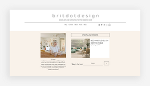
This engaging home renovation blog provides readers with content about interior design, DIY project tutorials and inspiration for home decor. Brit also shares where visitors can find her favorite products on a page labeled Faves, as well as the components she uses to complete each project. Links to all of her social media appear next to the horizontal menu at the top of the page, so readers can easily find her other online platforms.
As visitors dive into her blog posts, Brit shares details of her project plans before and after they’re completed, along with colorful photos to provide a real visual sense of her work.
The gorgeous images throughout this travel blog will have readers coming back again and again. This website is a great representation of how blog design can be simple yet effective in connecting with its readers.
One of the highlights is the Gallery section, in which these two bloggers showcase their outstanding, professional photos taken from around the world. They’re pieced together into a grid format in various sizes, with contrasting colors and textures adding beautiful elements to the page. Snow-capped mountains next to Buddha statues and bustling city streets showcase the scope of travel destinations this couple has visited.

This German company sends customers different seeds every month, along with instructions on how to help them grow within an urban environment. A simple logo consisting of the company name inside a circle conveys a feeling of wholeness and renewal, perfect imagery for an earth-centric brand.
The logo is featured in the upper left corner of each page on their site, including their blog. A simple array of articles in both German and English provide readers with tips and tricks on how to keep their plants healthy and thriving. Beautiful, vibrant photos of flowers and herbs draw in users’ eyes and entice them to click through.


By Talia Cohen
Small Business Expert and Marketing Blogger












![Toni Kroos là ai? [ sự thật về tiểu sử đầy đủ Toni Kroos ]](https://evbn.org/wp-content/uploads/New-Project-6635-1671934592.jpg)


